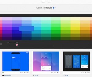
- Having lived through 1990s website with visit counting tickertapes and dancing babies, and then the 2000s with endless moving carousels, I’m skeptical of movement for movement’s sake. But Nick Babich explains three valid use cases for animation in mobile user interface design.
- If your email open rates are flagging, consider using emojis. New research finds that adding emojis to subject lines can boost email open rates 85%.
- A wiki can be a terrific tool for collaboratively creating and updating an organization’s knowledge base, but not without challenges. Lack of governance, different naming conventions, and plain old human nature mean that information there could be buried. Niles.ai aims to surface knowledge in wikis by making it accessible through Slack’s conversational interface.
- This article explains how to build a digital experience your customers will hate. I’ve seen most of these mistakes, from the one-stop-shop home page to the attempt to create all new, special snowflake digital vocabularies.
- Scheduling meetings is tedious and time consuming with the ping pong of availability times — and full-time, human assistants are expensive. Help is on the way: x.ai has released an enterprise edition of its virtual assistant.
Weekend fun: Can’t afford a personal trainer to whisper motivation in your ears? Netflix has you covered. Also, some are pointing out that better interface design and typography could have saved the Oscars.
Consumed: Way better than your average mall fare at Blue Ribbon Sushi.
GIF credits: KREATIVA Studio
Every Friday, find five, highly subjective pointers to compelling technologies, emerging trends, and interesting ideas that affect how we live and work digitally. Sign up for a weekly email.

