Tag: ux

  • Friday 5 — 5.2.14

    Friday 5 — 5.2.14

    1. foursquare location
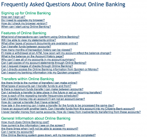
For a few years now, Foursquare has felt like a location data layer in search of a business model. The company just announced a move toward a more explicit user value proposition by revising its core app and splitting off a new Swarm app — a social heat map that doesn’t require an explicit check-in.
    2. How can we stop wasting users’ time? Here are some practical ways to design experiences that avoid common user experience pitfalls. My favorite? Stop the madness of persnickety fields that make for tiresome web forms.
    3. User growth is flat and the stock precipitously down — and now Twitter gets its very own eulogy.
    4. At Facebook f8, Mark Zuckerberg announced a set of new features, few of which you might associate with Facebook as we know it. They include anonymous login, linking between apps, and a mobile like button. Also, he said trust, stable, and mobile a heck of a lot.
    5. Teen-friendly, ephemeral, and visual messaging app Snapchat counters the unbundling trend of Foursquare and Facebook by adding features. Now users can swipe to chat via text or video — and true to brand, the conversation disappears when users leave the app.

    Weekend fun: In one minute and twenty-three seconds you could accomplish something productive, like answering an email or flossing your teeth. Or you could watch tiny hamsters eating tiny burritos. And it’s only episode one of the series, so submit your suggestions printed on tiny tortillas via #TinyHamsterIdeas.


    Every Friday, find five, highly subjective links about compelling technologies, emerging trends, and interesting ideas that affect how we live and work digitally.

  • Friday 5 — 4.25.2014

    Friday 5 — 4.25.2014

    1. mobile addict chartAre you reading this on your phone right now? Do you find you’re checking your phone compulsively? Then you might just be a mobile addict — defined by mobile analytics firm Flurry as someone who launches apps more than 60 times a day. High risk groups are identified as Teens, College Students (skewing female), and Middle Aged Parents, all of which ensures college campuses are teeming with the Infected.
    2. Facebook makes nice with the media by launching FB Newswire, a service that helps users find, share, and embed newsworthy items from its vast trove of user-generated content. A partnership with social media news agency Storyful provides content verification to separate wheat from chaff. No doubt this service will do some useful sifting for overtaxed newsrooms, but ultimately Facebook and its algorithms retain editorial control by deciding what’s newsworthy enough to make the wire.
    3. Fun fact from Q1 earnings report: Facebook now has 1.1B mobile monthly active users. Not including its Messenger app. Or Instagram. Or newly-acquired What’s App. For context, those monthly mobile users united would be the third largest country in the world, after China and India.
    4. This week Airbnb, the website that lets you make a buck renting out your pull-out couch or luxury vacation home, closed a round of 500M on a 10B valuation. Looks like the collaborative economy is starting to have quantifiable impact at least at the lower end of the hotel market: The Economist reports on research suggesting that if Airbnb’s growth continues at its current clip, budget hotel revenue will be down 10% by 2016.
    5. Codeacademy, an interactive platform that teaches people to code, relaunched its website. Here are the 10 design principles that informed their approach. Elevated social proof, commitment to fewer form fields, and enabling focus stand out as drivers of superior user experience.

    Weekend fun: Wait — you’ve already seen Brian Williams rapping gin and juice? Well, you should probably watch it again, because it doesn’t get any less funny the tenth time around. Jimmy Fallon’s video editors are a force to be reckoned with.


    Every Friday, find five, highly subjective links about compelling technologies, emerging trends, and interesting ideas that affect how we live and work digitally.

  • Friday 5 — 4.18.2014

    Friday 5 — 4.18.2014

    1. carousel app Now that we’re all shooting more photos and videos than ever before, Dropbox is hell bent on storing them for you. Dropbox knows there’s a high switching cost for moving all your personal stuff (hassle, trust) so they’re making it easy and appealing to store and share, particularly via mobile. And yesterday Dropbox purchased iOS photo app Loom to continue the offensive.
    2. This week, Twitter took a page out of Facebook’s monetization playbook by adopting app install ads. With a heavily mobile user base, Twitter provides an appealing audience for app creators looking for new users. Here’s hoping this proven ad revenue model shores up Twitter’s languishing stock price.
    3. Hunter Walk illustrates how context matters when serving up recommendations for end users. When YouTube recommended videos to users, the interface explicitly told them why: e.g., “because you watched these puppy videos, we’re showing you this kitten.” As a result, users were less likely ignore the recommendations — and consumed more video.
    4. But what if you don’t want your online behavior tracked, for relevant video recommendations or anything else? The Atlantic cites research from Zeynep Tufekci on emerging user behaviors, from passive-aggressive subtweeting to active hatelinking, that regular people are adopting to remain invisible to the algorithms that track online behavior.
    5. Also filed under “what your social networks now know about you,” Facebook has launched Nearby Friends, a way for you to find out who’s close by. The technology is based on Glancee, a startup Facebook acquired back in 2012. Needless to say, early messaging is all about user control and privacy settings.

    Weekend fun: Done right, Vine videos are a glorious, six-second art form. Here are this year’s winners from the Tribeca Film Festival, with my favorite Wrap Dancer winning the animation category.

    Every Friday, find five, highly subjective links about compelling technologies, emerging trends, and interesting ideas that affect how we live and work digitally.

  • Friday 5 — 3.21.2014

    Friday 5 — 3.21.2014

    1. design enterprise on mediumMedium has released its first mobile app, bringing its elegant, curated reading experience to your iPhone. Login requires Twitter, and they made the somewhat curious decision not to “bog users down” with a homepage. Still to come: more robust search and a mobile writing experience.
    2. The internet of things garnered a lot of attention in January when Google shelled out $3.2 billion for Nest, its patents, and its people. Is the next step for IoT consumers an app store for hardware? NEX band is making an early foray, counting on the viral sharing behaviors of youth to attract developers and ideas.
    3. If you manage a Facebook page for a brand, you might want to double-check those reach numbers. With an upcoming algorithm change, the organic reach for a brand page may fall to as little as 1-2% of the fan base. Facebook is looking to migrate organizations to a paid acquisition and retention model.
    4. Why do people edit Wikipedia? Here’s a quick explanation — part of a useful short series on the who, why, and how of Wikipedia editors.
    5. Is Twitter ditching @ replies and hashtags? Sounds as though they will keep the functionality, but lose some of this “visible scaffolding” around user behaviors. Expect to see ongoing evolution of the user experience as Twitter seeks the user growth needed to buoy its newly-public stock.

    Weekend fun: Ever wish you could go back and erase or edit your early online ramblings? For better or worse, Twitter is breathing new life into them by featuring “my first tweet” for its eighth birthday. Here’s how you can look up your own very first tweet.

    first tweet

    Every Friday, find five, highly subjective links about compelling technologies, emerging trends, and interesting ideas that affect how we live and work digitally.

  • Friday 5 — 1.10.2014

    Friday 5 — 1.10.2014

    1. yahoo news item
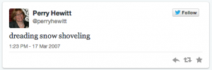
If you’re not shivering right now, perhaps you were at CES in Vegas this week. Among the loveliest of launches is Yahoo’s News Digest app, the fruit of its Summly acquisition a year ago. With this sleek app, Marissa Mayer is making good on her commitment to prioritize beautiful product. Yahoo is cleverly delivering not only well-designed mobile news, but the far more valuable editorial filtering via morning and evening digest editions (complete with a countdown clock to the next edition).
    2. Is it OK to admit we’re all getting overwhelmed by the endless stream of information? This article makes the case for more filters and bridges, and summarizes recent attempts to staunch the flow like nuking your Twitter feed.
    3. There’s been a saying for a while now — and Jonathan Zittrain takes a stab at its provenance here — that when something online is free, you’re not the customer, you’re the product. In a similar vein, this article asks if we will come to regret the myriad small decisions we make each day — opting into free products like social networks, email provider, file and photo storage in the cloud — where we don’t pay with money, but with our private data.
    4. Here’s a compelling argument for building online systems with empathy and not disdain in civic tech. It’s a great example of how digital strategy and communications are inextricable. The best digital platforms with stellar experience design, flawless cross-device rendering, and optimal performance become useless when impeded by content and communications that obfuscate rather then enable.
    5. How do African Americans have access to or use technology differently? Pew’s recent report finds that there’s a 12 percentage point gap in broadband adoption, but that African Americans are represented in roughly similar mobile numbers for cell phone and smartphone ownership. And the phenomenon referred to as “Black Twitter” may be backed up by these numbers: 22% of online African Americans use Twitter versus 16% of online whites.

    Weekend fun: If you enjoy black humor, you may already have played Cards Against Humanity. If you’re concerned about the future of news and painful linkbait headlines, why not go play Headlines Against Humanity?

    Every Friday, find five, highly subjective links about compelling technologies, emerging trends, and interesting ideas that affect how we live and work digitally.

  • Jelly and the visual web

    Jelly and the visual web

    jelly question
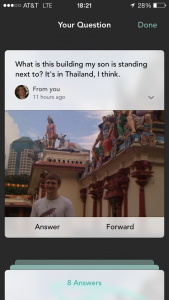
Biz Stone’s new visual Q&A platform called Jelly launched this week. The mobile app lets you use images to pose brief questions to your social network, which is defined rather expansively to include friends of friends on Facebook and Twitter. Interestingly, the site is positioned more for the helpers than for those seeking to crowdsource the help. Have five minutes in line at Starbucks or the post office? Use it to help someone in your network out.

    The site discourages the long back-and-forth threads of Reddit, and at first glance doesn’t seem to attract the thoughtful commentary of Quora. Without any means of sorting by upvoted or downvoted responses, you have to wade through a bunch of bad answers or jokes to find the right one. There’s also an element of randomness to the requests themselves — is it Chatroulette for fleeting questions? — without any kind of categorization for questions you might like to answer, like you’d find on Metafilter or QuizUp.

    jelly harvey ballThere are some great details in the UX, like the way a small Harvey ball fills to show you are approaching the character limit as you type a question. The sound effects are terrific, even if the stream of alerts is a little noisy. And the ease with which you can send a civilized and shareable thank you will promote social virality.

    But what’s the end game here? Is there a differentiated and solid enough use case to make a visual Q&A platform like Jelly a standalone business? An alternative theory is that this app is a smart approach to analyzing an increasingly visual web. Gathering a large amount of data about how social networks of people respond to, understand, and share images would be a step toward solving a valuable equation. Combine that human sensibility with algorithms, and there might be a real opportunity to develop and scale insights about performance and effectiveness of images in the visual web.

  • It’s not online banking — it’s banking!

    It’s not online banking — it’s banking!

    Continuous and miraculous advances in the digital sphere — cloud computing! big data! the internet of things! — lead us to have a high bar for digital experiences. So it’s particularly surprising when there are mainstream services out there, in this case a retail bank, that seem to have missed the memo on the integration of the internet into their core business.

    Recently I was looking for information about how to report a missing debit card (since found, thankfully). Late one evening I logged onto my bank’s website, through which we manage all our family’s banking transactions. I went to the FAQ to look for something like “lost/stolen debit card” and found all this:

    online banking

    I scrolled through the FAQ, which continues for pages, before realizing why I couldn’t find what I was looking for. All the questions pertained to online banking, i.e., how to use this website instead of actual banking questions. When I finally called the support line listed on the website, the person I reached could answer only questions related to online banking. All the help text and call center staff training were geared to questions like “which browser can I use?” or “how can I to export statements to Microsoft Money?” (a software package discontinued in 2009). To resolve any issues related to actual banking, like a misplaced debit card, I would need to go to a branch or call a different telephone number that the “online banking” person dutifully read off to me.

    Many of us live and work in an internet echo chamber, where we’ve been trained to view the internet as a set of capabilities that can enhance and extend traditional businesses, or create entirely new ones. Reading this FAQ was a stark reminder that [tweetable]there are still whole industries out there with a 1996 mindset[/tweetable], where digital is a discrete channel positioned as a segregated use case rather than a realization of the core business.

    Despite the many “flying car” advances we see, there are still lagging businesses in desperate need of internet integration. The dramatic juxtaposition brought to mind this tweet:


  • Grokking Google+

    It’s hard to grok Google+. On the one hand, since January 2013 Google+ user numbers have made it the undisputed second largest social network. In a similar vein, Mashable just published a breathless Google+ for beginners how-to that calls it “an intriguing network for all users.”

    social media referrals by network

    On the other hand, web traffic referrals from Google+ are down. Way down, if this recent Shareaholic report is anywhere near accurate. And web traffic sent is a good indicator of the volume of content that users are actively sharing on Google+. Image-rich social sites like Facebook and Pinterest are leading the pack.

    The Google+ user experience make it seem more like a loosely-tied set of features than a cohesive network or service. Sometimes this lack of clarity evokes privacy concerns. The Google+ personalization of www.google.com on your birthday is one relatively benign example. The brand you’ve come to think of as your private search tool is surfacing your own information in a way that it’s easy to mistake as public to all.

    birthday doodle

    More disconcertingly, Google+ seems to automatically display birthdays of Google+ “friends” through the Android browser. The experience below led a colleague to ask, “How did you buy screen space on my phone?”

    Android screenshot

    Perhaps it’s more useful to think of Google+ not as a Facebook or Twitter competitor, but as something entirely different. Charles Arthur in the Guardian described Google+ as the Matrix, “an invisible overlay between you and the web, which watches what you’re doing and logs it and stores that away for future reference.” Sure, there are some compelling social network features, like Hangouts. But in the end, you’re serving up your data in return for getting a suite of services like email and search, and only an occasional, visible glitch will remind you of the Matrix. Given the deep embedding of Google service in many of our lives, it’s a tough tradeoff to walk away from.

  • What is an annotation on the web?

    What is an annotation on the web?

    A new content type, user annotation, has been cropping up on popular websites lately. An annotation allows site visitors to interact directly with a chunk of content rather than scroll to the bottom of a page to leave a comment. User-contributed annotations are not only a way for readers to interact with text, but for users to engage with other media like images on Gawker and audio files on Soundcloud.

    soundcloud annotation

    Unlike threaded commenting, which descends all-too-frequently into a cage fight of the uninformed versus the enraged, annotations offer the hope that civil discourse can occur when users interact directly with the content. User contributions are marked by a small icon (in this case, a 1) that other site visitors can click on to expand:

    gizmodo annotation

    How do you create an annotation? Here’s what the process of leaving an annotation looks like on Quartz:

    creating annotation

    Clicking on the + box brings up a simple text field to submit an annotation. Site authors and editors can moderate the content before it is posted, and reward thoughtful contributions by featuring or replying to the annotation.

    See the Citi logo at top right of the text field? That’s a clever revenue approach to have corporate sponsors underwrite a specific technical feature. Sponsoring technical features offers a promising complement to a predominantly native advertising business model used by many news sites — with fewer of the underlying editorial concerns.

    Annotations have been around forever in academia, but this relatively new web behavior will be familiar to a wider group of people who use comments in ubiquitous desktop applications like Word or PowerPoint.

    The days of sitting back and passively viewing content are, for good or for ill, over. Finding ways for people to interact with content that encourage new ideas or productive debate is the new nut to crack.

  • 5 ways to make your admin interface shine

    5 ways to make your admin interface shine

    Your design meeting for the new website was standing room only. People who routinely wear mismatched socks showed up to express strong opinions on color hue, saturation, and value, and to weigh in on flat vs. skeuomorphic design. A public website for the enterprise is important — it’s a brand statement seen millions of times each month. So while it’s not surprising that these meetings garner internal attention, it’s unfortunate how little mindshare is paid to its less sexy alter ego, the admin interface.

    Chicago Tribune kittens
    Chicago Tribune taken over by kittens – was the admin interface to blame?

    The admin interface is the dashboard view for the internal users managing your site through a content management system (CMS). A fair amount of your website may be automated through feeds or ad servers, but odds are you still have a team to edit/add content or choose what to feature on the homepage. Spending the time to make this dashboard a user-friendly control center instead of a jargon-filled, out-of-the box system can improve productivity and reduce errors.

    1. Start by giving your developers a clear idea of how site admins will manage site content. Who writes/curates the content? What’s the process for inputting the content, and for any proofing and approval? How often does existing content get updated, and how much new content comes in each day? How many site admins need different levels of access? The bottom line is that the technology must support human users, and not the other way around. An out-of-the-box system can adequately handle 90% of the use cases. But considering the amount of time your site managers spend each day inside the admin interface, small improvements can add up to big value.
    2. Volume matters. Make sure to test each aspect of the interface with the right amount of content. For each entry, make sure heads, subheads, and copy lengths approximate or are real ones. (For fun: read a good attack and defense of Lorem ipsum) Once you’ve populated the system with hundreds or even thousands of content items, is it still possible to quickly find a specific article or multimedia asset for an edit?
    3. Disable unnecessary features. Most CMS systems serve general audiences, and offer features and links you may never use. Developers are often loath to remove features because they may someday be useful. It’s important to push for showing only what is needed. Removing unnecessary options will make daily functions easier to find, and accelerate task completion.
    4. Enable workflow, but also workarounds. Enforce data validation, but be careful not to create processes so cumbersome that they slow down content entry. The workflow needs to be painless enough to ensure its adoption, and anticipate common use cases. But recognize that you can’t design for every content and staffing scenario, so leave some flexibility in the system. Examples might include a “nuke” button for a social media feed, or a way to override approvals for certain content types.
    5. Add your brand to the admin interface. This interface is the home screen of the people who work in it. As much as is practical, make sure your organizational and site identities are reflected. The latter is particularly useful in seeing at a glance one site’s admin interface from another in organizations where admins may manage multiple sites.

    Internal, task-oriented admin interfaces will never be the rockstars that public website designs are, but an infrequently updated site can often be tied directly to how damn hard it is to add or change content. Investing time in thinking through and designing a usable admin interface does more than make your internal users happy — it’s a strong predictor of a well-maintained public website.