Tag: mobile

  • Farewell, “click here” – the disappearance of chrome

    Chrome is an umbrella term for the navigational elements throughout user interface design. NN Group offers a useful description of chrome at all layers of human-computer interaction, from operating system to website to mobile app. Fun fact: Google’s browser derives its name Chrome in part from this term since it attempts to minimize visible UI chrome — most notably by merging the address and search bars.

    Visible chrome is disappearing fast from many interfaces for desktop and mobile. Why?

    First, because our interface interactions are increasingly designed by and for digital natives. People who have grown up with “traditional” mouse/click, and then moved to touchscreen, and then moved to gestural interfaces powered by Kinect or Leap Motion aren’t going to need or want a lot of superfluous instruction.

    Next the the capabilities of technology fuel the disappearance of chrome. Think about the vanished “save” button in applications like Google Docs or Evernote. All your stuff is in the cloud, and it’s autosaving. There’s a task we don’t have to remind you to do, and a button removed.

    Finally, the rise of mobile has made us more conscious of real estate value. I can remember the collective sigh of relief when web designers in the late 1990s or early 2000s were liberated from 800 x 600 to 1024 x 768 — look at all those pixels we could commandeer! Now we’re increasingly cognizant of and designing for the reality that most experiences will be mobile first. Mobile for content consumption and commerce transaction are a new norm, and mobile design now affects what your “desktop web” looks like.

    A couple of website examples of the fading away of chrome:

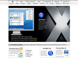
    Back in 2005, Apple had to tell us what to do when we got to the home page:

    2005 apple home

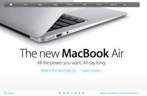
    By 2013, Apple can offer a single clean horizontal navigation bar, and a large, visual carousel without any obvious forward or back arrows:

    2013 apple home

    Or take a site designed to appeal to a wider range of audiences: New York Public Library. In 2005, there was a lot of upfront and explicit instruction about what users can do on the page:

    2005 New York Public Library

    By 2013, there’s an assumption that users know how to directly manipulate the content to get the information or experience they want. There’s a single nav bar at top, but otherwise the first view surfaces the content and prompts interaction.

    2013 New York Public Library

    User interface design remains a balancing acts of many variables — navigability, clarity, form factor, appeal, and a content strategy you can support. Scaling back the chrome in these interfaces lets us reclaim valuable real estate, but it’s important to make sure usability doesn’t get lost in the shuffle.

  • Friday 5 – 06.07.2013

    Every Friday, find five quick links about compelling technologies, emerging trends, and interesting ideas. Source: the internet.

    1. Despite the oft-declared demise of RSS, many recoiled at the announcement of a Google Reader shutdown in July. Feedly, Pulse, and others have picked up migrating users, but Digg has an upcoming launch of a social news site / RSS reader said to be uncluttered and functional. Here’s an interesting interview with the team.
    2. In case Mary Meeker hasn’t convinced you, mobile behaviors continue to indicate that there’s a lot more upside ready to be monetized. YouTube announced that its mobile ad revenue has tripled, and revealed that 40% of U.S. video views are on mobile.
    3. HBR offers an elegant envisioning of the state of email — which is not dead, but evolving. Each year workers spend the equivalent of 111 workdays dealing with the frustrations of email, and its clunky utility is not going away anytime soon.
    4. Similarly, calendar functionality feels like it could get a lot better. Sunrise launched back in early 2013 to reimagine calendar via lush design and smarter data sources —  here’s hoping its new 2.2M round will continue to advance the product.
    5. Personal security is a headache. The system of requiring human brains to come up and remember ever more human-unreadable passwords is unsustainable. Looking for a better way? David Pogue offers a comprehensive review of Dashlane as one solution.
  • Friday 5 – 05.17.2013

    Every Friday, find five quick links about compelling technologies, emerging trends, and interesting ideas. Source: the internet.

    1. Google celebrated I/O by dialing up the design, it seems. There are some sexy, new fast actions in Gmail and a flat, card-based Google+ re-launch that shows they’ve been doing plenty of pinning over in Mountain View.
    2. David Carr on Snooping and the News Media: It’s a 2-Way Street. Best line about digital trails: “The absence of friction has led to a culture of transgression. Clearly, if it can be known, it will be known.”
    3. Twitter buys some visualization skills so we have more ways to make sense of all those tweets.
    4. Quartz takes a look at why iPhones still have the lion’s share of mobile data activity. “So while it is true that Android phones vastly outsell iPhones, Apple users seem to be getting a lot more out of their devices. For now, at least.”
    5. There’s a lot of crisp thinking and beautiful writing going on in this elegant longform piece on MOOCs, Harvard, and higher education by Nathan Heller in The New Yorker.
  • Teens as mobile challenge to enterprise IT

    mobile-teerAnyone who’s spent time in a high school or college campus recently won’t be wholly surprised by Pew Internet’s recent study on U.S. teens and technology. 78% of teens have a mobile phone, and 47% have smartphones — meaning that a whopping 37% of all teenagers have a smartphone.

    More surprising may be the number of mobile-mostly users, people who access the internet mostly through their mobile device. About 15% of adults mostly use the internet via mobile, but there’s a big leap to 25% of mobile-mostly teens — and a full 50% of teens with smartphones.

    What does this mean as older teens entering college campuses and the workforce? The communications and ecommerce worlds have been living mobile-first for a while. Jonah Peretti reminded us at SXSW that mobile used to be where content stopped, but today mobile is instrumental in content spread. Black Friday 2012 was a wake-up call for any remaining retailers who didn’t see the opportunity for mobile transactions.

    The seismic shift will occur for enterprise IT when these teen mobile-everything users expect to be able to perform tasks from registering for class to entering time in PeopleSoft to submitting expense receipts. Bring Your Own Device (BYOD) has been an IT practice for a number of years, with non-trivial concerns about support and security. Make no mistake: this teen mobile usage data shows there’s a tsunami of application development work awaiting organizations for this rising generation of mobile internet users.

  • Raju Narisetti in a Q&A with Nieman Labs

    I think Twitter — unlike all the fears people had that it’s going to turn us into short attention-span people because we were so focused on the character limit — Twitter actually brought serendipity back into my life in a major way. I now encounter and experience so much more interesting content from around the world that would have been impossible in the days when we had a lot of time and bought a bunch of magazines and a bunch of newspapers.

    –  Raju Narisetti in a Q&A with Nieman Labs on journalism and mobile and his role with New News Corp. This excerpt encapsulates for me why participation in the social web is worth all the time and effort. And Android keeps me up at night, too.

  • How are arts orgs wrangling digital?

    How is the digital explosion affecting arts organizations? Last week, a Pew Internet report revealed the current digital focus of arts orgs, and what they identify as emerging opportunities and costs. Unsurprisingly, 99% have a web presence and many struggle with the time and expertise cost of social media. A few other findings that leapt out:

    • a full 97% have a presence on social networks and 45% post at least once a day
    • the “brand champion” strategy of having patrons help manage negative comments on social media is working for many
    • widely varied audience use cases (e.g., older/younger patrons divide on social media) creates need to support traditional alongside new media outreach
    • 20% have reprimanded employees over content shared online, which speaks to tensions between employees’ right to freedom of expression and the organizational needs for confidentiality and appropriate, public behavior (if this isa tension in publicly-funded arts orgs, what does this look like for banking?)

    One opportunity that stood out was the sizeable gap between adoption of websites (99%) and social presences (97%) and that of mobile apps (24%).

    Certainly, not every arts org needs a native application, but if I were working on a low-cost SaaS mobile solution with ecommerce baked in, arts organizations would be on my target list.


  • Context is everything: preview button

    “The fact that we can even offer a ‘preview’ shows how tight the association is between content  management and delivery….The existence of a preview button reinforces the notion that the desktop website is the “real” website and mobile is a satellite, an afterthought.”

    – Karen McGrane, in Content Strategy for Mobile

  • 5 apps for self-improvement in 2013

    Having survived the near-miss apocalypse, today we’re all turning our calendars over to 2013. Many are pausing for a natural moment of reflection and resolution — all those things we were yesterday will henceforth cease to be, and today we begin again as our newer, better selves. At least until we remember where we hid the cookies.

    Here are five apps useful to those looking to track time, create new habits, or merely keep a firmer grip on their to-do lists in 2013. I recently read The Power of Habit, which underscored the importance of documenting what you intend to do in order to actually get the damn thing done. The social overlay is powerful in these aspirational apps — it’s one thing to tell oneself in the mirror of one’s intention to walk five miles a day, and quite another to tell a couple hundred Facebook friends. These apps promote behavior change by understanding the importance of social capital, and that “‘individual’ health behaviors are actually complex network phenomena” which play a part in spreading conditions like happiness to obesity.

    1. Wunderlist 2 :: Ideal for the task management obsessed, this app has elegant list making and sharing. Am still muddling through its recent (Christmas Eve!) upgrade and attendant syncing problems, but a really lovely user interface.
    2. Evernote :: This is my go-to productivity app, and Evernote 5 delivers a raft of useful, new features. It always makes me feel vaguely guilty — am I Evernoting to my full potential? — but features like the page camera and the audio are killer.
    3. Lift :: Think of Lift as cleanly-designed reminders to be that better person in 2013. Pre-set options include “Unclutter” (4,190 participants); “Go to gym” (10,867 participants); and “Tell my wife I love her” (3,426 participants — presumably the husbands are already hearing this, or the wives just can’t be bothered?). The social network feels like a big benefit here: if that many other people can unclutter a cabinet, why shouldn’t I?
    4. Everest :: Everest captures your long and short term goals and allows you break them into small steps. It’s designed to be a lush, photo-rich experience. As the name implies, much of the user content seems more focused on long-term goals rather than the banal day-to-day. (h/t Eric Kuhn for prompting me to check this out.)
    5. Timer :: If you’re anything like me, a task can expand to fill any amount of time allotted to it. There’s no hidden, killer feature — it’s set of lovely, clean programmable buttons that prompt you to keep yourself on track and on time.
  • On the web, what is the job to be done?

    While the overall economy haltingly recovers, web and mobile development have resumed at full tilt. Maintenance on digital properties deferred since the 2008 financial crisis is now critical to perform. The growth in mobile device adoption and the proliferation of tablets in multiple form factors are forcing even the desktop-devoted to accelerate mobile development. Vendors are busy, RFPs are everywhere, and clients are eager to get started.

    But when clients undertake a web project, what is really the job to be done? Back in the 2000s, Clay Christensen pointed out that “every job people need or want to do has a social, a functional, and an emotional dimension.” The customer’s articulation of the job, which he offers up in his popular milkshake example, is not always the job that needs to be done.

    Christensen’s findings ring especially true today during this renewed digital development boom. Clients say, “I need a web refresh/mobile app,” as a statement of their perceived functional need. But often what they are looking for is a strategy that guides them through:

    • Walk me through my audiences in the digital realm
    • Help me understand how digital technology will change my core business processes
    • Show me where my company fits in a new competitive landscape in a disrupted environment
    • Teach me about social media, and how to use it

    Large management consulting firms have the chops to tackle many of these questions, but often without a strong delivery arm for the quick prototyping and execution required for digital. Conversely, web and mobile development shops want to solve a technology problem, ideally with a reusable product, and may be ill-equipped to take on the strategy component. The right blend of digital firm does exist, but may not be on the clients’ radar if they are beginning with the functional end in mind. What’s the solution? Re-focus your team on the higher level of problem — the complete social, emotional, and functional job to be done by your web presence.

  • Getting to scale: advancing platforms for online content

    These days Software as a Service (SaaS) is ubiquitous. Project management? Got Basecamp for that. Bulk email at scale? See Constant Contact or Mailchimp. And say goodbye to your server logs — Google Analytics has been widely adopted for understanding website performance. The move to SaaS has long been the case for bloggers, who from the early days migrated to solutions like TypePad. Today, many would rather have a Tumblr instance or a site on WordPress.com than be in the business of building and updating an application.

    Currently I’m involved in two projects, one as part of a team implementing and promoting a multi-tenant Drupal instance, and the other as a client for migrating the server side of an open source mobile application to a SaaS platform. In both cases, moving to a platform will enable updating and scale at lower cost — but it’s highly instructive to sit on both sides of the table simultaneously and see transition pain points. A few observations on ways to drive platform adoption:

    • Give people control of their pixels. Enabling admin users to make small tweaks for brand or preference make an organization feel more ownership of the process and the CMS.
    • Invest in admin UX. The boring “killer app” behind adoption is often a clean admin user interface. If the person charged with updating the content doesn’t feel confident in the user interface, updates occur less frequently.
    • Create systems that enable adaptive content. Karen McGrane speaks persuasively about why we need to stop the madness of systems that cram print layouts into ever-smaller screens. Systems that enable authoring the right content types and metadata are essential — they help publishers reach users on the proliferation of devices today, as well as the ones not even created yet.
    • Meet the need for speed. Content publishers, especially for news sites, live in the admin interface. A system that lags on the backend will fail to impress, especially in today’s environment where 400 milliseconds (the blink of an eye) is now considered too long to wait.
    • Be explicit about ways platforms remove pain points. Custom online publishing platforms for web or mobile rarely calculate total cost of ownership at a level that includes both feature enhancements and maintenance updates. Open source systems update frequently, and even in a cleanly-coded site where the Drupal core is untouched, these updates require time and testing.
    • Expose and sell the roadmap. Platforms need a product roadmap informed by both articulated user needs and emerging trends. Too much on the former, and you lose a coherent product. Too much of the latter and you slow adoption. Find the right blend collaboratively with content creators and designers, and iterate.
    • Integrate social services. We’re no longer building independent publishing systems, we’re integrating them into an ecosystem of always-on channels of social applications like Facebook. Make sure the content types enable compelling and clean sharing to social.

    For those making a move to a platform, remember that feature set alone is rarely the differentiator for a great online presence. A thoughtful investment in content and social strategy drives effective digital communications, particularly for those in the information business — whether that’s an educational institution, a news organization, or a consulting firm. Find the right platform to provide a solid underpinning, and focus on a strategy that delivers what matters for your online audiences.