Chrome is an umbrella term for the navigational elements throughout user interface design. NN Group offers a useful description of chrome at all layers of human-computer interaction, from operating system to website to mobile app. Fun fact: Google’s browser derives its name Chrome in part from this term since it attempts to minimize visible UI chrome — most notably by merging the address and search bars.
Visible chrome is disappearing fast from many interfaces for desktop and mobile. Why?
First, because our interface interactions are increasingly designed by and for digital natives. People who have grown up with “traditional” mouse/click, and then moved to touchscreen, and then moved to gestural interfaces powered by Kinect or Leap Motion aren’t going to need or want a lot of superfluous instruction.
Next the the capabilities of technology fuel the disappearance of chrome. Think about the vanished “save” button in applications like Google Docs or Evernote. All your stuff is in the cloud, and it’s autosaving. There’s a task we don’t have to remind you to do, and a button removed.
Finally, the rise of mobile has made us more conscious of real estate value. I can remember the collective sigh of relief when web designers in the late 1990s or early 2000s were liberated from 800 x 600 to 1024 x 768 — look at all those pixels we could commandeer! Now we’re increasingly cognizant of and designing for the reality that most experiences will be mobile first. Mobile for content consumption and commerce transaction are a new norm, and mobile design now affects what your “desktop web” looks like.
A couple of website examples of the fading away of chrome:
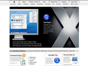
Back in 2005, Apple had to tell us what to do when we got to the home page:
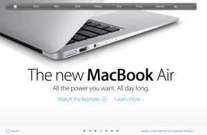
By 2013, Apple can offer a single clean horizontal navigation bar, and a large, visual carousel without any obvious forward or back arrows:
Or take a site designed to appeal to a wider range of audiences: New York Public Library. In 2005, there was a lot of upfront and explicit instruction about what users can do on the page:

By 2013, there’s an assumption that users know how to directly manipulate the content to get the information or experience they want. There’s a single nav bar at top, but otherwise the first view surfaces the content and prompts interaction.

User interface design remains a balancing acts of many variables — navigability, clarity, form factor, appeal, and a content strategy you can support. Scaling back the chrome in these interfaces lets us reclaim valuable real estate, but it’s important to make sure usability doesn’t get lost in the shuffle.