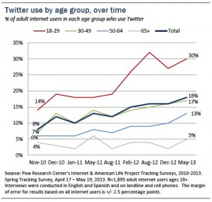
Language is always changing, but the arrival of consumer technology over the past 25 years has meant a sharp uptick in our new day-to-day jargon. Terms like modem, pager, or smartphone enter and exit the common usage with remarkable frequency.
FlowingData this week pointed out how Google’s “define: <word>” feature now displays word etymology via flowchart and graphs word usage over time. Three words graphed over time tell a story of technology adoption and attrition:

You can clearly see where telegraphy emerged in the mid 1800s, and how the flat line begins around the time the last telegram is sent in 2006. Telegram remains in the language as a common noun and as a relatively popular name for newspapers, but the arc aligns with the technology in use.
Next, let’s track fax technology, which clings on doggedly in the finance, law, and healthcare sectors. A sharp rise in the 1990s, but not the subsequent flatline many might assume.
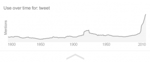
 Finally, have a look at tweet:

The word tweet meaning “the chirp of a small or young bird” has been around since at least 1800. You see a minor spike in the 1920s, when Jazz Age musicians produce and record “When my sugar comes down the street, all the little birdies go tweet tweet tweet.” But the real hockey stick spike starts in 2006 when Twitter enters the scene.
As a language geek I love how we can track and quantify language usage in more simple, visual ways. Analyses like souped-up concordances can not only track macro usage trends, but perhaps even diagnose dementia in individual authors. As visualization tools become more common and accessible, we’ll have more ways to analyze and add context to our understanding of the language we use.

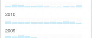
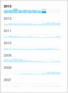 View tweet volume and navigate by month. For me, tweet frequency corresponds with conference attendance and making new connections. My archive shows the year I skipped SXSW with a far lower tweet volume in March. Click through tweets by month to see what’s going on in your high or low volume outliers.

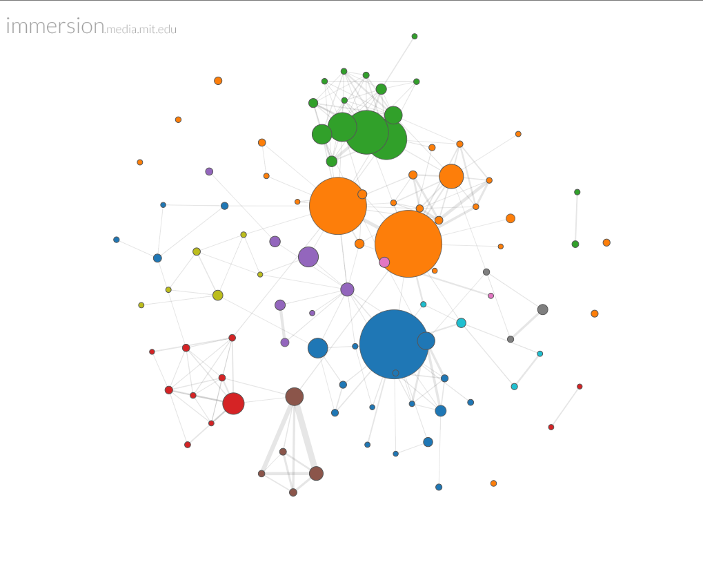 Use gmail? You might want to try
 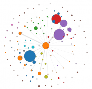 A drill down feature allows you to see your network from the perspective of a single node. In this case I have singled out
 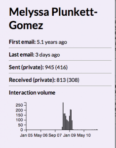 correspondence back and forth over the years, and it’s easy to see the volume peak during our time as colleagues. A section not shown here shows who introduced us to each other (no one — that transaction occurred in Facebook, not gmail), and lists the people Melyssa has introduced me to over the years.