 Video on the internet has come a long way from the jerky, plugin-encumbered frustration of the late 90s to its speed and near-ubiquity today. YouTube now reports 1 billion unique monthly visitors watching more than 6 billion hours of video each month. The proliferation of smart phones and accompanying rise in social sharing mean that mobile video viewing is at an all-time high.
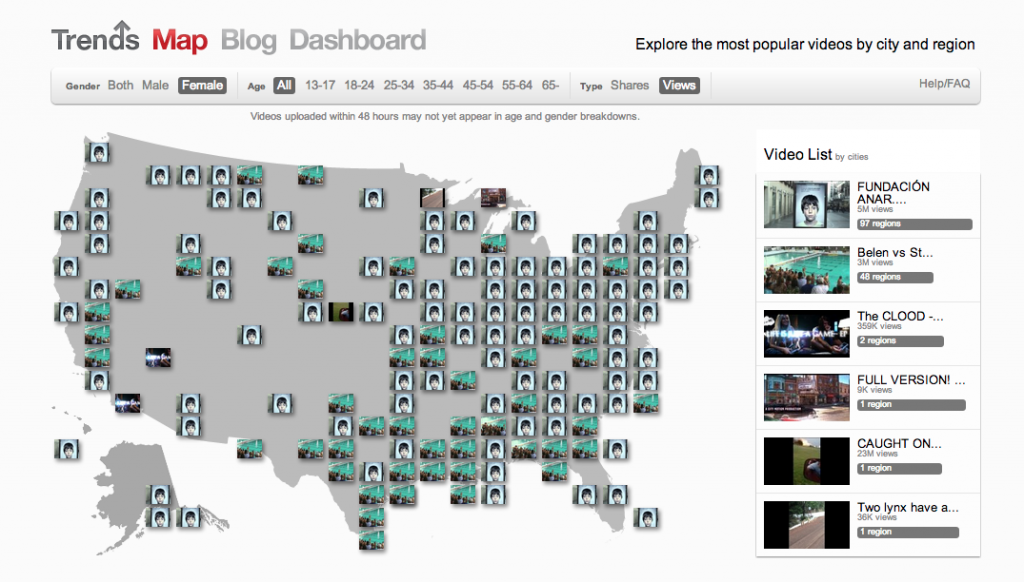
Data visualization pro Martin Wattenberg has collaborated with the YouTube trends team to create a map of trending videos in the U.S. Six ways to explore the data:
- Click on any of the video thumbnails on the map to play. I’m generally not a fan of the lightbox treatments because they lose the metadata that provides context — but it works well here. Interestingly, the lightbox views seem to have no pre-roll.
- Mouse over the video list by cities/regions at right. The other videos on a map will gray out and let you see at a glance what’s playing where nationally.
- Next, toggle between Shares and Views in the filter bar at top. I love this as a metric to understand what people enjoy watching versus what they suggest others watch.
- Click Male or Female in the filter bar to see what’s trending by gender. On Tuesday, the females seemed to be watching Blake Shelton while the males tuned into Charles Ramsey.
- Click the age ranges to see what’s trending by the usual bands. The high overlap between the 13 year olds and the 65+ crowd confirms my suspicion that the age reporting in YouTube is highly suspect. Twelve year olds tend to sign up as senior citizens to avoid age restrictions, and Google prevents them the changing the age on the account when they go back to fix it in their late teens.
- Finally, scroll down below the map to see the top videos trends bars. The colors cleverly derive from the video thumbnail, and offer a great visual that changes as you select filters up top. It’s a great way to see, for example, that tonight there is uniformity in what people are watching but far more variety in what they are sharing.
The trends map is an immensely readable view of the enormous U.S. video data set. For large publishers of video to YouTube, this would be a terrific at-a-glance addition to a video performance dashboard.