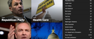
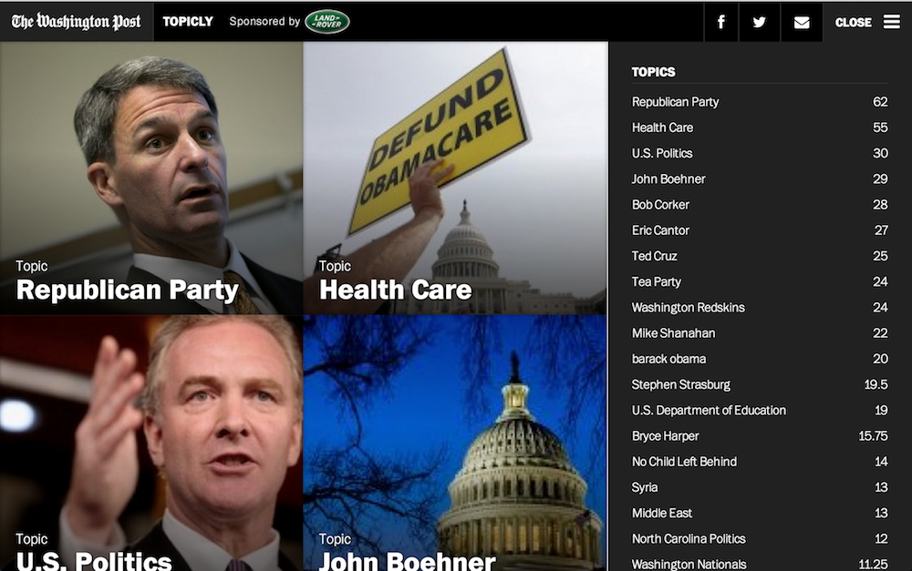
As Flipboard collects another $50M on a $800M valuation, traditional news publishers are experimenting with more visual displays of the news. The Washington Post’s Topicly is largely algorithm-driven, full-bleed display of news stories by volume. Editors plan to incorporate more social media from the web as well as from the Post’s own journalists.
A few observations:
- This is a good example of desktop user interface informed by mobile — see how the three horizontal line icon is rapidly becoming a standard meaning “expand this” on the desktop web.
- More context and functionality in the interface (what do those numbers in the expanded menu mean?) might be helpful to understand what you’re seeing. Is it sheer volume or is there a measure of resonance? Is there any editorial hand?
- Sites like this are tough beasts to feed with visual content: see how some of the images are pixellated when you click through.
- This is a revenue experiment, as well as a visual one. There is a site-level sponsorship at top left in addition to interspersed native advertising. Sites looking for sustainable models will continue to experiment with sponsorship of specific features and functionality, like Citi sponsoring the launch of Quartz’s annotations.