Tag: data

  • Friday 5 — 11.7.2014

    Friday 5 — 11.7.2014

    Restaurant Reservations

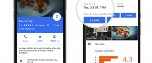
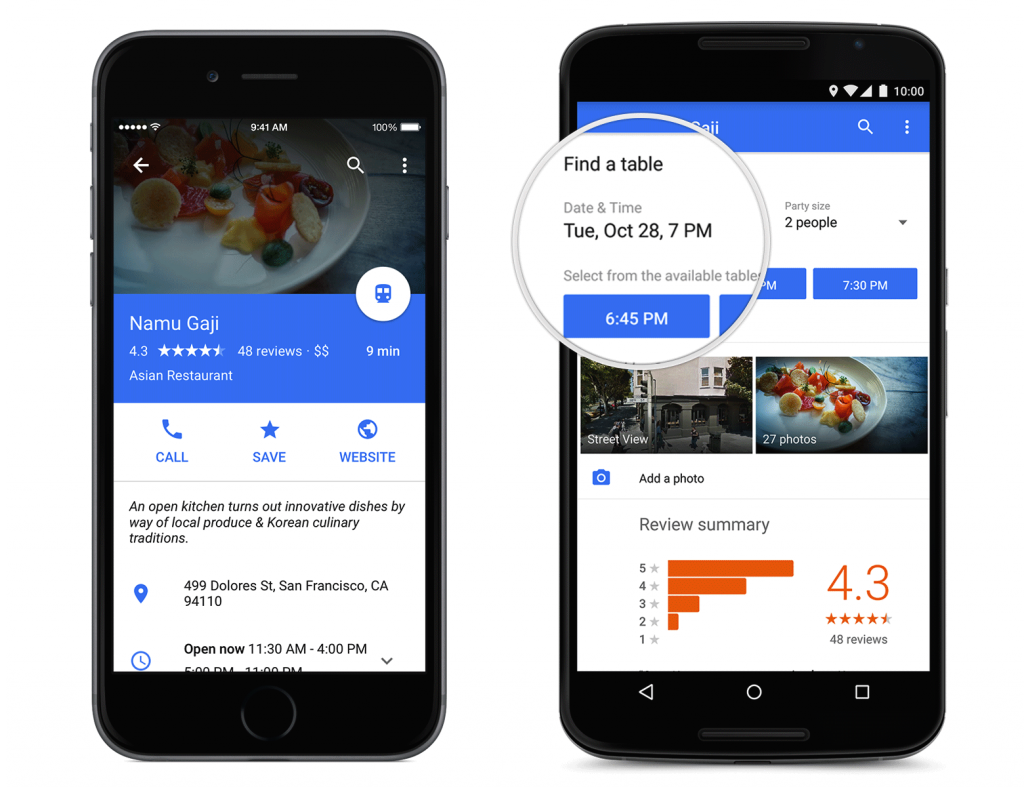
    1. This week Google Maps is rolling out a new redesign with improved ease of use. Beyond the clean look and brighter palette, note the increased surfacing of transactions through the map, like making a restaurant reservation through Open Table or booking a car through Uber.
    2. Reddit’s Bit of News bot summarizes news that’s shared on Reddit as it reaches a certain click-popularity threshold, and then pushes those summaries to an app. It’s a great example of ideal human-algorithm partnership. The humans do the smart discernment, and the algorithm figures out when and how to share more broadly. Check out this good write-up about the Bit of News bot.
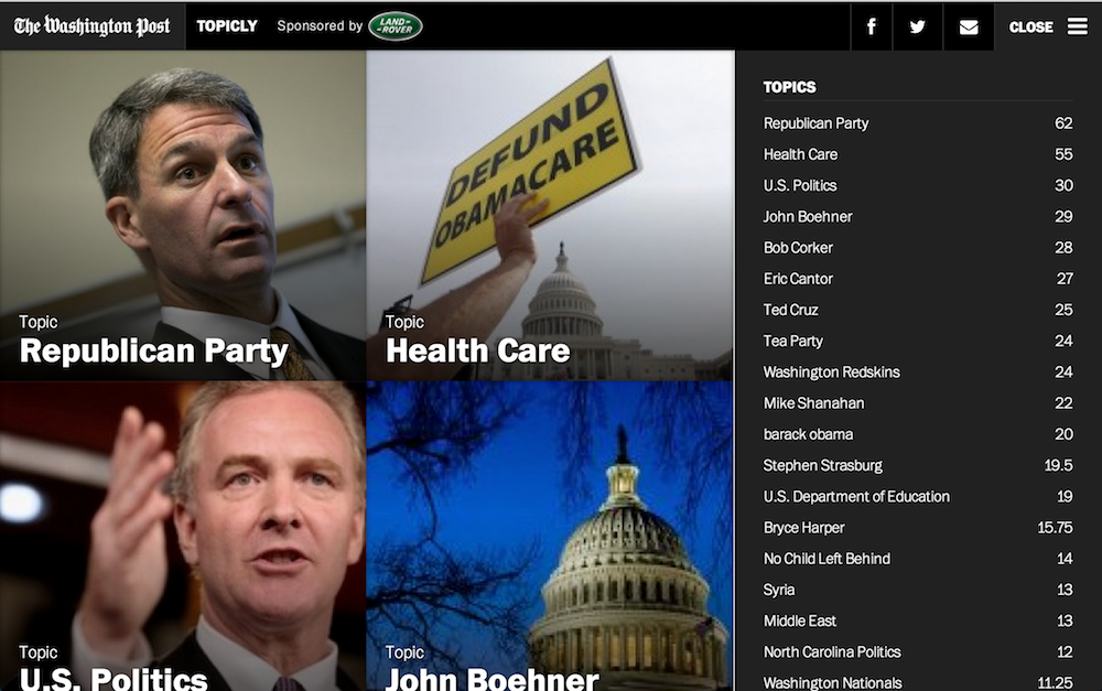
    3. With Google Analytics, you can create so many custom reports that it’s hard to know where to start. This article compiles and reviews 12 useful, downloadable report templates created by GA experts. Hours and days and content efficiency reports are particularly useful for bloggers.
    4. As we all store more documents far from our hard drives, there’s a greater need for seamless integration with daily office applications. This week Microsoft announced a new integration with Dropbox, just as Google launched a Chrome extension to let you access Drive files from apps.
    5. Big Moose Is Watching You tells the fascinating story of LL Bean’s strategic use of customer data from the very beginning, when they targeted nonresident Maine hunting license holders with direct mail. Today, the company uses data to provide sophisticated “omnichannel” presentation, and takes an approach that favors highly relevant offers to customers over brand awareness.

    Weekend fun: Geek out with Brian Cox in the world’s largest vacuum chamber, minus 800,000 cubic feet of air. Watch to the end for the full child-like glee when the predictable occurs.


    Every Friday, find five, highly subjective pointers to compelling technologies, emerging trends, and interesting ideas that affect how we live and work digitally. Try out the Friday 5 archive, or sign up for a weekly email.

  • Friday 5 — 10.3.2014

    Friday 5 — 10.3.2014

    active_exposure

    1. Pageviews and clicks provide some insight into your content’s performance, but understanding if and where your users are paying attention is far more valuable for content producers and advertisers alike. Chartbeat announced that it’s been certified by the Media Ratings Council for a new way of measuring reader attention: active exposure time.
    2. Are we actually reading the articles we share on social networks? Buzzfeed’s new data blog has some encouraging news: on average, users who share spend 68% more time on page than users who don’t.
    3. Google Ventures shared these five rules for creating great interface copy. The rules offer designers and developers a useful reminder of the importance of well-crafted microcopy, and how all those little, big details add up in interface design.
    4. Reddit received $50 million in funding, to be used in part for product development, community management, and mobile tools (maybe an app, finally?). Reddit also announced plans to share back 10% of equity with the site’s users via crypto-currency.
    5. Overwhelmed by your inbox? Try Eric Schmidt’s 9 rules for email. I’ve been rescued by the LIFO strategy more times than I can count.

    Weekend fun: Anyone else remember using an SE/30 for wordprocessing or playing Dark Castle? A team working at the Harvard Innovation Lab has visualized the evolution of the desk (see the original video created by bestreviews.com) from an old-school Mac with accessories to your laptop today. Spoiler alert: there’s an app for that.

    desk evolution

    Every Friday, find five, highly subjective pointers to compelling technologies, emerging trends, and interesting ideas that affect how we live and work digitally. Try out the Friday 5 archive, or sign up for a weekly email.

  • Friday 5 — 9.12.2014

    Friday 5 — 9.12.2014

    music migration

    1. When Spotify bought music intelligence platform Echo Nest, they gained access to a trove of data, and a smart team of people who could optimize curation. A new Spotify Insights blog focuses on telling scientifically-driven stories about music. This first post takes a look at how music migrates, and the varying musical influence of cities around the world.
    2. The options for publishing your content online are myriad. When should  you post to your “owned” properties, and when should you syndicate to communities like Medium or Rebelmouse? Ths KISSmetrics post has some useful rubrics for how to overcome the content distribution hurdle to help your content find its audience.
    3. Digital disruption may have moved from buzzword to cliché, but the advent of agile marketing is a great example of this phenomenon. As technology has become both ubiquitous (so many options!) and pervasive (throughout the funnel), marketers must learn to manage for uncertainty and change. Make time for this terrific slide deck on Managing Marketing in High Gear by Scott Brinker.
    4. I once read that algorithms are people’s opinions, mathematically expressed — and nowhere is that more evident than digital journalism. As news becomes more mobile, the experience of news consumption can be more tailored — and potentially more monitored. A new study sheds light on how engineers and designers think about their role in news delivery.
    5. Twitter cards offer a way to create more visual tweets to drive engagement and spur specific actions. Here’s a comprehensive guide to types of Twitter cards and how to use them.

    Weekend fun: Ever wonder what your favorite characters in videogames do when you wander away from the controller? Find out here — GIFS included.

    Every Friday, find five, highly subjective pointers to compelling technologies, emerging trends, and interesting ideas that affect how we live and work digitally. Try out the Friday 5 archive, or sign up to get a weekly email.

  • On jazz hands and ad networks

    On jazz hands and ad networks

    Everybody is very enamored by Google’s self-driving cars, you know, Google making glasses. That’s all jazz hands. It’s a big, huge distraction. They’re an advertising network. They’re putting a 25 to 50 percent advertising tax on everything created in the world. That’s all their doing. It’s a huge ad network. They’re going to subsume all advertising into their network.


    And that’s what Facebook is building. That’s why Sheryl Sandberg, who was at Google and helped build that advertising business, was brought into Facebook by Zuckerberg. It’s to re-create that playbook. They’re all huge advertising marketing firms. All they’re doing is collecting data and then selling it, and they have an interface that’s wildly efficient, wildly efficient — unprecedented in its efficientness. …

    — Insightful interview with Jason Calicanis on the digital landscape for brands touches on content marketing, advertising networks, the role of data, and the importance of social media profiles. Read the whole interview on PBS Frontline.


  • Friday 5 — 1.31.2014

    Friday 5 — 1.31.2014

    1. wechat mobile giving
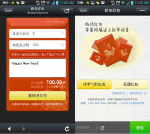
新年快乐 — or, Happy New Year! Tencent’s WeChat has greeted the year of the horse by allowing users to send lucky money via mobile. This smart marketing move is aimed to inspire transaction among WeChat’s nearly 300 million global active users, and perhaps lure new users drawn by the feature.
    2. In another nod to the increasingly visual nature of social engagement, Twitter has released new mobile photo sharing capabilities this week. It’s a move to keep people in the app, and drive engagement by issuing a reminder to @ mention others when you upload a photo containing people.
    3. Facebook takes a crack at a “distraction-free” newsreading experience with the launch of Paper. It’s a definite upgrade from its Android Home experience and more like Flipboard — but will it offer too much competition with its own app?
    4. Blogging is dead — long live collaborative publishing. Medium, the originally invitation-only content platform has announced a $25M round of investment. Medium pays some of its writers to attract quality content, and provides a lovely admin user experience for all. There are still some questions about Medium’s overall direction — how much is it a curated magazine versus a place for all storytellers?
    5. How do you make sense of all the social media noise to inform the news? CNN and Twitter announced a partnership with a new tool aimed at journalists. Dataminr, a firm better known for financial services products, is shifting to help CNN use algorithms to identify accurate, breaking news stories from Twitter.

    Weekend fun: Before all those SuperBowl ads go live on YouTube, amuse yourselves with this penguin dance-off. (h/t The Dodo, my new go-to source for all things animal-related).

    Every Friday, find five, highly subjective links about compelling technologies, emerging trends, and interesting ideas that affect how we live and work digitally.

  • Effective data visualization, football edition

    Effective data visualization, football edition

    Arsenal standingsAs an Arsenal fan (the London team that’s currently first in the Premier League, a fact I try to work speciously into every conversation), I spend far more time than I should reading about soccer/football online. Like many sports, football is a goldmine of data from goals to assists to caps. In addition, football (unlike American football) is a game played globally, so there’s rich data about the rapid rise of player transfers internationally. And as the game became commercialized — it’s now the Barclays Premier League — the money moving around gets exponentially larger. All this data has been captured in a compelling and slightly addictive interactive visualization by Mac Bryla.

    Back in 1965, when Bobby Moore was leading West Ham to FA Cup Victory, only one player transferred from England for a total of .02M €.  By 1986, when Gary Lineker is playing for Everton, you can see how far the England players are traveling:

    transfers 85-86

    Fast forward to 1990 when David Beckham is at his peak, and you can see 115 English players fanning out across the globe, and the rise of money changing hands reaches 61.4M €.

    1989-90 transfers

    By 2012-13, it’s up to 221 players and 151.3M €. So if you scroll through the visualization you can see very little until the 1970s, and then tremendous growth in moves and dollars that could be compared in interesting ways to the rise of television, the World Cup winners, the popularity of soccer in the U.S., or even the growth of the internet.

    What makes this data visualization work so well? First, while it’s not a breathtaking design, it’s clean and functional. The experience is also intuitive — the user can easily see the variables (explore by year; to and from country) that can be manipulated. Finally, the designer has done for us the most difficult job of all: winnowing out all the other facts (country of birth, team transfers, tenure abroad) that might be interesting data but would muddy this interface.

  • Try it: News visualized with Topicly

    Try it: News visualized with Topicly

    As Flipboard collects another $50M on a $800M valuation, traditional news publishers are experimenting with more visual displays of the news. The Washington Post’s Topicly is largely algorithm-driven, full-bleed display of news stories by volume. Editors plan to incorporate more social media from the web as well as from the Post’s own journalists.

    topicly

    A few observations:

    • This is a good example of desktop user interface informed by mobile — see how the three horizontal line icon is rapidly becoming a standard meaning “expand this” on the desktop web.
    • More context and functionality in the interface (what do those numbers in the expanded menu mean?) might be helpful to understand what you’re seeing. Is it sheer volume or is there a measure of resonance? Is there any editorial hand?
    • Sites like this are tough beasts to feed with visual content: see how some of the images are pixellated when you click through.
    • This is a revenue experiment, as well as a visual one. There is a site-level sponsorship at top left in addition to interspersed native advertising. Sites looking for sustainable models will continue to experiment with sponsorship of specific features and functionality, like Citi sponsoring the launch of Quartz’s annotations.
  • Emerging law for data inheritance

    More broadly, America’s Uniform Law Commission, a non-partisan group that creates model legislation that is then adopted unchanged by many American states, has a “Fiduciary Access to Digital Assets” committee working on amendments to existing ULC laws that would give executors many of the same powers over digital assets that they have over financial and physical ones, while absolving service providers of any liability. These adjustments could be incorporated into some states’ laws as soon as 2015, though some federal fiddles may be required as well. In her paper, Ms Perrone notes that such uniformity would mean that “people would no longer have to rely on companies’ varying terms of use to determine how to manage digital assets.” When dealing with death, a little certainty can be a great comfort.


    – The Economist reports on “Who owns your data when you’re dead.” Good summary of a recent paper and legal progress on how to distribute data post-mortem in a world with a couple thousand years of familiarity with the concept of physical asset inheritance.

  • Digital afterlife data policy

    Beyond the variability among states and companies, it’s worth asking if access to data post-mortem should extend beyond family members and enter some kind of publicly accessible data repository, which data scientists and presumably anyone else could explore. In presenting this concept, Brubaker used the word “donate,” not unlike a person permitting organ donations after death.

    – Jordan Novet, Dealing with data after death ain’t easy. Here’s why.

  • Try it: Graph your Facebook friends

    Last week, Stephen Wolfram released a long and interesting analysis of aggregated and anonymized Facebook user data from his Data Donor program. He offers some observations about how Facebook behaviors illustrate the trajectories of people’s lives — how many people they friend, where they settle, and how clusters of friends reflect communities (school, friend, neighborhood).

    In September I tried Wolfram Alpha to examine my Facebook use, and not much about the broad strokes observations changed when I re-ran it recently. I still use words more than pictures, and have roughly the same number of male and female friends. Geography is still fairly widely dispersed. This time, I took a closer look at the network graph.

    social_network_2013

    The colors indicate a typology defined in the web app. In brief:

    • Social insiders (purple) share the most connections with you. These include many colleagues in interactive, and my son.
    • Social outsiders (grey) share at most one friend with you. These include people I’ve worked with briefly during consulting gigs, or met traveling somewhere far away on vacation. I see far more of these than I would have predicted.
    • Social connectors (green) connect groups otherwise disconnected. In my network, this includes a friend who I went to elementary school with who also worked with me at the same software company in our twenties.
    • Social neighbors (orange) have few friends you don’t already know. In my graph, this includes late adopters of social networks, and skews older.
    • Social gateways (red) have a great many friends who you don’t know. If I were being more strategic about growing my social network, this is where I would focus, thinking that the strength of weak ties would provide more opportunities for connection that could be helpful for everything from a great restaurant in Montreal to job candidate referral.

    You can graph your own life and social network courtesy of Stephen Wolfram right here.