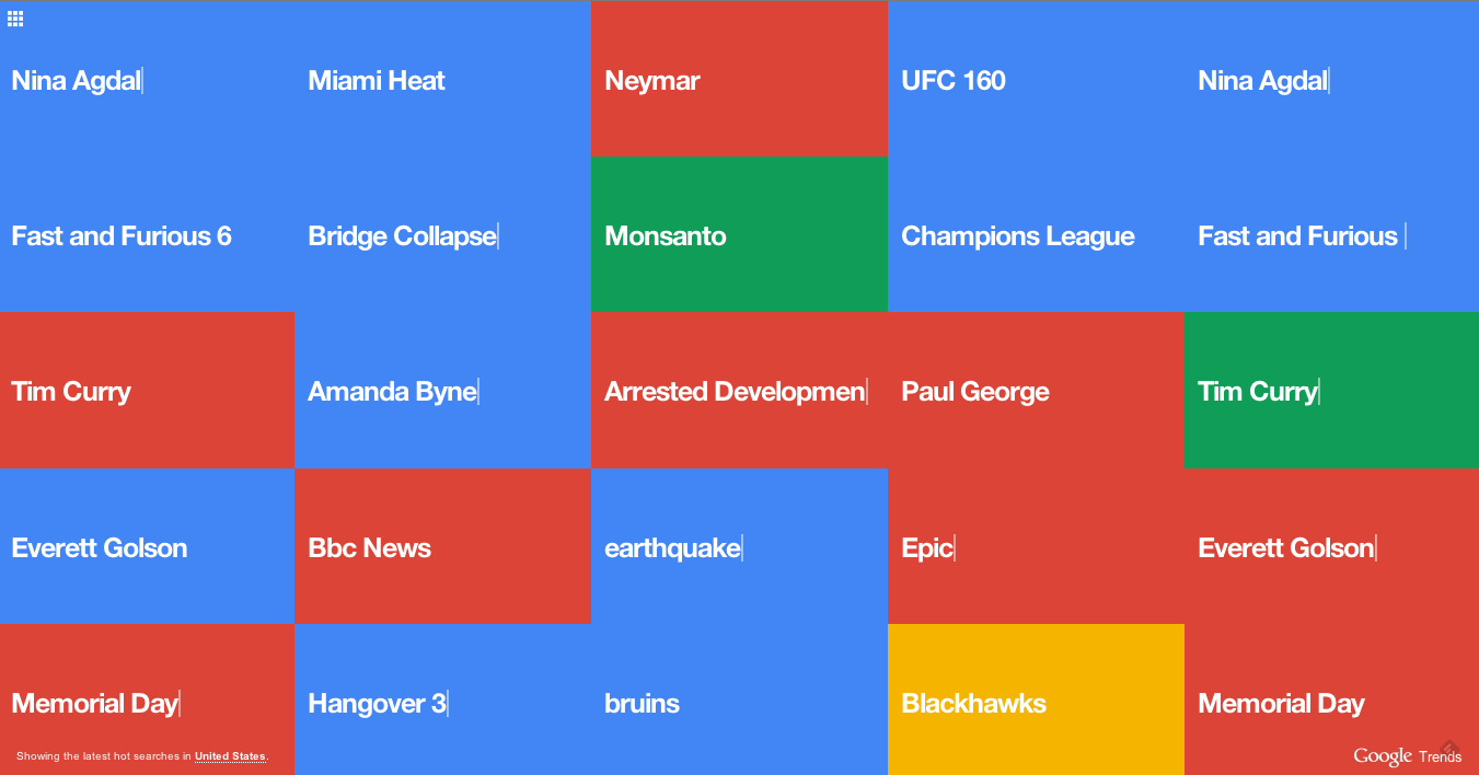
Add another curiously mesmerizing big data visualization to your procrastination list. This colorful visualization serves up a (presumably filtered for a G rating) constantly-updating view of all the Google search terms people in the U.S. are entering in near real-time. For fun, toggle over to see search terms in ten other countries, including Australia, India, and Russia.
Feature request: a customized version for brands to visualize the terms most frequently associated with the brands, like “Arsenal + Wenger” or “Harvard + financial aid.” There are other ways to discover those terms, but would be terrific to visualize them out of the box for a presentation on brand associations.
