visual Tag Archive

Friday 5 — 8.12.2016

By

Jasmine Friedl suggests how to make your not-so-great visual design better. More importantly, she shares the process that can help a designer get better: asking questions and guiding rather than issuing prescriptive statements. Connie Chan explains why stickers are more than just a frivolous gimmick: they are an emerging visual digital language. In messaging platforms like WeChat and Line, stickers …

Read More

Friday 5 — 5.27.2016

By

Friday 5 is taking a break to go peer at people’s internet-enabled devices in 三门峡 and 西安 — neither of which I can pronounce, but Wikipedia can teach you. Back in time for Lionel Messi’s birthday, Friday, June 24. This UX reality check presents 14 hard truths about users. Most common mistakes I’ve seen (and committed) are ignoring the fact that …

Read More

Friday 5 — 5.6.2016

By

  Visual content is everywhere, and measurement and optimization are starting to catch up. Netflix already knows which pictures you’ll click on and why, and blogged some lessons learned — including the value of regional nuance, and of recognizable, polarizing characters. As a travel geek, I loved this compilation of 16 apps that will help you travel the world. Some …

Read More

Friday 5 — 7.10.2015

By

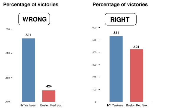
We all see (and rely on) many more visual representations of data these days — charts are everywhere in your social streams. Needless to say, how you set up your chart to reflect the numbers matters. Here’s a handy guide to spotting charts that lie. (Yes, Yankees fans, that chart is deceiving.) Facebook is already a …

Read More

Friday 5 — 6.26.2015

By

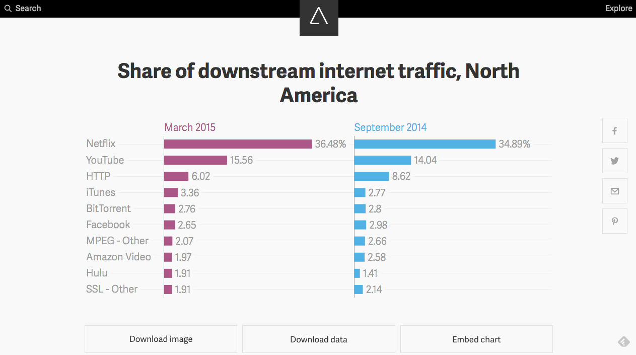
News stories are often well told visually, particularly in an era where more data than ever is available. Business and tech news site Quartz launched Atlas, a slickly-designed command center for all its charts, where you can download, embed, or grab the data. And it’s an open source product, so you can create your own version. McKinsey looks at …

Read More

Friday 5 — 3.27.2015

By

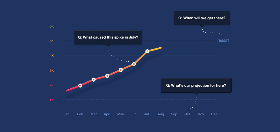
We are all generating a lot of data, and are attempting to serve it up in meaningful charts. This post addresses four ways charts can focus less on their appearance, and more on delivering relevant answers and insights. “Beautiful, terrible, and addictive” Twitter has turned nine. Today, it’s a critical source for breaking news with one billion tweets sent every …

Read More

Friday 5 — 10.17.2014

By

Twitter has enabled streaming audio to a limited number of partners via Audio Cards using Soundcloud. Now users can listen, like and share audio content on SoundCloud without leaving Twitter. This feature will be big for music, and useful for finding new audiences for public radio programming. Audio excerpts might also serve up interesting teasers for online learning content. With …

Read More

Friday 5 — 9.26.2014

By

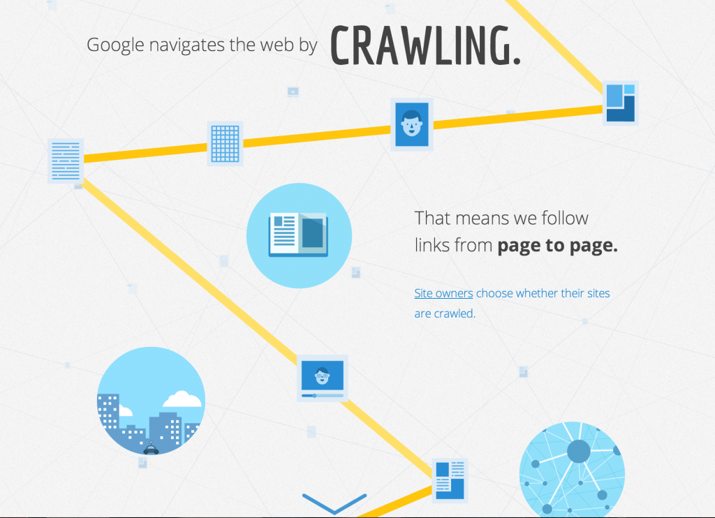
Even with the meteoric rise of social media, search remains a significant driver of traffic for most sites. Google released a helpful, scrolling infographic reviewing the basics of how search works. Visual social network Pinterest is a treasure trove for publishers. Not only a resource for trendspotting, Pinterest can in some cases drive more referral traffic …

Read More

Friday 5 — 8.8.2014

By

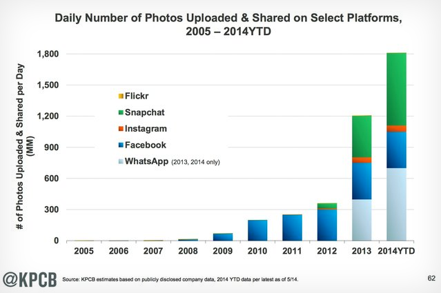
Snapchat and WhatsApp are emerging as dominant photo sharing platforms. Interesting that a main modality for this sharing is private messaging (quasi-ephemeral in the case of Snapchat) versus Facebook’s one-to-many concept of posting to your profile page. Social networking skeptics often decry the use of “friend” as an organizing principle for everyone from your sister …

Read More

Friday 5 — 6.6.2014

By

LinkedIn really, really wants you to buy a premium account, and is disrupting its current paid model with a less expensive $9.99/month option. This includes new, more visual profiles, and tools to help you optimize for search. For early access, you can sign up here. Despite the growth of and improvement in speech recognition software with Siri, …

Read More

× Close