Tag: ux

  • The science of website design

    The science of website design

    Few would dispute that website design is a creative exercise. A recent study by Katharina Reinecke and colleagues [PDF] would imply that there’s some interesting, quantifiable science baked in as well. Both common sense and studies confirm that users judge a site’s appeal within seconds. Reinecke et al. offer some compelling findings on how visual complexity and colorfulness play into that initial judgement.

    The researchers found visual complexity to be a significant factor in initial appeal. Low-to-medium complexity in the visual design translated into more positive initial impression. Apparently, preference for low visual complexity is notable for viewers over the age of 45. (Anecdotally, I’ve observed this as a similar cutoff age for tolerance of an endless scroll.)

    color wheelThe study also analyzed reactions to colorfulness, measured in part by distribution of colors in an image and composition of adjacent colors (the complementary colors effect). Overall, colorfulness was found to be a less important driver of visual appeal at first impression.

    The researchers also captured and analyzed demographic data. Findings included that while age correlated with preference for low-medium visual complexity, education level interacted more significantly with colorfulness. Gender did not play a major role in either visual complexity or colorfulness, and the study indicated that further research is required to better understand the role of native language and aesthetic rating.

    The process of creating website design remains highly creative and subjective. Great design, to a degree, follows Justice Stewart’s dictum: “I know it when I see it.” But the more we can understand and quantify the specific elements that form an initial and lasting impression, the better user experience we can create.

    Photo credit: Victor Hertz

  • Friday 5 — 07.19.2013

    Every Friday, find five quick links about compelling technologies, emerging trends, and interesting ideas. Source: the internet.

    1. Game development company Valve continues to think different. This week it launched Pipeline, an experimental project to introduce high school students with minimal experience to the video game development industry.
    2. Is user experience finally moving beyond the tech domain and being perceived as a strategic business asset? Robert Fabrikant describes how UX is the new black.
    3. A Pew survey finds that middle and high school teachers believe that students’ use of digital tools encourages creativity and personal expression (78%) as well as greater collaboration among students (79%). Regrettably, this doesn’t always translate into effective writing, and teachers expressed concern about students’ ability to “read and digest long or complicated texts.”
    4. Readwrite describes how to get the most out of Google+, with a good explanation of its different (and clever) hashtag behaviors. I still believe the unintuitive navigation poses a barrier to widespread adoption, and that community is hard to cultivate without that critical mass.
    5. Twitter released a gorgeous data visualization of all the verified accounts. It’s colored by category: blue for news, purple for government and politics, red for music, yellow for sports, and green for TV. You can zoom in close to see the verified account names. The yellow patch bottom right shows sports accounts in with music and TV at bottom right — at first glance, it looks like mixed martial arts tweeters are making a big media splash.
  • How to manage deceptive online reviews

    How to manage deceptive online reviews

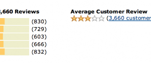
    reviewVia Bits Blog, an academic study on deceptive reviews explores why web reviewers make up bad things. It turns out that false negative reviews are not written predominantly by competitors or disgruntled employees. These reviewers are often loyal customers who have made multiple purchases from the company — just not the product in question. Customers writing false reviews may be upset about a different transaction, see themselves as “self-appointed brand managers,” or be seeking social status and validation in a public forum.

    The paper offers some recommendations for those designing business rules for review sites to consider:

    • reduce social status ties to reviewing like “elite reviewer”
    • stop reporting every user’s number of reviews
    • make it more difficult to see all reviews by one reviewer
    • require prior purchase of the product before writing the review

    False reviews provide a terrific example of unintended consequences, like these unexpected benefits and perils of showing quantifiable metrics like a user’s number of reviews. Review sites are communities where human primate behaviors, as one colleague likes to call them, tend to inflate rather than retract. It’s clearly worth investing time upfront in experience design to increase the likelihood of legitimate reviews, and ongoing analytics to spot the trends surrounding the deceptive ones. You might want to leave just a little room for gaming the system, though: the 4,288 reviews of the Hutzler 571 Banana Slicer are priceless.

  • Friday 5 — 07.05.2013

    Every Friday, find five quick links about compelling technologies, emerging trends, and interesting ideas. Source: the internet.

    1. Coverage of RSS technology that had largely faded from conversation reached a fever pitch this week with the July 1 shuttering of Google Reader. Digg Reader launched; Flipboard experienced some transition pain; and Anil Dash tries to direct attention to what matters.
    2. An undertold story on July 1 was the new COPPA regulations affecting data collection from people under 13 years old. If you’re developing an app for K-12, watch this space.
    3. Pew Internet confirms it: 6% of online adults are reddit users. Males 18-29 lead the category, and a casual glance at the headlines will confirm that many journalists are spending time sourcing stories on the site.
    4. I’ve long been an advocate for devil-in-the-details digital as a greater determiner of online experience than the direction indicated by mood boards. Here’s an interesting argument for the value of “micro-moments” in ux design.
    5. And the Harvard Gazette gets its first major refresh since 2009. Approach is mobile-first, analytics-informed, and media-rich. Baked in WordPress, measured by Google Analytics and Chartbeat, and hooked into social, the site reflects  a create-once-publish-everywhere (COPE) approach. Check it out for yourself.