Tag: ux

  • Friday 5 — 3.27.2015

    Friday 5 — 3.27.2015

    FOUR THINGS I WISH EVERY CHART DID

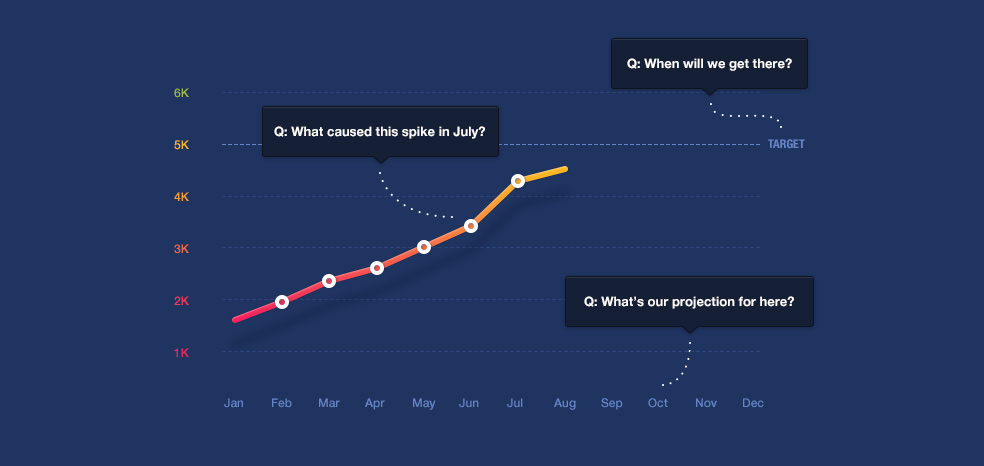
    1. We are all generating a lot of data, and are attempting to serve it up in meaningful charts. This post addresses four ways charts can focus less on their appearance, and more on delivering relevant answers and insights.
    2. “Beautiful, terrible, and addictive” Twitter has turned nine. Today, it’s a critical source for breaking news with one billion tweets sent every two days. Twitter is still struggling grow its active user base beyond news junkies and early adopters, while managing the noise factor to keep the community hospitable to all.
    3. UX for the enterprise is a complicated beast, involving prioritizing the end user over the client, learning to speak the local language, and ninja-level flexibility. But embrace these challenges, and there are interesting problems to be solved.
    4. The mobile video revolution is upon us — as of Q4 2014 mobile video viewership was up over 20% year over year. Less expensive data plans, larger screens, social distribution, and smartphone adoption are all drivers of this trend. And it’s not all consumption: mobile livestreaming apps like Meerkat or Periscope are taking off.
    5. Instagram launched Layout, a standalone app for making collages. Instagram addicts may also want to check out this  comprehensive Product Hunt list of useful apps and services.


    Weekend fun:
    Tinder hacks are the new rickroll, as evidenced by marketers breaking hearts at SXSW and some evil genius making hundreds of guys unwittingly flirt with each other. I guess it’s all a bit too much for this dog trying to catch a burger — or anything else, for that matter.

    Next week, Friday 5 is taking a break to enjoy April in Paris. Check out this collection of cool French products until the April 10 edition.

    Every Friday, find five, highly subjective pointers to compelling technologies, emerging trends, and interesting ideas that affect how we live and work digitally. Try out the Friday 5 archive, or sign up for a weekly email.

  • Friday 5 — 3.13.2015

    Friday 5 — 3.13.2015

    Google Maps: Empire State Building

    1. Google Maps is an app many use daily — after all, not everyone can live in a CityMapper zone — but have barely scratched the surface in terms of functionality. Here are some useful tips, including offline access and one-handed use.
    2. New digital projects often start with an existential crisis of organizational identity. Land the plane with some content strategy mad libs. Don’t knock it until you’ve tried it — I found it a useful exercise to lead stakeholders away from high level mission statement debates toward concrete areas to hammer out agreement.
    3. When designing a mobile app, it’s tempting to start by turning a feature list into a series of pages or views. For better usability, shift your emphasis from function to focus on user flow mapping instead.
    4. Google is entering the wireless industry — and its entrance might change the fundamental business of the access market. Through analogy (“like Uber for wireless”), this piece explains why there is a huge opportunity in wireless — even if Google never owns the last mile of delivery.
    5. Is Buzzfeed is the most important news organization in the world? Here’s a compelling argument, pointing to Buzzfeed’s wholesale adoption of of internet assumptions of constant iteration and learning, and its corresponding robust business model.

    mobile hellWeekend fun: Enjoy this painfully accurate comic about mobile browsing in 2015. And in absurd but adorable news, SXSW this year will have dogs to bring you mobile device chargers. Try not to use that device like an idiot on social.

    Every Friday, find five, highly subjective pointers to compelling technologies, emerging trends, and interesting ideas that affect how we live and work digitally. Try out the Friday 5 archive, or sign up for a weekly email.

  • Charge up data reach with smart UX

    Charge up data reach with smart UX

    data_meeting

    Last week I participated in a data and gov tech roundtable hosted by Nick Sinai at the Shorenstein Center at Harvard Kennedy School. Nick brought together an all-star panel with Lynn Overmann, Todd Park, Aneesh Chopra, and newly-named U.S. Chief Data Scientist D.J. Patil. Entrepreneurs, academics, and officials exchanged ideas on the challenges of collecting, structuring, and delivering meaningful open data.

    Patil led off with his (Day 5!) understanding of his new role, which — I was heartened to hear — included a mention of the importance of user experience. Back in the late 1990s, websites were created on the premise of “Build it and they will come.” Early release of data sets suffers from a similar problem — it’s hard to attract a wide range of users with only machine readable formats. Government officials invested in sharing data are realizing that a better approach to user experience is needed to get the data in the hands of more users. Ideally, an infrastructure will be created to meet this need, and it’s not yet clear how much public-private partnerships will (or should) play that role.

    As more government data is released (new datasets were announced today from the Department of Veterans Affairs, the Department of Labor and the Environmental Protection Agency), there is greater potential value for researchers and journalists. While improved data literacy is coming, the challenge of user experience remains critical to solve to reach wider audiences.

  • Friday 5 — 12.19.2014

    Friday 5 — 12.19.2014

    scrolling behavior

    1. Everybody scrolls, but visual cues don’t hurt. HUGE is starting a series on usability best practices, and this first post takes on “above the fold” dogma.
    2. File under meta: here’s another piece why newsletters matter. Capable curation and a strong personal voice drive higher open rates and engagement. Larger organizations can reap the same benefits if they identify the right segments for their content, and fuel their communications with both voice and deft curation.
    3. Jonah Peretti explained to The Verge how an app company acquisition will support a “Buzzfeed everywhere” strategy. It’s a must-read for his thoughts on technology-enabled distribution, managing video in hyper-growth mode, and the importance of building collaboration between engineering and editorial teams.
    4. Want to explain a new feature to users who will never RTFM? Fun idea: Try creating an animated GIF that shows the feature in action.
    5. I try to avoid including year-end prediction pieces, but loved this summary of the state of consumer technology at the end of 2014 (h/t Fred Wilson).  Excited to see what 2015 brings in mobile communications.

    Weekend fun: Are you counting down the minutes until the end of 2014? You might not have guessed that every single minute has a corresponding hex color, or that you can use a stream of tweets as a clock.

     Friday 5 is taking a break to celebrate the New Year with some Vietnamese spring rolls. We’ll be back in action on Friday, January 16, 2015. 

    Every Friday, find five, highly subjective pointers to compelling technologies, emerging trends, and interesting ideas that affect how we live and work digitally. Try out the Friday 5 archive, or sign up for a weekly email.

  • Check your normative defaults

    Check your normative defaults

    Your software has opinions — here’s how to spot them

    facebook globesIn July of this year, Facebook made a small design change that reflected a large shift in perspective. On both the desktop and the mobile app the globe icon in the blue bar became dynamic rather than static, reflecting your position on the planet. If you were logging on to Facebook from Jakarta, North America was no longer the default view.

    Why should such a small change matter? Mapmakers have known for centuries that whoever draws the map, defines the perspective. …

    Read the rest of Check Your Normative Defaults over at Medium.


  • Friday 5 — 10.3.2014

    Friday 5 — 10.3.2014

    active_exposure

    1. Pageviews and clicks provide some insight into your content’s performance, but understanding if and where your users are paying attention is far more valuable for content producers and advertisers alike. Chartbeat announced that it’s been certified by the Media Ratings Council for a new way of measuring reader attention: active exposure time.
    2. Are we actually reading the articles we share on social networks? Buzzfeed’s new data blog has some encouraging news: on average, users who share spend 68% more time on page than users who don’t.
    3. Google Ventures shared these five rules for creating great interface copy. The rules offer designers and developers a useful reminder of the importance of well-crafted microcopy, and how all those little, big details add up in interface design.
    4. Reddit received $50 million in funding, to be used in part for product development, community management, and mobile tools (maybe an app, finally?). Reddit also announced plans to share back 10% of equity with the site’s users via crypto-currency.
    5. Overwhelmed by your inbox? Try Eric Schmidt’s 9 rules for email. I’ve been rescued by the LIFO strategy more times than I can count.

    Weekend fun: Anyone else remember using an SE/30 for wordprocessing or playing Dark Castle? A team working at the Harvard Innovation Lab has visualized the evolution of the desk (see the original video created by bestreviews.com) from an old-school Mac with accessories to your laptop today. Spoiler alert: there’s an app for that.

    desk evolution

    Every Friday, find five, highly subjective pointers to compelling technologies, emerging trends, and interesting ideas that affect how we live and work digitally. Try out the Friday 5 archive, or sign up for a weekly email.

  • Friday 5 — 9.5.2014

    Friday 5 — 9.5.2014

    top 10 reasons

    1. Wondering why your iPhone app was rejected from the app store? Apple has revealed the top 10 reasons that submitted apps don’t make the cut. Placeholder copy is among the offenders, which provides good fodder for longtime foes of Lorem Ipsum.
    2. A common first step toward finding out what your website users value is to dive deep into existing quantitative and qualitative data. Why not also build your redesign in an open process alongside your users? The Guardian’s release of the beta version of its site, and its process of open and iterative change, has allowed them to engage its user base in the redesign process.
    3. Thinking of signing up for Twitter, but feeling daunted? At long last Twitter has improved its onboarding process, and made first steps for Twitter users easier. Now the process features compelling, visual tweet content, and points you to other users whom you might actually know.
    4. Apparently, men use the phrase “my zipper,” while women refer to “my yoga.” Language tells like these are among the ways that a Twitter algorithm determines your gender.
    5. With hacked celebrity photos in the news, it pays to brush up on basic ways to keep your accounts and files safe. TL;DR: enable two-factor authentication everywhere.

    Weekend fun: As I type this, some 80 million of my fellow Americans are sleeping. This clever visualization based on data from the Bureau of Labor Statistics provides an interactive and sortable view of what other Americans are doing.

    Every Friday, find five, highly subjective pointers to compelling technologies, emerging trends, and interesting ideas that affect how we live and work digitally. Try out the Friday 5 archive, or sign up to get a weekly email.

  • Friday 5 — 8.22.2014

    Friday 5 — 8.22.2014

    instagram analytics

    1. Brands are active on social networks to reach engaged audiences, and the networks are finding creative ways to monetize their involvement. SoundCloud this week announced a new advertising platform, just as Instagram rolled out its analytics tools for brands. Both SoundCloud and Instagram have afforded brands huge organic growth; the challenge will be to offer them new business tools without alienating individual users.
    2. We’re all suffering from The Stream, a deceptively gentle term for the firehose of ideas and links aimed at us every day by well-meaning friends, colleagues, and social network connections. Can radical scarcity improve quality? That’s the premise behind This., a social network incubated at the Atlantic which allows users to share a single link each day.
    3. Twitter is addressing onboarding issues to make the platform more compelling, but both the 140 character limit and a longstanding, insider-y community can mean that new users encounter daunting jargon. If you’re struggling to tell your RT from your MT, here’s an illustrated guide just for you.
    4. Launching a digital project can be like pulling the thread on a sweater — the more the new site/app/service makes possible, the more internal processes get disrupted and ideas get awakened. In a newly-launched responsive design podcast, Miranda Mulligan of the Boston Globe describes the politics between the newsroom and the design team, and how responsive design brought them together.
    5. In far too many organizations, potentially transformative digital and social strategy is outsourced to agencies or relegated to interns. Or at least, it’s reliably blamed on the interns when it all goes horribly wrong.

    Weekend fun:  Take your pick: you can watch a fascinating brief look at texting and the internet in film, or while away the hours with Serendipity, a gorgeous visualization of songs played simultaneously on Spotify.

    Every Friday, find five, highly subjective pointers to compelling technologies, emerging trends, and interesting ideas that affect how we live and work digitally. Try out the Friday 5 archive, or sign up to get a weekly email.


  • Friday 5 — 7.11.2014

    Friday 5 — 7.11.2014

    1. linkedin connected appLinkedIn launched an app called Connected to simplify and enhance networking. The app provides members with more information about the current status of their contacts, including new jobs, media mentions, and the dubious milestone of the “work anniversary”. The calendar sync allows for pre-meeting intelligence, which means pushing you information about contacts just ahead of your meeting with them. Standalone apps have been offering similar functionality for a couple of years, but I suspect the breadth of LinkedIn’s user base will make it difficult for new entrants to compete.
    2. Monthly subscription costs for digital services, now available to you via a single, impetuous click on your smartphone, can really add up. Streaming media services like Netflix and Spotify and storage services like iCloud and Dropbox make life easier but tend to accrue. Here’s are some quick tips on how to reduce your monthly payments for digital services.
    3. What happens before, during, and after the moment you sign up for new social networks says a lot about the culture they are trying to foster, and the specific behaviors they are trying to encourage. Here’s a step-by-step review of how Instagram onboards new users.
    4. In any web design meeting, there’s someone who wants to know exactly what’s above the fold. But in this era of myriad form factors and scrolling on your smartphone, there is no fold. Really, there isn’t.
    5. How do you make time for social media — but not automate to the degree that you’re mistaken for a robot? Here are 10 time-saving social media tools to consider.

    Weekend fun: Maybe you and your friends have a bunch of random stuff on your Instagram feeds. But it likely pales in comparison with what the TSA posts. 

    Every Friday, find five, highly subjective pointers to compelling technologies, emerging trends, and interesting ideas that affect how we live and work digitally.


  • 5 ways Google delivers winning World Cup results

    5 ways Google delivers winning World Cup results

    If you can’t watch every game live, you may be spending a lot of time surreptitiously tuning into the World Cup via search. Google serves up a clean, selective summary on the search results page above the organic news and web links. A search today for “France World Cup” yielded the interface below on desktop view:world cup search results

    1. The desktop view directs the eye to a visual view of current game score, with flags as the focal point. The timeline defaults to “Matches” tab with “Standings” tab accessible.
    2. The interface offers relevant but limited additional information, like a reminder of the Group, and of other France matches.
    3. There is selective use of color (‘Live 9’ in green) so you can see the game’s progress at a glance.
    4. The sidebar brings in visual and text content from the Wikipedia entry, with general team information and roster.
    5. The mobile view offers slightly different navigation. On mobile, the result omits the Wikipedia entry up top in favor of showing the roster via “Lineups”, and defaults to “Timeline” during the game. The scrollable interface highlights the great use of icons for elements like yellow cards, penalties, and own goals. As with the desktop view, playable video clips are prominent.

    france mobile

    So many sports sites and television interfaces — for reasons that include both ad revenue needs and poor design choices — succumb to confusing, poorly differentiated visual clutter. Google’s clean interface does a solid job of serving up status and context at a glance for the World Cup obsessed.

    world cup tv view