It’s easy to spot the difference between an organization with digital DNA and an organization still making the transition. Here’s an example highlighting different approaches to breaking news.
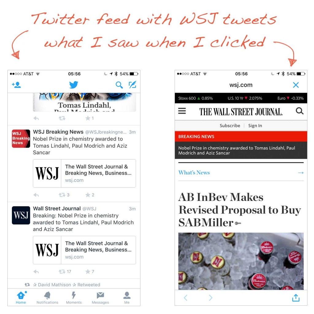
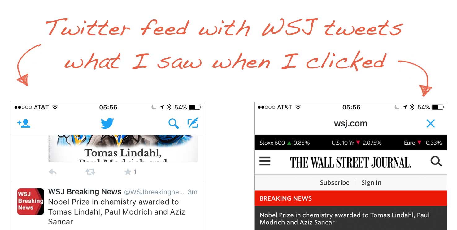
On Monday morning the Nobel Prize in chemistry was announced. The Wall Street Journal was pushing the story via multiple Twitter accounts. So I clicked on one of their links in my feed.

Beer. Suddenly I found myself reading a story about Budweiser beer, and wondering how on earth this won someone a Nobel Prize. My morning brain had to click in and out of the story a few times via both WSJ Twitter accounts until I noticed the breaking news banner at the top. That red and black bar isn’t an ad or a design element: it’s the lead story the tweet was directing me to. Banner blindness, a known phenomenon since 1998, caused me to ignore it entirely.
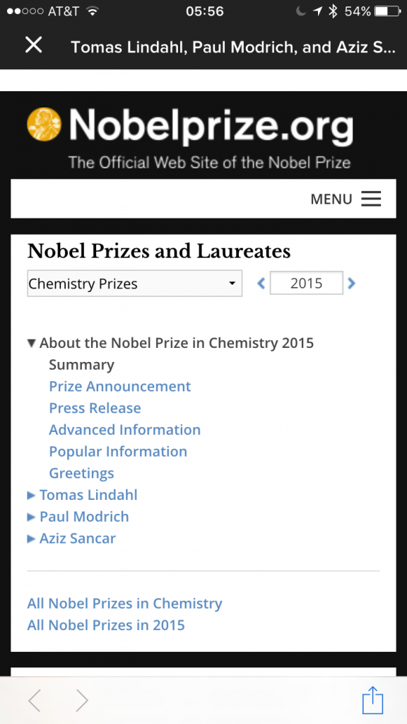
At around the same time, a tweet came through from Buzzfeed. I clicked through, and here’s what I saw:
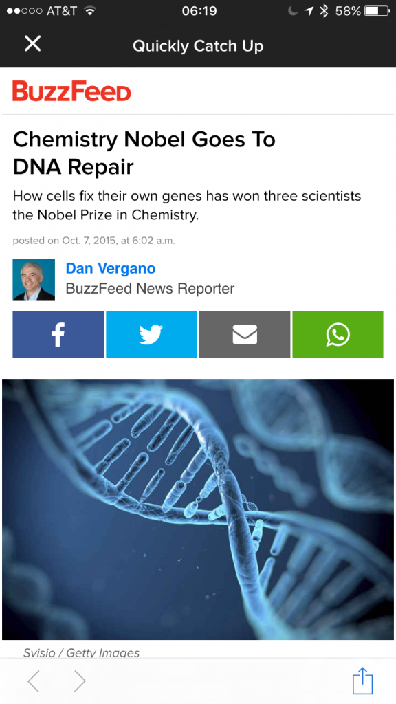
Buzzfeed sent me straight to the content on the Nobel Prize site. I can’t recall whether they framed the copy in some way on their own mobile site, but Buzzfeed took me straight to the news without any confusion. Several minutes later, I checked the Buzzfeed site again, and they’d written their own story:
It’s a small example, but a reminder of the stark difference between an old media organization still working on the transition to a mobile, social environment, and a new media organization that can’t envision news consumption any other way. As someone who has worked in large organizations making the shift to digital, I can empathize with the challenges. User experiences like this can be telling ‘iceberg’ examples, though: when you see these kinds of misses on the surface, they are signs of problematic software design practices and business processes lying beneath.


