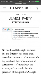
 The New Yorker has updated its web presence to take advantage of the internet’s love affair with quality, longform reads. The mobile design gets it right, with smooth interactive elements like a fly-in hamburger menu. This Guardian review credits the re-design for avoiding looking “like a middle-aged man dropping the ends of his words in an attempt to be down with the kids.” One quibble: given that their goal was to increase readership, I’m surprised they buried their email signup at the bottom of the page. But the best news of all? The archives since 2007 are free for three months, so dig in.
- The most important product design work is usually the ugliest, according to this Intercom post on The Dribblisation of Design that kicked up a kerfuffle online a while ago. It’s still a good summary of why the most interesting part of design is not the PSD, but the problem-solving.
- Remember back when Facebook was going to die because they were too old and uncool to get mobile? Yeah, me neither. Now they’re making money, handheld over fist.
- Reddit launched a new Live feature for unfolding news to better serve and reflect the high activity on the site when news breaks. The updated format makes the story easier to follow, and allows users to add content without starting a new thread and fragmenting the conversation.
- Should you buy an Amazon Fire phone? Unless you’re an Amazon-loving, domestic-only-traveling, early-adopter type who adores AT&T, Engadget suggests you hold off.
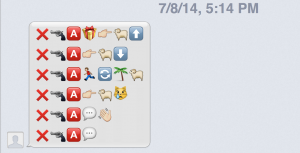
Weekend fun: Emoji karaoke is a thing, and the folks who came up with the one below are undisputed masters. Read more via Nate Matias, and try it yourself.

