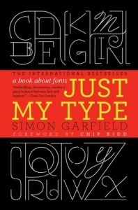
 Ignore the chick lit title — Just My Type is a wonderfully informative and gossipy exploration of fonts (thanks, Cesar). If you’re eager to learn why Garamond left an indelible mark on 16th century Paris, how Caslon cut the finest ampersand, or which master of the sans serif had a taste for ceaseless sexual experimentation, give it a go.
I started my career in textbook publishing at Houghton Mifflin, a company which back in the late eighties had a management approach oddly similar to Dunder Mifflin today. What it did have in its favor was passionate editors, mostly highly educated women who cared not only about the pedagogical value of the content but also about the painstaking review of page proofs. The editors led endless page reviews to ensure the accuracy of the fonts, point sizes, and line leading — and the absence of widows and orphans. For better or worse, I had a knack for spotting a stray serif, and gained a love for fonts just before an embarrassment of them appeared on all our dropdown menus.
Fast forward to Harvard in 2010, and to leading an effort to bring consistency to the University’s infamously decentralized visual identity. For the Harvard wordmark, the team settled on a modified version of Anziano Pro — striking a balance between Roman tradition and modern sensibility. It’s gratifying to see use of the wordmark spread as new digital properties are developed. Its success is partly driven by the desire for increased consistency, given the stark juxtapositions created by digital communications, and partly the recognition that fonts can reflect and amplify the nature of a message. It only takes one glimpse of Comic Sans on the side of an ambulance to understand the importance the right font.