Tag: visualization

  • Lovely and functional football table

    Arsenal results

    Most of the football visualizations I find seem to vanish after a few weeks or months, but I sure hope The Beautiful Table sticks.

    Designed by Jon Ferry, this lovely and functional visualization shows you how your team (in my case, sadly, Arsenal in the Premier League) is faring. There are many small details that make this work, including use of club colors, smart mouseover behaviors withe match details, and data from both played and scheduled matches enhance the timeline.

    Kudos for making something elegant that solves an actual problem: show me how my team is doing without making me look at a HTML table on a web page designed in 1997.

    Found via infosthetics.

  • How to visualize interconnections

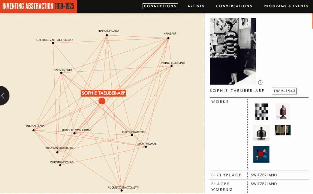
    MOMA has a terrific visualization as part of a show on Inventing Abstraction that opened back in December 2012. Visualization projects that map interconnections become complex quickly in a number of ways:

    • Content for each subject: How much should you display? This seems like the right amount, although there’s something hilarious about seeing Picasso’s interests reduced to an all-caps summary: GUITARS, MODELS, CUBISM, SUMMERS IN CATALONIA
    • Content that informs the connections: What’s the data source for these? Who relates to whom? How closely? How do you display relative strength of relationships, if at all?
    • Overall user experience: How will users know what to do? Where to start? Is the story that is emerging the one you started out telling?
    • Movement: What’s too sensitive? What’s not sensitive enough?
    • Technology: How can this work everywhere you need it to? This is mostly a solved technical problem, but not trivial in a world of proliferating devices. Will this ever be projected? What’s the level of accessibility required?
    • Flexibility: Depending on the life of your product, how do you handle new data about relationships? What’s the governance process for change post launch?

    Information aesthetics also points to a great three-minute movie made about the mapping process which gets to the complexity under the hood here.

    Reviews of the show overall can be found in The New Yorker and The New York Times, but only the latter of these mentions what struck me immediately in the visualization — the unusually large number of women represented as creators and not only subjects of an artistic movement.

  • Shuffling deck chairs in European football

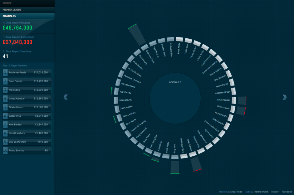
    Visualizing transfers in Premier League

    I follow Arsenal because I am a committed glutton for punishment. Agency Signal | Noise built this handy visualization to help you follow the rate and flow of players and money in European football. It’s helpful to see who’s accelerating the pace of cash out for talent — and vice versa.

    h/t Information Aesthetics

  • Visualizing characters + action over time = magic

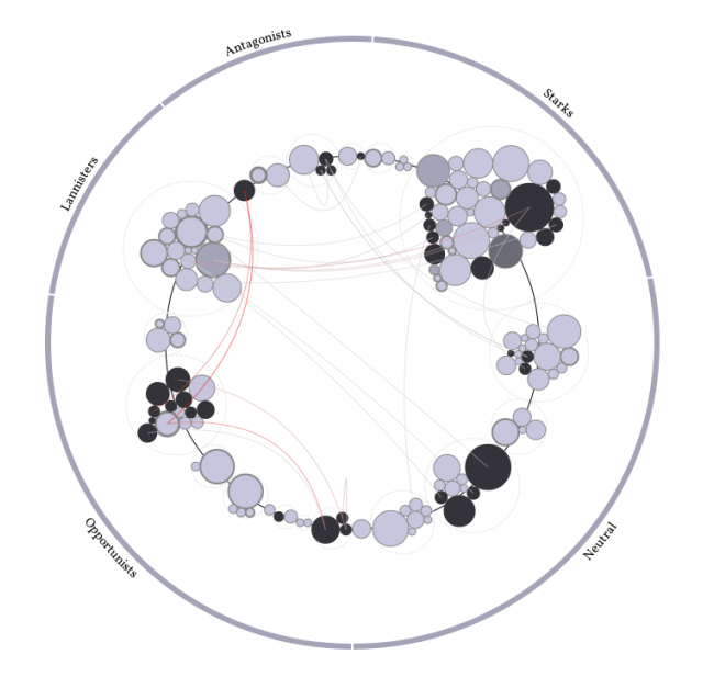
    Excellent visualization of Game of Thrones characters and their events trajectory (spoiler alert: lots of killing) over time by Jerome Cukier (h/t Nathan Yau).

    Love the proliferating use of data visualization to understand complex character structures and plot lines in novels; see also Infinite Atlas and this selection from brain pickings.

  • Visualizing the #linsanity

    Checking out visual.ly to track the rise and fall of #linsanity – with Obama as top influencer. Great way to see the wax and wane of a topic on Twitter.