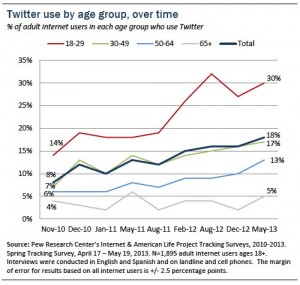
 In the past 7.5 years Twitter has gone from novelty to newsmaker. Today, Twitter boasts 200M monthly users and over 170B tweets sent with particularly strong growth in the coveted 18-29 demographic.
If you’re a Twitter user and curious to delve into your past (even though you may regret some of what you’ve shared), Twitter allows users to download all past tweets. To access your own Twitter archive, go to the gear icon top right, click on settings, and scroll to the bottom of the page. A link will be emailed to you where you can download the zip file, but note that Twitter prevents you from downloading too frequently.
[tweetable hashtags=”#twitter”]Three things to try with your Twitter archive [/tweetable]: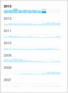 View tweet volume and navigate by month. For me, tweet frequency corresponds with conference attendance and making new connections. My archive shows the year I skipped SXSW with a far lower tweet volume in March. Click through tweets by month to see what’s going on in your high or low volume outliers.
- Search for the terms you mention in your bio. Unless you’re wonderfully creative, your Twitter bio is probably the best indicator to followers of what you tweet about. My bio references social and mobile technology and Arsenal Football Club. A search of my Twitter archive shows 659 references of social, 361 mentions of mobile, yet only 65 mentions of Arsenal, showing that there’s room to grow as a fan!
- Play with the data in the csv. In addition to the clean interface you get when clicking on index.html in the zip file, Twitter provides both JSON and csv files. A non-technical user can download the csv and sort the data in a variety of ways. One way to visualize the topics you tweet about is to download the csv, pull the text of all your tweets, and then plug them into Wordle, as I have below:


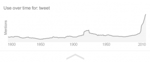

 Finally, have a look at tweet:
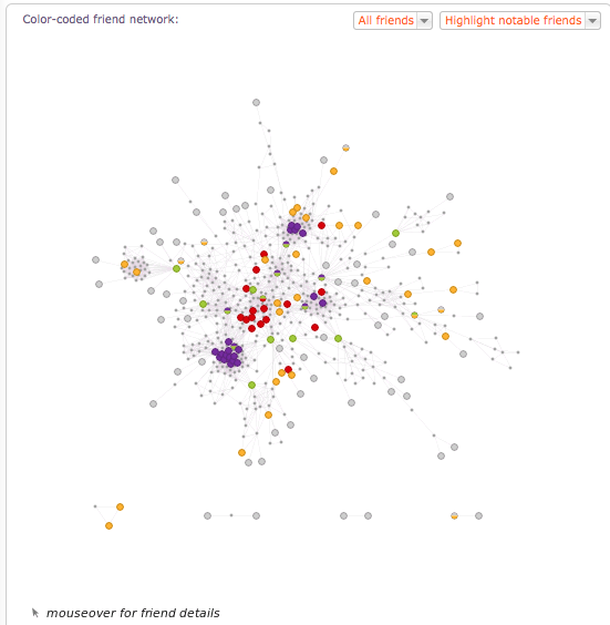
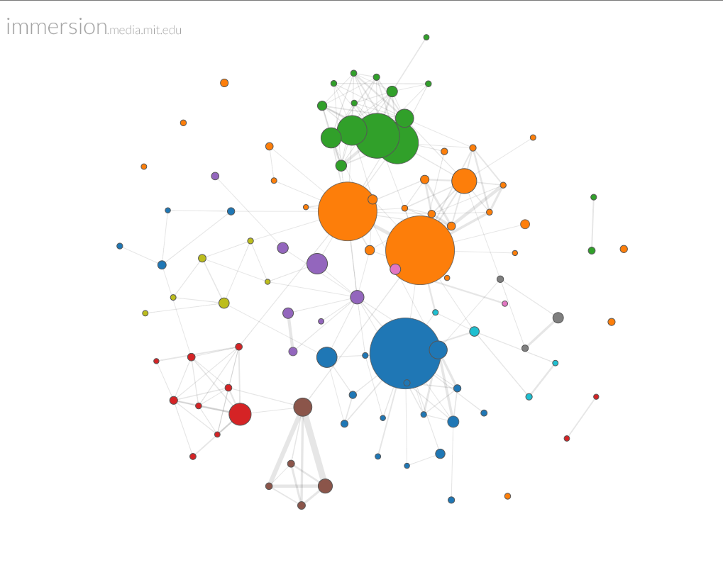 Use gmail? You might want to try
 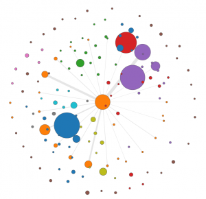 A drill down feature allows you to see your network from the perspective of a single node. In this case I have singled out
 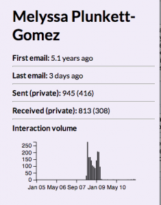 correspondence back and forth over the years, and it’s easy to see the volume peak during our time as colleagues. A section not shown here shows who introduced us to each other (no one — that transaction occurred in Facebook, not gmail), and lists the people Melyssa has introduced me to over the years.
 Next,
Next,