- As we perform more of our work collaboratively online — suddenly, nothing seems as antiquated as a corporate “shared drive” — there’s a lot of value in knowing the range of features available. These 18 Google docs tips, like the ability to search images by color, can help you keep up with recent improvements.
- Is a data scientist essential for a modern design team? This article argues that developing data literacy through three habits — checking source and context; being numerate; watching your biases — can be a good substitute.
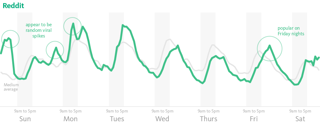
- How do you get explosive growth for your digital product? Josh Eman outlines five types of virality that can do the trick.
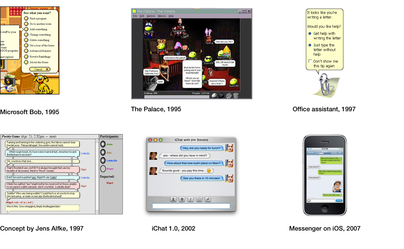
- Allo, Google’s new, IA-enhanced messaging app, launched with mixed reviews: it’s fine, or maybe it’s more like your annoying office intern. Edward Snowden says we shouldn’t use it.
- It’s one thing to claim you have skills on your LinkedIn profile, and have a couple of colleagues endorse you. It’s entirely another to have those skills tested and validated for potential employers. LinkedIn has revealed the learning program made possible by its Lynda.com acquisition, with consumer plans available for $29.99/month.
Weekend fun: First the robots took our factory jobs, and now they’re coming for the songwriters. Listen to “Daddy’s Car,” a song in the style of the Beatles composed by artificial intelligence, with arrangement and lyrics by an actual human.
Every Friday, find five, highly subjective pointers to compelling technologies, emerging trends, and interesting ideas that affect how we live and work digitally. Sign up for a weekly email.