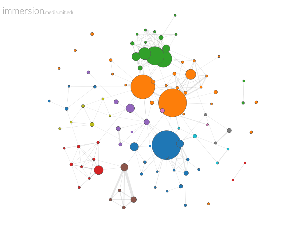
 Use gmail? You might want to try MIT Media Lab’s immersion, a terrific service that maps your email correspondence through metadata and provides you with a clear view of your email networks and correspondence habits over time. The colored clusters above reveal my own family, friend, and colleague configurations over 8.5 years of gmail use. You can segment by time period, which lets you juxtapose your shifting networks with personal or professional events like a wedding or a job change. Sliders allow you to increase or reduce the number of nodes or links among them viewed. You can choose to view or hide the node display names — I’ve chosen to hide them here to protect the innocent.
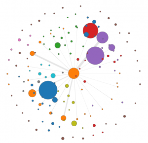
 A drill down feature allows you to see your network from the perspective of a single node. In this case I have singled out Melyssa Plunkett-Gomez (the orange dot in the middle), a former colleague from Crimson Hexagon and now a friend. The lines radiate out from Melyssa to individuals in colored network clusters, which are identified by the frequency of correspondence among the group. The width of the line indicates frequency of the messages.
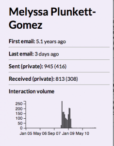
Sidebar content quantifies our mutual  correspondence back and forth over the years, and it’s easy to see the volume peak during our time as colleagues. A section not shown here shows who introduced us to each other (no one — that transaction occurred in Facebook, not gmail), and lists the people Melyssa has introduced me to over the years.
This post skims the surface of a complex and illuminating tool. The death of email continues to be predicted, but it seems inevitable that the way we manage it have to get better. Analyzing the metadata to reveal and understand the networks and patterns in our correspondence is an intriguing first step.