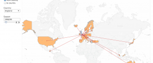
 As an Arsenal fan (the London team that’s currently first in the Premier League, a fact I try to work speciously into every conversation), I spend far more time than I should reading about soccer/football online. Like many sports, football is a goldmine of data from goals to assists to caps. In addition, football (unlike American football) is a game played globally, so there’s rich data about the rapid rise of player transfers internationally. And as the game became commercialized — it’s now the Barclays Premier League — the money moving around gets exponentially larger. All this data has been captured in a compelling and slightly addictive interactive visualization by Mac Bryla.
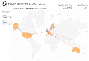
Back in 1965, when Bobby Moore was leading West Ham to FA Cup Victory, only one player transferred from England for a total of .02M €. By 1986, when Gary Lineker is playing for Everton, you can see how far the England players are traveling:
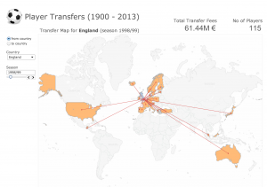
Fast forward to 1990 when David Beckham is at his peak, and you can see 115 English players fanning out across the globe, and the rise of money changing hands reaches 61.4M €.
By 2012-13, it’s up to 221 players and 151.3M €. So if you scroll through the visualization you can see very little until the 1970s, and then tremendous growth in moves and dollars that could be compared in interesting ways to the rise of television, the World Cup winners, the popularity of soccer in the U.S., or even the growth of the internet.
What makes this data visualization work so well? First, while it’s not a breathtaking design, it’s clean and functional. The experience is also intuitive — the user can easily see the variables (explore by year; to and from country) that can be manipulated. Finally, the designer has done for us the most difficult job of all: winnowing out all the other facts (country of birth, team transfers, tenure abroad) that might be interesting data but would muddy this interface.


