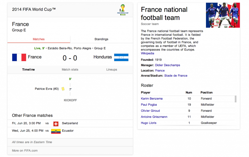
If you can’t watch every game live, you may be spending a lot of time surreptitiously tuning into the World Cup via search. Google serves up a clean, selective summary on the search results page above the organic news and web links. A search today for “France World Cup” yielded the interface below on desktop view:
- The desktop view directs the eye to a visual view of current game score, with flags as the focal point. The timeline defaults to “Matches” tab with “Standings” tab accessible.
- The interface offers relevant but limited additional information, like a reminder of the Group, and of other France matches.
- There is selective use of color (‘Live 9’ in green) so you can see the game’s progress at a glance.
- The sidebar brings in visual and text content from the Wikipedia entry, with general team information and roster.
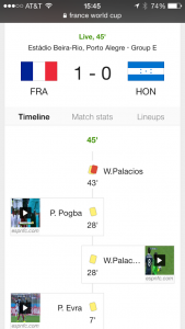
- The mobile view offers slightly different navigation. On mobile, the result omits the Wikipedia entry up top in favor of showing the roster via “Lineups”, and defaults to “Timeline” during the game. The scrollable interface highlights the great use of icons for elements like yellow cards, penalties, and own goals. As with the desktop view, playable video clips are prominent.

So many sports sites and television interfaces — for reasons that include both ad revenue needs and poor design choices — succumb to confusing, poorly differentiated visual clutter. Google’s clean interface does a solid job of serving up status and context at a glance for the World Cup obsessed.

