Month: September 2013

  • Two must-read pieces on social media

    Two must-read pieces on social media

    This month, two articles explored real-life examples of some of the unintended consequences of popular social media services and the kinds of behaviors they engender. What does it mean for the presentation of self in everyday life if the technology ensures the public audience is getting larger, and everyone is tuned in?

    First, in Vanity Fair, Nancy Jo Sales reports on how pervasive social media contributes to a problematic culture of Friends Without Benefits:

    Facebook, Twitter, Instagram, and new dating apps like Tinder, Grindr, and Blendr have increasingly become key players in social interactions, both online and IRL (in real life). Combined with unprecedented easy access to the unreal world of Internet porn, the result is a situation that has drastically affected gender roles for young people.

    In The Awl, a writer reflects on how a city park writing performance led to internet infamy in I Am an Object of Internet Ridicule, Ask Me Anything:

    As a member of the first generation to freely and gladly share my pictures, videos and thoughts online, I’d always—until now, anyway—adopted a “What’s the worst that could happen?” attitude, mixed with an “Everyone else is doing it!” mentality towards my online presence. Many of the best things in my life couldn’t have happened without sharing these pieces of myself online—meeting favorite authors at bars thanks to Twitter, getting another chance at a lost crush thanks to Facebook. And yet, I still felt thrown when I was presented with an image of myself that I couldn’t control.


  • Friday 5 — 9.27.2013

    Friday 5 — 9.27.2013

    1. 61 freshKudos to the Boston GlobeLab team on the beta launch of 61 Fresh, which features the most popular local stories shared on Twitter. Great to see the Harvard Gazette make the top-tweeted, and I’m buying a drink for the genius who added the “mute sports” feature.
    2. Maintaining a website requires constantly updating rapidly deprecating software, keeping up with new end-user hardware, and managing expiring links in the content. Law libraries have come together to create Perma.cc to mitigate link rot in academic scholarship.
    3. Why do 15% of American adults report that they don’t use the internet or email? 32% of them cite reasons tied to their sense that the internet is not very easy to use. Non-users expressed both usability and security concerns.
    4. WeChat is the multi-featured messaging app quietly taking over the world while U.S. based media outlets cover Snapchat. Recent enhancement include celebrity wake-up calls and vending machines, the latter being a quiet step toward a financial services offering.
    5. Gaming company Valve has announced Steam OS and Steam Machines, and a third announcement is slated for today. Valve has been a case study in disruptive innovation as a lower-priced entrant that cleverly crept into the console market.

    Every Friday, find five, highly subjective links about compelling technologies, emerging trends, and interesting ideas that affect how we live and work digitally. Please let me know what I’ve missed in the comments below.

  • Try it: News visualized with Topicly

    Try it: News visualized with Topicly

    As Flipboard collects another $50M on a $800M valuation, traditional news publishers are experimenting with more visual displays of the news. The Washington Post’s Topicly is largely algorithm-driven, full-bleed display of news stories by volume. Editors plan to incorporate more social media from the web as well as from the Post’s own journalists.

    topicly

    A few observations:

    • This is a good example of desktop user interface informed by mobile — see how the three horizontal line icon is rapidly becoming a standard meaning “expand this” on the desktop web.
    • More context and functionality in the interface (what do those numbers in the expanded menu mean?) might be helpful to understand what you’re seeing. Is it sheer volume or is there a measure of resonance? Is there any editorial hand?
    • Sites like this are tough beasts to feed with visual content: see how some of the images are pixellated when you click through.
    • This is a revenue experiment, as well as a visual one. There is a site-level sponsorship at top left in addition to interspersed native advertising. Sites looking for sustainable models will continue to experiment with sponsorship of specific features and functionality, like Citi sponsoring the launch of Quartz’s annotations.
  • Friday 5 — 9.20.2013

    Friday 5 — 9.20.2013

    1. Upworthy, a curated service providing a “steady stream of important and irresistibly shareable stuff” received another $8M. Here’s the post.
    2. Irresistible stuff of a more tangible nature remains wildly popular at Pinterest, which now claims 70M users. Unsurprisingly, Pinterest announced ads are coming in the form of promoted pins.
    3. Measurement is beginning to catch up with the way we consume media today — which is less about traditional TV time than mobile screen time. As of September 2014, Nielsen will include TV viewing on a smartphone or tablet to capture new viewing behaviors.
    4. Are we suffering from the Dribbblisation of design? Meaning, are we too focused on the superficial look and not enough on the ugly work of designing systems for the job to be done?
    5. So long, skeuomorphism: iOS 7 came out this week, ushering in an era of flat design. The update improves multitasking, access to settings, and even lets Siri be a guy. Not every iOS app is updated yet, but here’s a rundown of some apps that made the most of the relaunch.

    Every Friday, find five, highly subjective links about compelling technologies, emerging trends, and interesting ideas that affect how we live and work digitally. Please let me know what I’ve missed in the comments below.

  • Mobile mandate

    Mobile mandate

    In case the persistent drumbeat of blog posts, newsletters, and conferences underscoring the mobile mandate were not enough, here’s some compelling new data from Pew:

    pew phones online

    63% of cell owners are what Pew calls “cell internet users,” people who access the internet via phone. The number has doubled from 31% since 2009. See also that email and internet use were equal in 2009, and by 2013 internet is 13 percentage points higher. Presumably, as cell internet users move beyond email, they have higher expectations for mobile web and native app experiences.

    The report also includes recent demographic data. If your organization is focused on 18-29 year olds, take note: 85% of them use their phone to go online.

    So what are digital publishers doing about the rise of mobile internet use? Last week, Digiday asked publishers what mobile-first meant to them. Definitions varied, with emphasis on interface design or short-form content. All concurred that optimizing for mobile is a core element, not an option. Buzzfeed, for one, has seen mobile traffic rise from 20% to 40% over the last 12 months, and predicts an increase to 80% as networks improve.

    Now you’ve seen the numbers and read the anecdotes — what can you do to improve your mobile readiness today? Here’s one idea, taken from Facebook’s successful shift of emphasis to mobile by turning off the desktop version internally. The next time your agency shows you design comps, or your team shows you a prototype, ask that it be demoed only on a handheld. At the end of the meeting, during the last five minutes, have them show you the desktop version. [tweetable]It’s time to flip the focus toward mobile [/tweetable].

    The separate mobile use case is dead; the universal mobile mandate is here. Digital leaders need to work with their agencies and teams to flip the process: think, build, and ship mobile-first.

  • Five Mistakes to Avoid When Managing Digital Teams

    Five Mistakes to Avoid When Managing Digital Teams

    What’s the best way to tackle management of digital teams to keep engagement and output high? I’ve been through two Internet booms and busts in corporations, nonprofits, and startups — so I’ve made plenty of management mistakes by commission and by proxy. Posted over at Harvard Business Review, five common mistakes I’ve seen or made myself.

  • Friday 5 — 09.13.2013

    Friday 5 — 09.13.2013

    1. So, the iPhone 5C/5S launched and turned out to be more evolutionary than revolutionary. Is Apple more about fashion than electronics these days?
    2. Infographics are everywhere, and their stepchildren “snackables” are likely clogging your social media stream. “Get me an infographic” has replaced “Make me a viral video” as the new top-down, digital/social mandate. Here are five questions executives should answer before requesting an infographic.
    3. The best way to make compelling and shareable content has been a battle between two camps: the automated and optimized for search crew versus the heavily human editorial approach. Here’s how Techmeme is striving for the right mix by having humans power the headlines.
    4. How are adult smartphone users using location services? According to Pew 74% of them are lost like me, and use their phone to get directions or other information based on their current location. While more users report activating location as part of their mobile social posts, fewer are using explicit geosocial services like Foursquare to check in.
    5. If you were planning to tweet your way to the top, a position with a social media title may not be the right path. Turns out social media jobs have slowed because social is everyone’s job now. A savvy digital team will turn to empowering the enterprise rather than hoarding the know-how.

    Every Friday, find five, highly subjective links about compelling technologies, emerging trends, and interesting ideas that affect how we live and work digitally. Please let me know what I’ve missed in the comments below.

  • The best news email knows mobile, adds voice

    What do effective news headlines emails have in common? First of all, they’re mobile in design and content. Here’s a daily email received yesterday from the New York Times:

    mobile NYT email

    This email arrived at 4:43 a.m., when I’m still about four hours from a laptop encounter. How could this headlines email perform better for mobile? Start with the subject line — this version teases only one story, so it’s a single-shot opportunity to grab a reader who’s thumbing through all the early morning messages. Next, look at all that navigation taking up valuable screen space. The navigation narrates the static departmental structure of the institution rather than engaging the reader, and the links don’t work on mobile. And that big CUSTOMIZE? It goes to a page designed for the desktop. Finally, as the user scrolls through the ~12 screens of content, nearly every story has a thumbnail image, many of which are extraneous or tough to parse at that size.

    [tweetable hashtags=”#news”]This email feels like a missed opportunity for what’s arguably the strongest brand in news.[/tweetable] Why not optimize for mobile readers who are likely stumbling to their first cup of coffee? There’s a second, larger opportunity to add editorial voice to this message. Don’t give me a laundry list of the entire Times — I’ll get that on a tablet or laptop, later. Instead, tell me what someone smart about today’s news thinks I should be reading.

    mobile quartz email
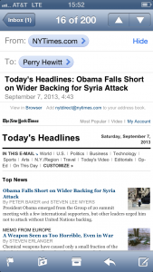
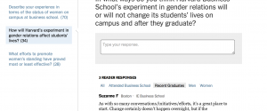
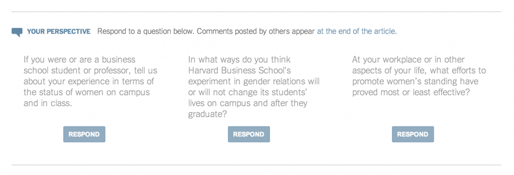
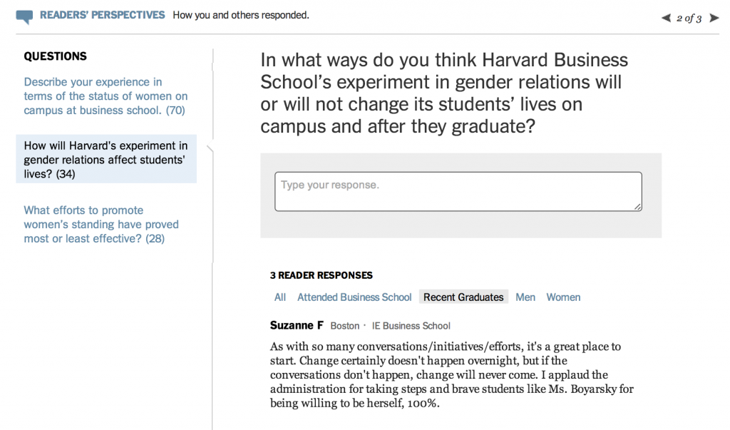
Compare the Times message with the same day’s Quartz weekend brief. There are four teasers in the subject line so if I’m not interested in global rebalancing, then maybe women on Wall Street? And the brief is built for mobile, with a clean, readable font.

    This email projects a strong editorial voice. The New York Times leads by telling you about itself as an institution — in case you were wondering, here are all our editorial departments. Quartz engages you up from with a greeting and narrative in the second person that your high school English teacher taught you never to use. As you scroll, the links appear more naturally in the text, underscoring the idea that this was written by a human rather than a cut-and-paste of headlines. And it follows its own reporting with “Five links elsewhere that made us smarter.”

    [tweetable hashtags=”#mobile”]Email isn’t dead. If anything, millennials are more plugged into email than ever[/tweetable] via savvy services like the Skimm or PolicyMic or even Upworthy. What’s different is the content strategy — the best email newsletters engage you early, can be read easily on mobile in an elevator or a Starbucks line, and have a voice that keeps you opening them, day after day.

  • How to solicit smart comments

    How to solicit smart comments

    Articles about the complex issues affecting women in the workplace are lightning rods for impassioned conversation. This New York Times article on gender equity at Harvard Business School was bound to elicit strong opinions, just like the original 2003 Opt Out Revolution piece and its 2013 sequel (spoiler alert: damned if you do, damned if you don’t). [tweetable hashtags=”#content”]How can editors ensure thoughtful conversation and minimize ad hominem, all-caps outrage?[/tweetable]

    Midway through the HBS article, the Times article introduces a full-width block with three specific questions to respond to:

    inline questions

    It’s an Oprah’s book club type of approach, with an entire section of questions for readers to consider. Rather than a mass call for comments, it’s a prompt for directed discussion. The mid-way through placement is smart, giving readers questions to consider as they (presumably) finish the piece. Mid-stream blocks with calls to action can be surprisingly successful. Analytics pros will be taking a hard look at the comments originating with a click here versus those starting from the text block at the bottom.

    There’s a nice segmentation of the comments at the bottom, where you can read the comments not only by question but by author: all, business school alumni, recent graduates, men, and women. Again, the questions remain highly visible at left and up top.

    questions bottom page

    Previously, I took a look at the rising use of annotation — here’s a good example of an annotated piece on opting-out at Medium. These are all valiant swings at a pernicious, unsolved problem: how to benefit from the wisdom of the crowd while keeping comments from devolving into an angry lowest common denominator? The article on the HBS gender equity experiment will no doubt put this approach to the test.

  • Friday 5 — 09.06.2013

    Friday 5 — 09.06.2013

    1. We know almost everything about the iPhone 5C except the most critical one: price. Mobile pro Benedict Evans breaks it down.
    2. Price point for the new iPhone is highly correlated to its global #2 performance in the face of Android’s dominance. Market share stakes are high with an estimated total of 1.8B mobile phones shipping this year, and 2.3B units predicted by 2017.
    3. Does it seem like you spend about twice as much time online as you did three years ago? Apparently, you’re right, and those smartphones and tablets are to blame.
    4. If you’ve ever sheepishly deleted your browser history, rest assured that you’re in the majority. According to Pew, 86% of internet users have taken steps online to remove or mask their digital footprints. Perhaps more surprising was the news that 21% of internet users reported an email or social networking account compromised or commandeered without permission.
    5. At last — big data comes to the women’s sport pages! Check out this awesome rapgenius analysis of the New York Times wedding section. Weddingcrunchers.com is a database of ~60K wedding announcements published in the New York Times from 1981 to 2013.

    Every Friday, find five, highly subjective links about compelling technologies, emerging trends, and interesting ideas that affect how we live and work digitally. Please let me know what I’ve missed in the comments below.