Tag: user experience

  • Friday 5 — 1.8.2016

    Friday 5 — 1.8.2016

    oculus rift headset

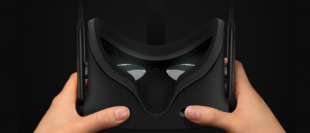
    1. A lot of 2016 predictions, including Fred Wilson’s excellent list, mention consumer adoption of virtual reality (VR) games and apps. This week, Oculus announced a March release date and a price point just shy of $600.
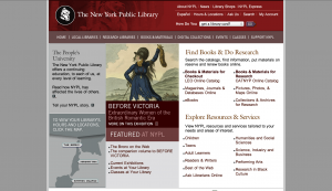
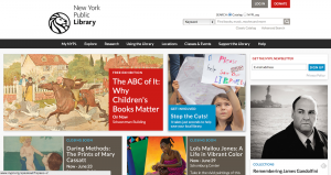
    2. The New York Public Library, often a leader in digital, has released more that 187,000 digitized images in the public domain. You can filter images on range of criteria, and use them however you like. Be sure not to miss this visualization tool created by NYPL Labs.
    3. Algorithms govern what we do and don’t see on our Facebook news feeds. Slate explains how it all works, and ways your behavior plays a part.
    4. If you missed this post before the holidays, spend some time with Benedict Evans’ 16 mobile theses. Read for his insights on mobile as an ecosystem, the future of productivity, and (note to marketers) messaging as a route to customer acquisition.
    5. Even though we are sure you are sharing your Netflix password, the company’s growth (and stock price) continue to rise with new expansion into India and Russia. One of the very many things the company gets right is their responsive design: this podcast explains how they do it.

    Weekend fun: We may be hurtling toward a future of self-driving cars, but for now President Obama’s chatting in a car driven by Jerry Seinfeld, and a student driver learns the ropes from Conan O’Brien and friends.

    Every Friday, find five, highly subjective pointers to compelling technologies, emerging trends, and interesting ideas that affect how we live and work digitally. Try out the Friday 5 archive, or sign up for a weekly email.

  • Farewell, “click here” – the disappearance of chrome

    Chrome is an umbrella term for the navigational elements throughout user interface design. NN Group offers a useful description of chrome at all layers of human-computer interaction, from operating system to website to mobile app. Fun fact: Google’s browser derives its name Chrome in part from this term since it attempts to minimize visible UI chrome — most notably by merging the address and search bars.

    Visible chrome is disappearing fast from many interfaces for desktop and mobile. Why?

    First, because our interface interactions are increasingly designed by and for digital natives. People who have grown up with “traditional” mouse/click, and then moved to touchscreen, and then moved to gestural interfaces powered by Kinect or Leap Motion aren’t going to need or want a lot of superfluous instruction.

    Next the the capabilities of technology fuel the disappearance of chrome. Think about the vanished “save” button in applications like Google Docs or Evernote. All your stuff is in the cloud, and it’s autosaving. There’s a task we don’t have to remind you to do, and a button removed.

    Finally, the rise of mobile has made us more conscious of real estate value. I can remember the collective sigh of relief when web designers in the late 1990s or early 2000s were liberated from 800 x 600 to 1024 x 768 — look at all those pixels we could commandeer! Now we’re increasingly cognizant of and designing for the reality that most experiences will be mobile first. Mobile for content consumption and commerce transaction are a new norm, and mobile design now affects what your “desktop web” looks like.

    A couple of website examples of the fading away of chrome:

    Back in 2005, Apple had to tell us what to do when we got to the home page:

    2005 apple home

    By 2013, Apple can offer a single clean horizontal navigation bar, and a large, visual carousel without any obvious forward or back arrows:

    2013 apple home

    Or take a site designed to appeal to a wider range of audiences: New York Public Library. In 2005, there was a lot of upfront and explicit instruction about what users can do on the page:

    2005 New York Public Library

    By 2013, there’s an assumption that users know how to directly manipulate the content to get the information or experience they want. There’s a single nav bar at top, but otherwise the first view surfaces the content and prompts interaction.

    2013 New York Public Library

    User interface design remains a balancing acts of many variables — navigability, clarity, form factor, appeal, and a content strategy you can support. Scaling back the chrome in these interfaces lets us reclaim valuable real estate, but it’s important to make sure usability doesn’t get lost in the shuffle.

  • 3 tips for timelines

    I can still remember the pain of drawing history report timelines during an analog childhood. The inevitable result was a shaky line of unequal width, with at least one or two skips on the ruler, and uneven pointed arrows each end. A career in draughtsmanship did not beckon.

    Timelines seem like the kind of thing digital technology would solve easily. We’d all agree on a protocol and set of user experience conventions, and voilà — a customizable template for slider-enabled, scannable history of any topic. Sadly, that doesn’t seem to have happened. While there are some solid solutions out there, there’s still a wide variety in execution and no common user experience dominates. Here are three tips for designing and developing a timeline.

    1. Think upfront about the content types/data points and the relationship among them. Will there be video? A slideshow? An infographic? When crafting the layout, let the content drive the design and not the reverse. It’s too easy to fall in love with a polished design experience to realize only too late that it won’t accommodate the information that will tell the story.
    2. Build in substantial testing with real users to make sure that features are not too subtle to be useful. It’s easy to underestimate actual user frustration with fiddly fingers and a bouncing eye track.
    3. Mobile views of the timeline are a requirement in a world where the Guardian reports record mobile traffic, and Buzzfeed, going after the bored-people-in-line market is up to 50% mobile. As devices and browsers proliferate, the user experience may need to degrade gracefully for some devices.

    Chronicle Timeline MOOCHere are two recent timeline examples with divergent approaches and effects. First, the Chronicle of Higher Education offers a timeline of MOOCs (massively open online courses). It’s a clean if clunky view, with a collapse feature that reduces the elements to headlines and a button to reverse the chronology. A vertical view may be easier for older users, but there’s no responsive for mobile. Best of all the timeline accommodates various content formats while keeping the layout clean.

    The Digital Public Library of America (DPLA) launched a beta site last week (coverage here) with a timeline view of the assets. This timeline is elegant, with a sexier horizontal orientation and responsive for mobile (although not fully swipe-able). The biggest challenge posed here is the content — there’s a long historical timeframe but some screens with 0 items shown. The controls are also extremely sensitive, and you have to drag the slider rather than click on an individual year to jump back and forth.

    DPLA timeline

    Bottom line: timelines aren’t a universally solved problem or easy to get right — a successful outcome depends on balancing functionality with design and working with the content and timeframe you have.

  • How to update forums for 2013

    Forum software, 2013-styleA lot has changed in how we access content on the internet over the past ten years. Rise of (widespread) blogging that popularized individual-as-publisher? Early 2000s. Switch to mobile interfaces? Arguably started with the 2007 launch of the first iPhone. Video? Now it’s mobile and everywhere, as YouTube has over a billion monthly viewers. And with Twitter’s seventh birthday just last week, we’re reminded of the meteoric rise in social behaviors over the last five years. (Fun stat: per Nielsen, U.S. adults spent 121 billion minutes in social in July 2012, compared with just 88 billion one year earlier.)

    But as Jeff Atwood explains, forums today look pretty much like they did a decade ago. And that’s a problem, because there’s lots of good stuff stored there. Forums are an undersung hero of online content — not as sexy as Pinterest, not as real-time as Twitter, not as immersive as Facebook, but often areas for discussion of specialized topics that generate huge referrer traffic. The out-of-the-box software found today in B2B and B2C still has limited features and a poor interface, like the internet that Web 2.0 forgot.

    So, what would an ideal forum experience look like in 2013? Atwood others are taking a stab with Discourse, an early-stage project with a long feature list (Conversations not pages! Notifications! Ability to paste images for those who converse in animated gifs!) that seems intuitive and useful, without being bloated.

    Today many fanciful consumer-facing digital projects and apps get funded in crowded spaces, or are a solution in search of a still-unidentified problem. Forums are valuable content repositories that are both surprisingly ubiquitous and decidedly broken —so let’s take a stab at fixing them.

  • Context is everything: preview button

    “The fact that we can even offer a ‘preview’ shows how tight the association is between content  management and delivery….The existence of a preview button reinforces the notion that the desktop website is the “real” website and mobile is a satellite, an afterthought.”

    – Karen McGrane, in Content Strategy for Mobile

  • Stop the Madness: Password Proliferation

    The growth of the internet has been blamed for a good deal: the decline of conversationan explosion of pornography, and even the re-wiring of the human brain. But perhaps the most egregious crime is the proliferation of passwords required to navigate one’s everyday life. From newspaper subscriptions to checking accounts to all flavors of online retail, we’re relentlessly prompted to create and remember passwords. Each site has its own rules around the length, capitalization, and the number of special characters permitted (or required). Effectively, we’re reinforcing a system that trains people to create passwords that are hard for humans to remember, but easy for computers to guess. And if you work in an enterprise IT environment, Sharepoint and Peoplesoft will cheerfully remind you to recall and re-enter those passwords again and again as Draconian settings time out within minutes.

    And guess what — it’s not working. This week SplashData released the top 25 passwords of 2012 — and once again, “password” topped the list. It’s easy to mock passwords like “123456” and “abc123” (although I like the vaguely paranoid “trustno1”) but the fault is with the system, and not the users. The proliferation is unmanageable, and leads to people either using the same password for everything or keeping long lists in Google docs and sticky notes — exactly the kind of data insecurity passwords were designed to prevent. Password management services like LastPass and 1Password address this need, but have yet to see widespread adoption.

    So, what’s the answer? Within the enterprise, it means tackling single sign-on, which is challenging in any organization with large legacy systems. Web applications are relying heavily on social network integration before smartcards or retinal scans obviate the need.

    And as passwords get harder to manage, Facebook has cleverly capitalized on this pain point ever since it launched Facebook Connect back in 2008. I’d never want Facebook feed to allow Spotify to display my dubious taste in music, but I was damned if I’d create yet another password and defaulted to Facebook login. Innovations like the news feed in 2006 and acquisitions like Instagram in 2012 are often cited as drivers for Facebook’s success. Perhaps we’ve got it all wrong: the creation of Facebook as a seamless password management system with a social network on the side may have been the cleverest innovation of them all.