Tag: map

  • Friday 5 — 5.22.2015

    Friday 5 — 5.22.2015


    google maps view

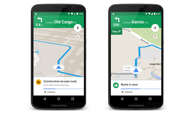
    1. For those of you already planning your Memorial Day driving routes, Google Maps has released useful, new features alerting users to delays and detours as you enter your destination. Beyond the time estimate, new cards provide additional context about potential delays. Related trivia: Google Maps also released the top destinations from Memorial Day 2014.
    2. new twitter search
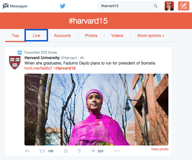
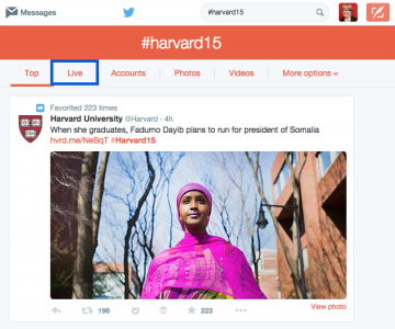
Google is once again showing tweets in search results, starting with mobile. Now you can search for topics and hashtags directly within Google. At the same time, Twitter is rolling out its own more robust search, with new features for logged-out users. My guess is that Twitter native search will cater more to live Twitter consumption of breaking news or events.
    3. More than just music — everyone’s favorite social playlist subscription service Spotify is diversifying into podcasts and programming.
    4. Today’s workforce spans multiple generations, new economy and old economy roles, and various degrees of digital capability. Here’s why the expertise gap matters, and why the first step is acknowledging the problem.
    5. The MOOC (Massively Open Online Course) hype cycle peaked in 2012, but educators are still trying to crack the right formula for effective, online learning. Read this explanation of why primacy of location and cost still matters to motivate learners in a world outside the autodidacts of Silicon Valley.

    Weekend fun:  It’s the long weekend — why not let loose with some street dancing to beatboxers. Bad weather where you are? Then pore through these examples of faux code in TV and movies.

    Every Friday, find five, highly subjective pointers to compelling technologies, emerging trends, and interesting ideas that affect how we live and work digitally. Try out the Friday 5 archive, or sign up for a weekly email.

  • Friday 5 — 3.13.2015

    Friday 5 — 3.13.2015

    Google Maps: Empire State Building

    1. Google Maps is an app many use daily — after all, not everyone can live in a CityMapper zone — but have barely scratched the surface in terms of functionality. Here are some useful tips, including offline access and one-handed use.
    2. New digital projects often start with an existential crisis of organizational identity. Land the plane with some content strategy mad libs. Don’t knock it until you’ve tried it — I found it a useful exercise to lead stakeholders away from high level mission statement debates toward concrete areas to hammer out agreement.
    3. When designing a mobile app, it’s tempting to start by turning a feature list into a series of pages or views. For better usability, shift your emphasis from function to focus on user flow mapping instead.
    4. Google is entering the wireless industry — and its entrance might change the fundamental business of the access market. Through analogy (“like Uber for wireless”), this piece explains why there is a huge opportunity in wireless — even if Google never owns the last mile of delivery.
    5. Is Buzzfeed is the most important news organization in the world? Here’s a compelling argument, pointing to Buzzfeed’s wholesale adoption of of internet assumptions of constant iteration and learning, and its corresponding robust business model.

    mobile hellWeekend fun: Enjoy this painfully accurate comic about mobile browsing in 2015. And in absurd but adorable news, SXSW this year will have dogs to bring you mobile device chargers. Try not to use that device like an idiot on social.

    Every Friday, find five, highly subjective pointers to compelling technologies, emerging trends, and interesting ideas that affect how we live and work digitally. Try out the Friday 5 archive, or sign up for a weekly email.

  • Friday 5 — 11.7.2014

    Friday 5 — 11.7.2014

    Restaurant Reservations

    1. This week Google Maps is rolling out a new redesign with improved ease of use. Beyond the clean look and brighter palette, note the increased surfacing of transactions through the map, like making a restaurant reservation through Open Table or booking a car through Uber.
    2. Reddit’s Bit of News bot summarizes news that’s shared on Reddit as it reaches a certain click-popularity threshold, and then pushes those summaries to an app. It’s a great example of ideal human-algorithm partnership. The humans do the smart discernment, and the algorithm figures out when and how to share more broadly. Check out this good write-up about the Bit of News bot.
    3. With Google Analytics, you can create so many custom reports that it’s hard to know where to start. This article compiles and reviews 12 useful, downloadable report templates created by GA experts. Hours and days and content efficiency reports are particularly useful for bloggers.
    4. As we all store more documents far from our hard drives, there’s a greater need for seamless integration with daily office applications. This week Microsoft announced a new integration with Dropbox, just as Google launched a Chrome extension to let you access Drive files from apps.
    5. Big Moose Is Watching You tells the fascinating story of LL Bean’s strategic use of customer data from the very beginning, when they targeted nonresident Maine hunting license holders with direct mail. Today, the company uses data to provide sophisticated “omnichannel” presentation, and takes an approach that favors highly relevant offers to customers over brand awareness.

    Weekend fun: Geek out with Brian Cox in the world’s largest vacuum chamber, minus 800,000 cubic feet of air. Watch to the end for the full child-like glee when the predictable occurs.


    Every Friday, find five, highly subjective pointers to compelling technologies, emerging trends, and interesting ideas that affect how we live and work digitally. Try out the Friday 5 archive, or sign up for a weekly email.

  • Friday 5 — 2.28.2014

    Friday 5 — 2.28.2014

    internet necessity

    1. Pew released a report on the Web at 25 — and how Americans have adopted and are affected by the internet usage. A full 87% of us now use the internet, 90% have cell phones, and 58% have smartphones. And as you can see from the chart above, many report it would be very hard to give some of these behaviors up. Interesting to see that while 71% of Americans online report using Facebook, and 40% do so several times a day, only 11% reported social media would be hard to give up. Hmmm.
    2. Here’s an unscientific yet thoroughly enjoyable analysis of what people have on their homescreens, as self-reported on Twitter. Lots of texting, news, and social apps win top spots on homescreens, compared to gaming and payment apps.
    3. Self-confessed map geeks might enjoy browsing Google Maps’ new gallery. Google partners like National Geographic have provided maps and geospatial information which the gallery aims to make more visible and usable. Google sorts them into handy categories, like Historical and Infrastructure and Space.
    4. Many who shake their heads at Google+ have a soft spot for Hangouts. Today Google released a redesign of Hangouts for iOS, with the ability to attach a map, add animated stickers, and record a short clip. It makes sense that Google would invest more in the product given Facebook’s aggressive move into social messaging with WhatsApp purchase.
    5. If you think people smile a lots less in Moscow than Sao Paulo, you’d be right — at least according to their selfies. Selfiecity analyzed over 120,000 images from Instagram and found that only about 3-5% of pictures posted were selfies, and that women take far more than men. See the site for more interesting findings, and visualizations by city.

    Weekend fun: Getting ready for your Oscar party on Sunday? Challenge your guests to identify every single Best Picture winner from these gorgeous and clever icons designed by Beutler Ink.

    Every Friday, find five, highly subjective links about compelling technologies, emerging trends, and interesting ideas that affect how we live and work digitally.

  • 6 ways to view the new YouTube trends map

    YouTube trends mapVideo on the internet has come a long way from the jerky, plugin-encumbered frustration of the late 90s to its speed and near-ubiquity today. YouTube now reports 1 billion unique monthly visitors watching more than 6 billion hours of video each month. The proliferation of smart phones and accompanying rise in social sharing mean that mobile video viewing is at an all-time high.

    Data visualization pro Martin Wattenberg has collaborated with the YouTube trends team to create a map of trending videos in the U.S. Six ways to explore the data:

    1. Click on any of the video thumbnails on the map to play. I’m generally not a fan of the lightbox treatments because they lose the metadata that provides context — but it works well here. Interestingly, the lightbox views seem to have no pre-roll. 
    2. Mouse over the video list by cities/regions at right. The other videos on a map will gray out and let you see at a glance what’s playing where nationally.
    3. Next, toggle between Shares and Views in the filter bar at top. I love this as a metric to understand what people enjoy watching versus what they suggest others watch.
    4. Click Male or Female in the filter bar to see what’s trending by gender. On Tuesday, the females seemed to be watching Blake Shelton while the males tuned into Charles Ramsey.
    5. Click the age ranges to see what’s trending by the usual bands. The high overlap between the 13 year olds and the 65+ crowd confirms my suspicion that the age reporting in YouTube is highly suspect. Twelve year olds tend to sign up as senior citizens to avoid age restrictions, and Google prevents them the changing the age on the account when they go back to fix it in their late teens.
    6. Finally, scroll down below the map to see the top videos trends bars. The colors cleverly derive from the video thumbnail, and offer a great visual that changes as you select filters up top. It’s a great way to see, for example, that tonight there is uniformity in what people are watching but far more variety in what they are sharing.

    The trends map is an immensely readable view of the enormous U.S. video data set. For large publishers of video to YouTube, this would be a terrific at-a-glance addition to a video performance dashboard.