
Author: Perry Hewitt
-
Commencement morning
Harvard Commencement 2013: the calm before the storm -
Listen up: how to advance an audio strategy
Audio is the perpetual bridesmaid at the multimedia wedding celebrated on the web today. That’s not to say people haven’t long recognized the value of audio files distributed over the internet. Major milestones include the creation of PRX and the mainstreaming of podcasting, the iTunes store (now 10 years old with 50 billion downloads), and the relatively recent arrival of SoundCloud for more social and embeddable audio. But most people looking to create a comprehensive online presence don’t stop and ask “What’s my audio strategy?” They should, and here are three ways to do it.
- Resist the knee-jerk, “let’s make a video” answer for content you want to call attention to. Remember that good video can be difficult to make — and that it requires great audio to be watchable. Evaluate your content resources (story, people, space, equipment) and decide whether audio may be the best fit. Pro-tip: if you do make a video, consider separating out the high-quality audio as a discrete asset, and make both available to your audience.
- Consider audio less as a companion retelling of your text piece, and more as a way to add depth and color. Here’s an example of a Harvard Gazette article about Cambridge Phone-a Poem enlivened by one of the poems read by its author, Allen Ginsberg.
- Remember that NPR’s oft-cited COPE model applies here: create and store your own audio, but publish it everywhere. Holy wars are regularly fought over the virtues of streaming versus downloading: enable both through as many platforms as feasible. The goal is to keep the content in a format that remains accessible as long as possible with minimal deprecation. Multiple custom players served only on your own website is pretty much the worst way to achieve that audio longevity.
Audio is too often an undersung web content hero beyond the context of radio online. Make sure it has a seat at the table as you plan your next online initiative.
-
Try it: Visualize search worldwide
Add another curiously mesmerizing big data visualization to your procrastination list. This colorful visualization serves up a (presumably filtered for a G rating) constantly-updating view of all the Google search terms people in the U.S. are entering in near real-time. For fun, toggle over to see search terms in ten other countries, including Australia, India, and Russia.
Feature request: a customized version for brands to visualize the terms most frequently associated with the brands, like “Arsenal + Wenger” or “Harvard + financial aid.” There are other ways to discover those terms, but would be terrific to visualize them out of the box for a presentation on brand associations.
-
5 tips for your post-college social media self
 If you’re reading this somewhere between finishing your last college final and returning the polyester academic robe crumpled on the floor of your dorm room, you’re in the commencement process. Your brain is on emotional and practical overload: you’re simultaneously figuring out how to say goodbye to friends; planning for (or praying for!) a new internship, job, or grad school; and wondering how on earth to pack up all the stuff you’ve accumulated during your college years. Here’s a manageable to-do list: five ways for new graduates to get your digital and social media presence in order.
- Set up and clean up your LinkedIn profile. Of the five profiles sent to me this week from recent grads, three of them had typos — and two candidates had misspelled their major. Have a friend read your profile for common sense, grammar, and spelling. Do the same for a Google+ profile. Pro tip: try your name on Google image search and see what comes up. If you don’t like what you see, update your online profiles and let indexing do its work.
- Review your social media privacy settings. If you’re 21 today, you were 12 when Facebook launched, 14 when Twitter emerged, and are now far too old to be messing around on Snapchat. Younger users tend to be savvier about privacy settings, but just in case: read these Facebook basics and settings controlling who can find you, then hop over to Google and check out Me on the Web. While not all companies will hire through Twitter like this the web is, increasingly, your resume.
- Put together a listening system. Are you still looking for a job or entering a new field? Set up a system of alerts and feeds to keep you informed. Google Alerts have been around forever but are surprisingly useful — enter one or more terms relevant to your area of interest. For blogs and sites you follow, try feedly and its fantastic mobile interface. Use the content you follow to your advantage — at very least you’re staying informed, and at best you’ll have current and relevant ideas to share with co-workers.
- Manage your inbox and contacts effectively. Email is an overwhelming and unwieldy system where, some say, information goes to die. Gmail does have a number of features to improve email management from starred senders to priority inbox; check out Lifehacker for a useful selection of hacks. Mobile email ninjas may do well mastering all the swipe actions of Mailbox to prevent overload. And while a new grad won’t need a fully-fledged contact management system, be sure to keep your contacts in a way that ensures they’re accessible and in context.
- Own your own domain and a sensible email address. It’s true that each new release of gTLDs makes your URL less relevant and search and social more important. That said, for less than 10 bucks a year you can have your own domain name, and refer it to a profile page on LinkedIn or about.me. And now’s the time to set up email forwarding via your academic institution, if they offer it, or settle on an email address that omits your year of birth or favorite Twilight character.
Congratulations! The good news is that it’s neither difficult nor costly to set up a reasonable online presence. The even better news is that digital and social technologies provide you with the keys to find and connect with people and ideas to continue learning beyond the campus you’re leaving behind.
Photo credit: Ladies Home Journal 1931, courtesy George Eastman House
-
When lines blur: medium and content in online publishing
We all like clarity — bright dividing lines that indicate what we’re accountable for and where we should fear to tread. Back in the old days of newspaper publishing, roles were clear: the journalists wrote the copy, the photographers snapped the images (but not too many of them for a Serious Publication), and the business side handled the unseemly aspects of the work, like advertising and circulation management. For the most part, people knew how to swim in their own lane to achieve a clear result.
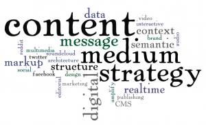 But along came the internet, and all the intricacies of online publishing emerged once people realized the new world wasn’t just a Quark-to-HTML export function. Along with disrupting who could capture and report the news (with highly variable quality), the internet has also made murky the clear dividing lines dictating where the content drives use of the medium, and where new opportunities in the medium drive the content.
Two recent articles highlight different aspects of this complexity:
Om Malik weighs in with a terrific piece on the opportunities for journalism in a post-Snow Fall world. Lauding The New York Times for its innovation, he points out:
There is a failure in the media business to understand that the medium and the content are intertwined much like those lovers on the walls of Ajanta and Ellora caves. … Now take all of that as context and then understand why I keep harping on the point that Snow Fall-type products are a brand new media, a whole new style of storytelling and a model for 21st-century journalism
There is a remarkable opportunity here for online publishers ready to adopt a forward-thinking digital strategy. The winners will be those willing to blur the content type lines — and they will get there only by embracing innovative techniques for delivering shareable content made possible by the rapidly shifting digital medium.
Next, Karen McGrane surfaces important issues with how we think about and design the content management systems that underpin how we actually do online publishing. We need to separate content from presentations to preserve meaning and structure for an orderly and semantic web. It’s hard, though, as she writes:
And yet, we know that medium and message are intertwined so tightly, they can’t be easily split apart. Graphic designers rail against the notion that “look and feel” can be painted on at the end of the process, because design influences meaning. The more skilled we are as communicators, the more we realize that the separation of content from presentation is an industrial-age feint, an attempt to standardize and segment tasks that are deeply connected.
The very tactical way we create, edit, and publish the content has implications for how we both structure and perceive it. Without continuous investment in these systems (unlike the one-off printing press capital cost), content creation will struggle to meet the shifting of the digital medium. Beyond the system itself, there’s a new need for people who have an outward-facing awareness of all the mobile and social places the content will live, and the rendering an sharing opportunities inherent to each.
Bottom line: As the bright lines previously dividing the medium and the content blur, there’s a need to re-think the capabilities and approaches supporting each. How does this new murkiness change what the content is, how it’s created, and how it gets pushed it out into the world through a lens of realtime context? Successful organizations will innovate often and measure fast, and operationalize the kind of nimble experimentation required to succeed.
-
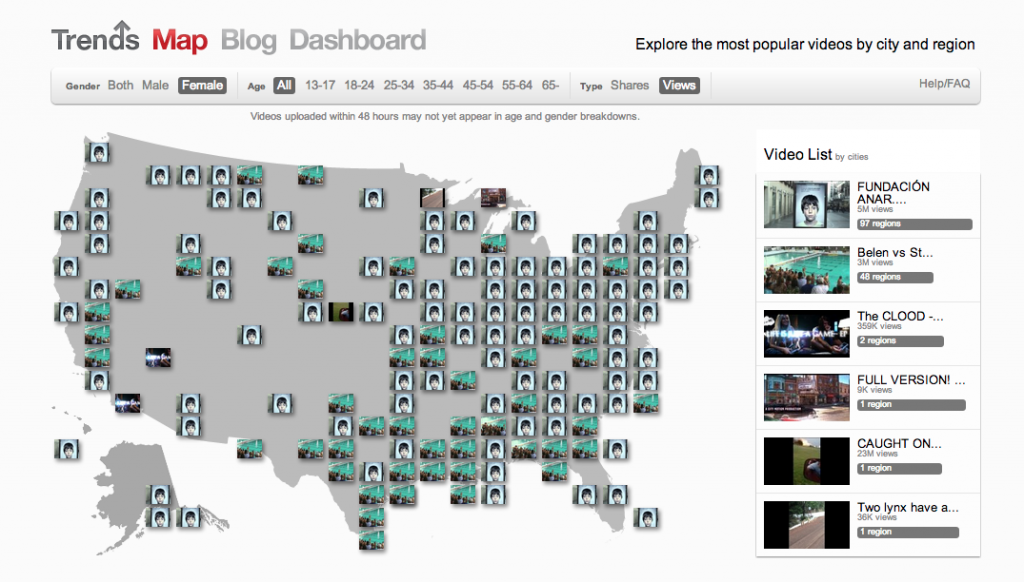
6 ways to view the new YouTube trends map
 Video on the internet has come a long way from the jerky, plugin-encumbered frustration of the late 90s to its speed and near-ubiquity today. YouTube now reports 1 billion unique monthly visitors watching more than 6 billion hours of video each month. The proliferation of smart phones and accompanying rise in social sharing mean that mobile video viewing is at an all-time high.
Data visualization pro Martin Wattenberg has collaborated with the YouTube trends team to create a map of trending videos in the U.S. Six ways to explore the data:
- Click on any of the video thumbnails on the map to play. I’m generally not a fan of the lightbox treatments because they lose the metadata that provides context — but it works well here. Interestingly, the lightbox views seem to have no pre-roll.
- Mouse over the video list by cities/regions at right. The other videos on a map will gray out and let you see at a glance what’s playing where nationally.
- Next, toggle between Shares and Views in the filter bar at top. I love this as a metric to understand what people enjoy watching versus what they suggest others watch.
- Click Male or Female in the filter bar to see what’s trending by gender. On Tuesday, the females seemed to be watching Blake Shelton while the males tuned into Charles Ramsey.
- Click the age ranges to see what’s trending by the usual bands. The high overlap between the 13 year olds and the 65+ crowd confirms my suspicion that the age reporting in YouTube is highly suspect. Twelve year olds tend to sign up as senior citizens to avoid age restrictions, and Google prevents them the changing the age on the account when they go back to fix it in their late teens.
- Finally, scroll down below the map to see the top videos trends bars. The colors cleverly derive from the video thumbnail, and offer a great visual that changes as you select filters up top. It’s a great way to see, for example, that tonight there is uniformity in what people are watching but far more variety in what they are sharing.
The trends map is an immensely readable view of the enormous U.S. video data set. For large publishers of video to YouTube, this would be a terrific at-a-glance addition to a video performance dashboard.
-
LinkedIn turns 10
So, LinkedIn is turning 10. The Next Web ran this comprehensive recap of the pivotal moments in its evolution — complete with jazzy infographic and a fun look back at its clunky 2003 web design.
LinkedIn’s main differentiator was being among the first user-generated content networks focused on expertise. As an early adopter (user 6818 — you can find your own member number embedded in your LinkedIn profile URL after “id=”), I pulled together some thoughts on what I’ve observed as milestones contributing to its success.
- Recognizing that they are a data company, and making some high-profile data scientist hires like Daniel Tunkelang — and enabling them to attract strong teams.
- Embracing mobile — a little late to the game, but a snazzy, much talked about tablet launch in 2012 and frequent updates since.
- Continuously improving the social aspects for average users sharing content — image integration that’s easy on the eyes, a longer character count than Twitter, a Like feature just like that other social network.
- Cracking the code for content original to LinkedIn. Other companies, like Facebook and Tumblr have shuttered similar efforts (here’s a good piece from RWW). While I’d argue that they have a natural advantage over Facebook and Tumblr in terms of shared audience purpose, they get credit for bringing in a range of thought leaders who make the site compelling and who become champions for the platform.
- Moving from text heavy resumes only to portfolio display opportunities — presumably the success of Bēhance and others has prompted LinkedIn to cast a wider net by supporting more visual experiences.
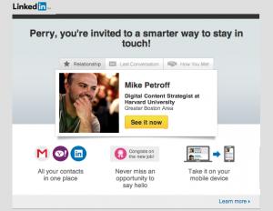 Rolling out new applications like a new contact importing/ management service (see email offer at right — perhaps more compelling if the data pulls someone not in the office next to mine) that try to make LinkedIn the default drive for your connections.
While not a specific feature, I’d argue that LinkedIn’s ultimate killer app was shifting the social norm around job hunting. Back in the day, leaving a copy of your resume on the printer meant only one thing — you weren’t intending to stick around your current role very long. Now keeping your LinkedIn profile up-to-date is more a sign of career attention than looming transition. And arguably, in some fields today the bias is in precisely the opposite direction: people who don’t update their LinkedIn profiles are less likely to be actively engaged in their own career development — which as Tom Friedman reminded us last week in his bleak 401(K) world column, is a dangerous place to be.