Last week, Stephen Wolfram released a long and interesting analysis of aggregated and anonymized Facebook user data from his Data Donor program. He offers some observations about how Facebook behaviors illustrate the trajectories of people’s lives — how many people they friend, where they settle, and how clusters of friends reflect communities (school, friend, neighborhood).
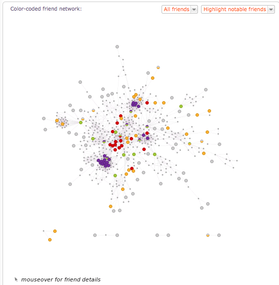
In September I tried Wolfram Alpha to examine my Facebook use, and not much about the broad strokes observations changed when I re-ran it recently. I still use words more than pictures, and have roughly the same number of male and female friends. Geography is still fairly widely dispersed. This time, I took a closer look at the network graph.
The colors indicate a typology defined in the web app. In brief:
- Social insiders (purple) share the most connections with you. These include many colleagues in interactive, and my son.
- Social outsiders (grey) share at most one friend with you. These include people I’ve worked with briefly during consulting gigs, or met traveling somewhere far away on vacation. I see far more of these than I would have predicted.
- Social connectors (green) connect groups otherwise disconnected. In my network, this includes a friend who I went to elementary school with who also worked with me at the same software company in our twenties.
- Social neighbors (orange) have few friends you don’t already know. In my graph, this includes late adopters of social networks, and skews older.
- Social gateways (red) have a great many friends who you don’t know. If I were being more strategic about growing my social network, this is where I would focus, thinking that the strength of weak ties would provide more opportunities for connection that could be helpful for everything from a great restaurant in Montreal to job candidate referral.
You can graph your own life and social network courtesy of Stephen Wolfram right here.
