- Facebook’s Q2 numbers are in and the company appears to have mastered mobile ads — which now make up 41% of ad revenue.
- Google delivered Chromecast, a device that lets you watch the web on your TV for $35, and competes with the likes of Apple TV and Roku. Its approach is fundamentally different, though, using your smartphone as the interface for the TV experience.
- YouTube releases customizable subscribe buttons to allow users to follow channels from anywhere. It’s another way to promote the high-value content channels, channels you might develop a fondness for and watch on your TV screen via, say, Chromecast.
- Flipboard affirmed its position as both distributor and competitor to its content providers by launching a web-based version of the service. Publishers have used Flipboard to reach audiences on iPad, but may have questions about a web-based version that runs ads like their own sites.
- Visiting your parents this summer? Just how many times do you think you’ll see them before they die? This app offers up a best guess based on WHO health statistics — and provides great material for guilt-purveying mothers everywhere.
Tag: google+
-
Friday 5 — 07.26.2013
-
Friday 5 — 07.19.2013
- Game development company Valve continues to think different. This week it launched Pipeline, an experimental project to introduce high school students with minimal experience to the video game development industry.
- Is user experience finally moving beyond the tech domain and being perceived as a strategic business asset? Robert Fabrikant describes how UX is the new black.
- A Pew survey finds that middle and high school teachers believe that students’ use of digital tools encourages creativity and personal expression (78%) as well as greater collaboration among students (79%). Regrettably, this doesn’t always translate into effective writing, and teachers expressed concern about students’ ability to “read and digest long or complicated texts.”
- Readwrite describes how to get the most out of Google+, with a good explanation of its different (and clever) hashtag behaviors. I still believe the unintuitive navigation poses a barrier to widespread adoption, and that community is hard to cultivate without that critical mass.
- Twitter released a gorgeous data visualization of all the verified accounts. It’s colored by category: blue for news, purple for government and politics, red for music, yellow for sports, and green for TV. You can zoom in close to see the verified account names. The yellow patch bottom right shows sports accounts in with music and TV at bottom right — at first glance, it looks like mixed martial arts tweeters are making a big media splash.
-

Google Reader, you still autocomplete me

Google Reader may be nearly two weeks gone, but Google Chrome’s autocomplete feature just took me back to our 7+ year, highly co-dependent relationship. Reminder: you have until tomorrow (12pm PST July 15, 2013) to download a copy of your Google Reader data via Google Takeout.
Where should you go from here? Some people aren’t replacing their readers at all, where others view this time as an unexpected RSS renaissance. I’ve been deep in feedly for a while, but look forward to checking out digg.
-
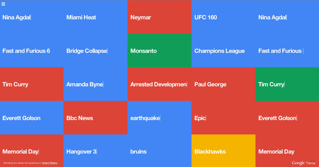
Try it: Visualize search worldwide
Add another curiously mesmerizing big data visualization to your procrastination list. This colorful visualization serves up a (presumably filtered for a G rating) constantly-updating view of all the Google search terms people in the U.S. are entering in near real-time. For fun, toggle over to see search terms in ten other countries, including Australia, India, and Russia.
Feature request: a customized version for brands to visualize the terms most frequently associated with the brands, like “Arsenal + Wenger” or “Harvard + financial aid.” There are other ways to discover those terms, but would be terrific to visualize them out of the box for a presentation on brand associations.
-
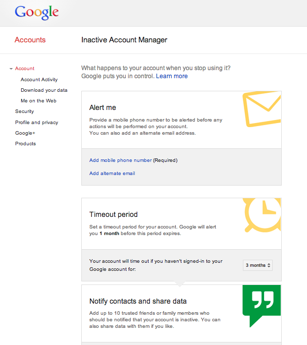
Prepare for your digital afterlife
 100% of the people who read this post will die. As will 100% of the people who have accounts with Google. And Google’s finally doing something about it with the launch of Inactive Account Manager, an awkwardly-named but sensible service for deciding what to do with your digital legacy. I’ve written about death in the social era before and the need for social web services to develop new protocols for the decease; as personal online data accumulates, the need is ever greater.
Google has created a straightforward step-by-step process: select what “inactive” should mean for your account; verify your mobile phone number; and select the data (email, contacts, photos, etc.) you’d like to share with a designated recipient; or, delete your account entirely.
I did pause at the hardest screen of all: a blank email to complete to your digital heir. We don’t often take the time to consider or have the opportunity to craft our last words in pixels. What subject line is appropriate from the afterlife? What’s the optimal email length from a deceased sender? Save some time for this; that email message was short, but took far longer to write than I ever imagined.


 If you’re reading this somewhere between finishing your last college final and returning the polyester academic robe crumpled on the floor of your dorm room, you’re in the commencement process. Your brain is on emotional and practical overload: you’re simultaneously figuring out how to say goodbye to friends; planning for (or praying for!) a new internship, job, or grad school; and wondering how on earth to pack up all the stuff you’ve accumulated during your college years. Here’s a manageable to-do list: five ways for new graduates to get your digital and social media presence in order.
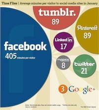
 Throughout 2011, it was clear that Google+ was mostly a male bastion. Mashable reported that