Tag: development

  • Friday 5 — 3.24.2017

    Friday 5 — 3.24.2017

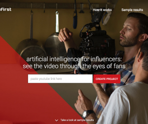
    1. YouTube has released an AI-powered emotion engine that helps video creators, aka influencers, understand which elements are most and least effective. YouFirst shows the video to a segment of the creator’s audience, uses facial recognition to identify the “power moments” that resonate, and can even tell you which groups of people enjoyed different parts of the content.
    2. Anyone remember when building a website meant hiring a webmaster and writing a million dollar check for servers? Now there’s Universe, a mobile-only tool that lets you set up a website in under a minute.
    3. Read this useful summary of how to get the most out of Google Maps. I’ve noticed that the “explore” button has been getting a lot better lately. Another new fun/creepy feature: share your location with others.
    4. In many enterprise organizations, there’s been a rapid proliferation of social media accounts. Prophet explains how to kill the social media accounts you no longer need.
    5. NiemanLab reports that people trust news based on who shared it, not who published it. This underscores the need for news organizations and brands to consider their audience as social ambassadors and invest in building strong communities.

    Weekend fun: How to use the phone privately in an open office setting and scare the life out of your co-workers. Also, a useful test for sniffing out voice-activated devices.

    Consumed: Upgraded from Palestra hot dogs to phenomenal fried chicken and biscuits at Bubby’s.

    Spring break: Skipping March 31 and back on track April 7. Until then, don’t talk to strangers.

    Every Friday, find five, highly subjective pointers to compelling technologies, emerging trends, and interesting ideas that affect how we live and work digitally. Sign up for a weekly email.

  • Friday 5 — 6.12.15

    Friday 5 — 6.12.15

    What is code?

    1. Cancel all your meetings today and read: “What is code?
    2. Finished with item number 1? Then turn your attention to the Nieman Lab’s elegant explanation of Apple’s news initiatives announced this week at WWDC.
    3. Here’s why we should stop designing for millennials as if they were an entirely homogeneous generation, alien to the ones that preceded it. Instead, design for personas that represent attitudinal and behavioral traits, and then combine these with social, market, and emerging technology trends.
    4. Many recent changes affect how we use Twitter and are designed to entice newcomers, including abandoning the 140 character limit for direct messages and making conversations on the tweet age easier to follow. In an effort to cut down on harassment, Twitter enabled sharing of block lists.
    5. VR is here: Microsoft is releasing a real live consumer Oculus Rift headset with Xbox One controller. Gaming may be the first use case for virtual reality, but it’s certain that broader, transformative applications from health/wellness to education will soon follow.

    Weekend fun: We send about 42 texts a day, and receive what feels like a million, some of which are inevitably personal and awkward. Now there’s a way to crowdsource suggestions how to respond.

    Every Friday, find five, highly subjective pointers to compelling technologies, emerging trends, and interesting ideas that affect how we live and work digitally. Try out the Friday 5 archive, or sign up for a weekly email.


  • Friday 5 — 3.20.2015

    Friday 5 — 3.20.2015

    payments-in-messenger

    1. Facebook introduced new friend-to-friend payments on Facebook Messenger. Now friends can split a lunch check, or settle a wager right in a chat. And, for now, zero fees.
    2. Google Code shut down and moved nearly a thousand of its open source projects to GitHub. Here are a few important ways GitHub got it right where others failed.
    3. Should news media drop costly native apps in favor of mobile web? Monday Note makes the case that a mobile site, lightweight and focused on a small feature set, can satisfy most use cases.
    4. We’re generating an ever-larger stream of data, and that data is increasingly accessed by our connected devices to serve up relevant experiences. Many layers of data — identity, financial, etc. — combine to shape and enhance our daily activities in the Age of Context.
    5. Crowdfunding platforms provide an outsized opportunity for entrepreneurs and innovators. $529 million was pledged in 2014 on Kickstarter alone. Here are 9 tips for building a successful project on Kickstarter.


    Weekend fun:
    When you read this, I will be flying back after Harvard Men’s Basketball readily defeated UNC in the first round of March Madness. Unless, you know, Nate Silver at FiveThirtyEight is right. Sports not your thing? How about a Star Wars-themed drone instead?

    Every Friday, find five, highly subjective pointers to compelling technologies, emerging trends, and interesting ideas that affect how we live and work digitally. Try out the Friday 5 archive, or sign up for a weekly email.

  • Enough said


  • Mobile mandate

    Mobile mandate

    In case the persistent drumbeat of blog posts, newsletters, and conferences underscoring the mobile mandate were not enough, here’s some compelling new data from Pew:

    pew phones online

    63% of cell owners are what Pew calls “cell internet users,” people who access the internet via phone. The number has doubled from 31% since 2009. See also that email and internet use were equal in 2009, and by 2013 internet is 13 percentage points higher. Presumably, as cell internet users move beyond email, they have higher expectations for mobile web and native app experiences.

    The report also includes recent demographic data. If your organization is focused on 18-29 year olds, take note: 85% of them use their phone to go online.

    So what are digital publishers doing about the rise of mobile internet use? Last week, Digiday asked publishers what mobile-first meant to them. Definitions varied, with emphasis on interface design or short-form content. All concurred that optimizing for mobile is a core element, not an option. Buzzfeed, for one, has seen mobile traffic rise from 20% to 40% over the last 12 months, and predicts an increase to 80% as networks improve.

    Now you’ve seen the numbers and read the anecdotes — what can you do to improve your mobile readiness today? Here’s one idea, taken from Facebook’s successful shift of emphasis to mobile by turning off the desktop version internally. The next time your agency shows you design comps, or your team shows you a prototype, ask that it be demoed only on a handheld. At the end of the meeting, during the last five minutes, have them show you the desktop version. [tweetable]It’s time to flip the focus toward mobile [/tweetable].

    The separate mobile use case is dead; the universal mobile mandate is here. Digital leaders need to work with their agencies and teams to flip the process: think, build, and ship mobile-first.

  • 5 ways to make your admin interface shine

    5 ways to make your admin interface shine

    Your design meeting for the new website was standing room only. People who routinely wear mismatched socks showed up to express strong opinions on color hue, saturation, and value, and to weigh in on flat vs. skeuomorphic design. A public website for the enterprise is important — it’s a brand statement seen millions of times each month. So while it’s not surprising that these meetings garner internal attention, it’s unfortunate how little mindshare is paid to its less sexy alter ego, the admin interface.

    Chicago Tribune kittens
    Chicago Tribune taken over by kittens – was the admin interface to blame?

    The admin interface is the dashboard view for the internal users managing your site through a content management system (CMS). A fair amount of your website may be automated through feeds or ad servers, but odds are you still have a team to edit/add content or choose what to feature on the homepage. Spending the time to make this dashboard a user-friendly control center instead of a jargon-filled, out-of-the box system can improve productivity and reduce errors.

    1. Start by giving your developers a clear idea of how site admins will manage site content. Who writes/curates the content? What’s the process for inputting the content, and for any proofing and approval? How often does existing content get updated, and how much new content comes in each day? How many site admins need different levels of access? The bottom line is that the technology must support human users, and not the other way around. An out-of-the-box system can adequately handle 90% of the use cases. But considering the amount of time your site managers spend each day inside the admin interface, small improvements can add up to big value.
    2. Volume matters. Make sure to test each aspect of the interface with the right amount of content. For each entry, make sure heads, subheads, and copy lengths approximate or are real ones. (For fun: read a good attack and defense of Lorem ipsum) Once you’ve populated the system with hundreds or even thousands of content items, is it still possible to quickly find a specific article or multimedia asset for an edit?
    3. Disable unnecessary features. Most CMS systems serve general audiences, and offer features and links you may never use. Developers are often loath to remove features because they may someday be useful. It’s important to push for showing only what is needed. Removing unnecessary options will make daily functions easier to find, and accelerate task completion.
    4. Enable workflow, but also workarounds. Enforce data validation, but be careful not to create processes so cumbersome that they slow down content entry. The workflow needs to be painless enough to ensure its adoption, and anticipate common use cases. But recognize that you can’t design for every content and staffing scenario, so leave some flexibility in the system. Examples might include a “nuke” button for a social media feed, or a way to override approvals for certain content types.
    5. Add your brand to the admin interface. This interface is the home screen of the people who work in it. As much as is practical, make sure your organizational and site identities are reflected. The latter is particularly useful in seeing at a glance one site’s admin interface from another in organizations where admins may manage multiple sites.

    Internal, task-oriented admin interfaces will never be the rockstars that public website designs are, but an infrequently updated site can often be tied directly to how damn hard it is to add or change content. Investing time in thinking through and designing a usable admin interface does more than make your internal users happy — it’s a strong predictor of a well-maintained public website.