Tag: design

  • Friday 5 — 7.11.2014

    Friday 5 — 7.11.2014

    1. linkedin connected app
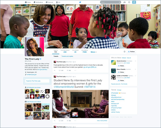
LinkedIn launched an app called Connected to simplify and enhance networking. The app provides members with more information about the current status of their contacts, including new jobs, media mentions, and the dubious milestone of the “work anniversary”. The calendar sync allows for pre-meeting intelligence, which means pushing you information about contacts just ahead of your meeting with them. Standalone apps have been offering similar functionality for a couple of years, but I suspect the breadth of LinkedIn’s user base will make it difficult for new entrants to compete.
    2. Monthly subscription costs for digital services, now available to you via a single, impetuous click on your smartphone, can really add up. Streaming media services like Netflix and Spotify and storage services like iCloud and Dropbox make life easier but tend to accrue. Here’s are some quick tips on how to reduce your monthly payments for digital services.
    3. What happens before, during, and after the moment you sign up for new social networks says a lot about the culture they are trying to foster, and the specific behaviors they are trying to encourage. Here’s a step-by-step review of how Instagram onboards new users.
    4. In any web design meeting, there’s someone who wants to know exactly what’s above the fold. But in this era of myriad form factors and scrolling on your smartphone, there is no fold. Really, there isn’t.
    5. How do you make time for social media — but not automate to the degree that you’re mistaken for a robot? Here are 10 time-saving social media tools to consider.

    Weekend fun: Maybe you and your friends have a bunch of random stuff on your Instagram feeds. But it likely pales in comparison with what the TSA posts. 

    Every Friday, find five, highly subjective pointers to compelling technologies, emerging trends, and interesting ideas that affect how we live and work digitally.


  • 5 ways Google delivers winning World Cup results

    5 ways Google delivers winning World Cup results

    If you can’t watch every game live, you may be spending a lot of time surreptitiously tuning into the World Cup via search. Google serves up a clean, selective summary on the search results page above the organic news and web links. A search today for “France World Cup” yielded the interface below on desktop view:world cup search results

    1. The desktop view directs the eye to a visual view of current game score, with flags as the focal point. The timeline defaults to “Matches” tab with “Standings” tab accessible.
    2. The interface offers relevant but limited additional information, like a reminder of the Group, and of other France matches.
    3. There is selective use of color (‘Live 9’ in green) so you can see the game’s progress at a glance.
    4. The sidebar brings in visual and text content from the Wikipedia entry, with general team information and roster.
    5. The mobile view offers slightly different navigation. On mobile, the result omits the Wikipedia entry up top in favor of showing the roster via “Lineups”, and defaults to “Timeline” during the game. The scrollable interface highlights the great use of icons for elements like yellow cards, penalties, and own goals. As with the desktop view, playable video clips are prominent.

    france mobile

    So many sports sites and television interfaces — for reasons that include both ad revenue needs and poor design choices — succumb to confusing, poorly differentiated visual clutter. Google’s clean interface does a solid job of serving up status and context at a glance for the World Cup obsessed.

    world cup tv view

  • Friday 5 — 4.25.2014

    Friday 5 — 4.25.2014

    1. mobile addict chartAre you reading this on your phone right now? Do you find you’re checking your phone compulsively? Then you might just be a mobile addict — defined by mobile analytics firm Flurry as someone who launches apps more than 60 times a day. High risk groups are identified as Teens, College Students (skewing female), and Middle Aged Parents, all of which ensures college campuses are teeming with the Infected.
    2. Facebook makes nice with the media by launching FB Newswire, a service that helps users find, share, and embed newsworthy items from its vast trove of user-generated content. A partnership with social media news agency Storyful provides content verification to separate wheat from chaff. No doubt this service will do some useful sifting for overtaxed newsrooms, but ultimately Facebook and its algorithms retain editorial control by deciding what’s newsworthy enough to make the wire.
    3. Fun fact from Q1 earnings report: Facebook now has 1.1B mobile monthly active users. Not including its Messenger app. Or Instagram. Or newly-acquired What’s App. For context, those monthly mobile users united would be the third largest country in the world, after China and India.
    4. This week Airbnb, the website that lets you make a buck renting out your pull-out couch or luxury vacation home, closed a round of 500M on a 10B valuation. Looks like the collaborative economy is starting to have quantifiable impact at least at the lower end of the hotel market: The Economist reports on research suggesting that if Airbnb’s growth continues at its current clip, budget hotel revenue will be down 10% by 2016.
    5. Codeacademy, an interactive platform that teaches people to code, relaunched its website. Here are the 10 design principles that informed their approach. Elevated social proof, commitment to fewer form fields, and enabling focus stand out as drivers of superior user experience.

    Weekend fun: Wait — you’ve already seen Brian Williams rapping gin and juice? Well, you should probably watch it again, because it doesn’t get any less funny the tenth time around. Jimmy Fallon’s video editors are a force to be reckoned with.


    Every Friday, find five, highly subjective links about compelling technologies, emerging trends, and interesting ideas that affect how we live and work digitally.

  • Friday 5 — 4.11.2014

    Friday 5 — 4.11.2014

    twitter michelle obama

    1. Twitter is going all Facebook with new, expanded profile pages. The new profile pages offer a wider banner, a larger profile image, and the ability to “pin” a tweet to the top of your profile. The profile pages will now emphasize your tweets with the most engagement by making them larger. First Lady Michelle Obama is already up and running — soon you will be, too.
    2. Good explainer post on the difference between the card design proliferating across the web and emerging card architectures. The former reflects a design aesthetic, which may be a more ephemeral trend. The latter supplants embedded media, and enables third-party and first-party content to co-mingle — potentially delivering more value to the user.
    3. Speaking of cards, the explanatory journalism startup Vox launched this week with a lush, card-enhanced look. Bright yellow highlights tease explainer cards that act almost like dynamic FAQs. Topics range from “what is marijuana” (really?) to “is it the Ukraine or just Ukraine.” GigaOm broke down the benefits and challenges of the new site.
    4. Internet of Things was canonized as the biggest new thing when John Chamber at Cisco referred to it as a $19T (t, as in trillion) market back in January. This Business Insider scrolling presentation walks you through examples (smart TVs, connected cars, wearables), venture capital investments, and security questions.
    5. A new report from mobile analytics and advertising firm Flurry tracked mobile behaviors from January to March 2014. Findings confirm that native mobile apps (versus mobile web) continue to dominate, commanding an astonishing 86% of the average U.S. mobile consumer’s time. HTML5 and CSS3 were the mobile web darlings of 2010 — today, not so much..

    Weekend fun: Turns out, Game of Thrones is more than a blood-thirsty way to spend a delightful Sunday evening with the family. The show’s popularity has ensured that there are now more baby Khaleesis than Betsys, and has spawned a veritable spike in female baby Aryas. But cheer up — weekend is coming.


    Every Friday, find five, highly subjective links about compelling technologies, emerging trends, and interesting ideas that affect how we live and work digitally.

  • Friday 5 — 12.27.2013

    Friday 5 — 12.27.2013

    The end of each year brings a slew of “best of” posts — here are five of my favorites:

    1. Flowing Data selected data visualizations that told great stories and made meaningful, real-world observations through data. See visualizations of everything from poisoned names to pizza to porn.
    2. Looking for a way to spend your gift card spoils from the holiday? ReadWriteWeb summarizes the best smartphones and tablets of 2013 (including the perennially underestimated HTC One).
    3. We’ve come a long way from webpages populated by Arial and Georgia only. Here’s a solid roundup of the best web and mobile fonts of 2013. Be sure to drop the term “semi-serif” in your next design meeting or at a particularly dull New Year’s party.
    4. Want to see some great typography in action? Line25 has rounded up 40 great examples from 2013. We’re definitely in the year of ubiquitous text-over-full-bleed-photo and endless scroll, but the type treatments are varied and interesting.
    5. With the constant distraction and our ever-shortening attention spans, productivity hacks can be a lifesaver. This list of best Mac OSX utilities can help you stay on track — my personal favorites Evernote and RescueTime are on there.

    Weekend fun: Before you put away the Christmas decorations, anyone who has ever sat through a ponderous brand presentation led by a creative director must watch the Santa Brand Book. And if people in 2013 have been more naughty than nice in reviewing your creative, consider implementing a Hater Translator.

    hater translator by mullen

    Every Friday, find five, highly subjective links about compelling technologies, emerging trends, and interesting ideas that affect how we live and work digitally.

  • Friday 5 — 12.20.2013

    Friday 5 — 12.20.2013

    1. Mandatory reading for web design geeks: Snow fail: Do readers really prefer parallax design? New research poses good questions about user orientation to parallax scrolling, which may be better suited for content heavier on video and other visualizations rather than text.
    2. NPR continues its leadership in forward-looking digital initiatives by securing $17M in grants. $10M will pay for the development of a new, presumably mobile-first platform to provide a personalized, location-based listening experience for content from NPR and affiliate stations.
    3. Harvard’s Berkman Center published its annual compendium of essays in Internet Monitor 2013: Reflections on the Digital World. Sections include governments, companies, and citizens as actors in the digital world. Favorite excerpt: Potentially lost in the debates over privacy, security, and surveillance, is the fact that access to information plays a critical role in human development, governance, and economic growth across all sectors, including health, education, energy, agriculture, and transportation.
    4. What’s App, a company of ~50 employees, is up to 400M users — and added 100M over the last four months alone. But how will all these social messaging apps make money? Some smart plays are emerging around e-commerce, with flash sales and sticker products driving revenue in Asia.
    5. This terrific, long read outlines a step-by-step approach to digital marketing success. Written by digital marketing evangelist and bigtime analytics nerd Avinash Kaushik, the piece provides great guidance on how to focus your analytics efforts and avoid endless “data puke”.

    Weekend fun: In case you’re suffering through an awkward office Christmas party or Yankee swap today, let me ratchet up your holiday envy: Bill Gates is an awesome Secret Santa.

    Every Friday, find five, highly subjective links about compelling technologies, emerging trends, and interesting ideas that affect how we live and work digitally.

  • Effective data visualization, football edition

    Effective data visualization, football edition

    Arsenal standingsAs an Arsenal fan (the London team that’s currently first in the Premier League, a fact I try to work speciously into every conversation), I spend far more time than I should reading about soccer/football online. Like many sports, football is a goldmine of data from goals to assists to caps. In addition, football (unlike American football) is a game played globally, so there’s rich data about the rapid rise of player transfers internationally. And as the game became commercialized — it’s now the Barclays Premier League — the money moving around gets exponentially larger. All this data has been captured in a compelling and slightly addictive interactive visualization by Mac Bryla.

    Back in 1965, when Bobby Moore was leading West Ham to FA Cup Victory, only one player transferred from England for a total of .02M €.  By 1986, when Gary Lineker is playing for Everton, you can see how far the England players are traveling:

    transfers 85-86

    Fast forward to 1990 when David Beckham is at his peak, and you can see 115 English players fanning out across the globe, and the rise of money changing hands reaches 61.4M €.

    1989-90 transfers

    By 2012-13, it’s up to 221 players and 151.3M €. So if you scroll through the visualization you can see very little until the 1970s, and then tremendous growth in moves and dollars that could be compared in interesting ways to the rise of television, the World Cup winners, the popularity of soccer in the U.S., or even the growth of the internet.

    What makes this data visualization work so well? First, while it’s not a breathtaking design, it’s clean and functional. The experience is also intuitive — the user can easily see the variables (explore by year; to and from country) that can be manipulated. Finally, the designer has done for us the most difficult job of all: winnowing out all the other facts (country of birth, team transfers, tenure abroad) that might be interesting data but would muddy this interface.

  • Friday 5 — 11.22.2013

    Friday 5 — 11.22.2013

    1. Spotify closes another $250M in funding at a >$4B valuation. The streaming music service enabling instant listening now has more than 6 million paid and 24 million active free users.
    2. Is it inciting generational warfare to imply that the youngs shape the direction of technology differently and more significantly than the olds? Mathew Ingram makes the case.
    3. Last year I read Thinking Fast and Slow, a thought-provoking book about the different systems of thinking and their applicability to life and work. Recently Sonya Song wrote in Nieman Lab about how these two modes of thinking, fast and slow, attract two different types of attention. Interesting implications for individuals and organizations sharing content to social.
    4. Most people frustrated by carrying a phone and a wallet everywhere they go were pleased by the widely-publicized launch of Coin. The digital all-in-one credit card last week met a $50K crowdfunding goal in 40 minutes. This week, Coin is answering criticisms about security and design flaws.
    5. Wondering how to plan for and execute a redesign of a  highly-trafficked digital property? You could do worse than read Brad Frost’s write-up of how he and his colleagues achieved the Techcrunch redesign. The part about development being part of the design process is key — the days of designers throwing PhotoShop files over the transom to front-end developers are long gone.

    Weekend fun: I’m sure you’ve seen Jean-Claude Van Damme in his brilliant self-parody for Volvo already. Instead, in honor of Harvard-Yale weekend, how about some Harvard students giving fake tours of Yale (“if I hit the floor, you do the same”)?

    Every Friday, find five, highly subjective links about compelling technologies, emerging trends, and interesting ideas that affect how we live and work digitally.

  • Friday 5 — 9.20.2013

    Friday 5 — 9.20.2013

    1. Upworthy, a curated service providing a “steady stream of important and irresistibly shareable stuff” received another $8M. Here’s the post.
    2. Irresistible stuff of a more tangible nature remains wildly popular at Pinterest, which now claims 70M users. Unsurprisingly, Pinterest announced ads are coming in the form of promoted pins.
    3. Measurement is beginning to catch up with the way we consume media today — which is less about traditional TV time than mobile screen time. As of September 2014, Nielsen will include TV viewing on a smartphone or tablet to capture new viewing behaviors.
    4. Are we suffering from the Dribbblisation of design? Meaning, are we too focused on the superficial look and not enough on the ugly work of designing systems for the job to be done?
    5. So long, skeuomorphism: iOS 7 came out this week, ushering in an era of flat design. The update improves multitasking, access to settings, and even lets Siri be a guy. Not every iOS app is updated yet, but here’s a rundown of some apps that made the most of the relaunch.

    Every Friday, find five, highly subjective links about compelling technologies, emerging trends, and interesting ideas that affect how we live and work digitally. Please let me know what I’ve missed in the comments below.

  • Mobile mandate

    Mobile mandate

    In case the persistent drumbeat of blog posts, newsletters, and conferences underscoring the mobile mandate were not enough, here’s some compelling new data from Pew:

    pew phones online

    63% of cell owners are what Pew calls “cell internet users,” people who access the internet via phone. The number has doubled from 31% since 2009. See also that email and internet use were equal in 2009, and by 2013 internet is 13 percentage points higher. Presumably, as cell internet users move beyond email, they have higher expectations for mobile web and native app experiences.

    The report also includes recent demographic data. If your organization is focused on 18-29 year olds, take note: 85% of them use their phone to go online.

    So what are digital publishers doing about the rise of mobile internet use? Last week, Digiday asked publishers what mobile-first meant to them. Definitions varied, with emphasis on interface design or short-form content. All concurred that optimizing for mobile is a core element, not an option. Buzzfeed, for one, has seen mobile traffic rise from 20% to 40% over the last 12 months, and predicts an increase to 80% as networks improve.

    Now you’ve seen the numbers and read the anecdotes — what can you do to improve your mobile readiness today? Here’s one idea, taken from Facebook’s successful shift of emphasis to mobile by turning off the desktop version internally. The next time your agency shows you design comps, or your team shows you a prototype, ask that it be demoed only on a handheld. At the end of the meeting, during the last five minutes, have them show you the desktop version. [tweetable]It’s time to flip the focus toward mobile [/tweetable].

    The separate mobile use case is dead; the universal mobile mandate is here. Digital leaders need to work with their agencies and teams to flip the process: think, build, and ship mobile-first.