I can still remember the pain of drawing history report timelines during an analog childhood. The inevitable result was a shaky line of unequal width, with at least one or two skips on the ruler, and uneven pointed arrows each end. A career in draughtsmanship did not beckon.
Timelines seem like the kind of thing digital technology would solve easily. We’d all agree on a protocol and set of user experience conventions, and voilà — a customizable template for slider-enabled, scannable history of any topic. Sadly, that doesn’t seem to have happened. While there are some solid solutions out there, there’s still a wide variety in execution and no common user experience dominates. Here are three tips for designing and developing a timeline.
- Think upfront about the content types/data points and the relationship among them. Will there be video? A slideshow? An infographic? When crafting the layout, let the content drive the design and not the reverse. It’s too easy to fall in love with a polished design experience to realize only too late that it won’t accommodate the information that will tell the story.
- Build in substantial testing with real users to make sure that features are not too subtle to be useful. It’s easy to underestimate actual user frustration with fiddly fingers and a bouncing eye track.
- Mobile views of the timeline are a requirement in a world where the Guardian reports record mobile traffic, and Buzzfeed, going after the bored-people-in-line market is up to 50% mobile. As devices and browsers proliferate, the user experience may need to degrade gracefully for some devices.
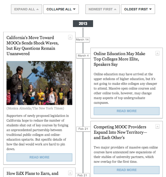
 Here are two recent timeline examples with divergent approaches and effects. First, the Chronicle of Higher Education offers a timeline of MOOCs (massively open online courses). It’s a clean if clunky view, with a collapse feature that reduces the elements to headlines and a button to reverse the chronology. A vertical view may be easier for older users, but there’s no responsive for mobile. Best of all the timeline accommodates various content formats while keeping the layout clean.
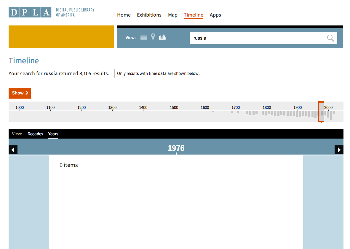
The Digital Public Library of America (DPLA) launched a beta site last week (coverage here) with a timeline view of the assets. This timeline is elegant, with a sexier horizontal orientation and responsive for mobile (although not fully swipe-able). The biggest challenge posed here is the content — there’s a long historical timeframe but some screens with 0 items shown. The controls are also extremely sensitive, and you have to drag the slider rather than click on an individual year to jump back and forth.
Bottom line: timelines aren’t a universally solved problem or easy to get right — a successful outcome depends on balancing functionality with design and working with the content and timeframe you have.
