Tag: fonts

  • Friday 5 — 4.28.2017

    Friday 5 — 4.28.2017

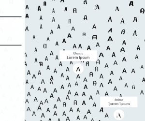
    1. An IDEO team combined human design talent and machine learning to create Font Map, a tool for designers to compare and find similar fonts. This started with Google’s ~750 typefaces, but can scale to many more. Explore for yourself.
    2. More and more of my searches start and end in the Google ecosystem, including those short snippets results in Q&A format. There’s an argument to be made that these snippets are damaging small business websites — and might move upstream from there.
    3. The wireframe strikes me as a kind of dress rehearsal: vital foundational work being done with little fanfare. Look at this collection of wireframes from top UX designers to learn more about why they matter.
    4. I use my camera less for beautiful images than data capture. What hotel room am I in (anyone remember when keys had number tags)? What was that guy’s title? And, of course, where did I park my car? Google is trying to solve this last one.
    5. One last link: Paul Ford’s beautiful speech on 10 timeframes. Let’s always be mindful of the experiences we create for all the creators out there.

    Weekend fun: We’re finally getting our flying cars. And an edible water bottle, I guess.

    Consumed: This was a week of breakfasts. It’s hard to go wrong with the fancy menu at Beaubourg, but I have an enduring fondness for the good food, weak coffee, and brusque service at The Red Flame.

    Planned obsolescence: This is the final edition of this Friday 5 newsletter (or at least this incarnation of it!), as I take a deep dive into a couple of projects. Thanks for all your notes this week — may be back in the fall post summer research!
  • Friday 5 — 12.27.2013

    Friday 5 — 12.27.2013

    The end of each year brings a slew of “best of” posts — here are five of my favorites:

    1. Flowing Data selected data visualizations that told great stories and made meaningful, real-world observations through data. See visualizations of everything from poisoned names to pizza to porn.
    2. Looking for a way to spend your gift card spoils from the holiday? ReadWriteWeb summarizes the best smartphones and tablets of 2013 (including the perennially underestimated HTC One).
    3. We’ve come a long way from webpages populated by Arial and Georgia only. Here’s a solid roundup of the best web and mobile fonts of 2013. Be sure to drop the term “semi-serif” in your next design meeting or at a particularly dull New Year’s party.
    4. Want to see some great typography in action? Line25 has rounded up 40 great examples from 2013. We’re definitely in the year of ubiquitous text-over-full-bleed-photo and endless scroll, but the type treatments are varied and interesting.
    5. With the constant distraction and our ever-shortening attention spans, productivity hacks can be a lifesaver. This list of best Mac OSX utilities can help you stay on track — my personal favorites Evernote and RescueTime are on there.

    Weekend fun: Before you put away the Christmas decorations, anyone who has ever sat through a ponderous brand presentation led by a creative director must watch the Santa Brand Book. And if people in 2013 have been more naughty than nice in reviewing your creative, consider implementing a Hater Translator.

    hater translator by mullen

    Every Friday, find five, highly subjective links about compelling technologies, emerging trends, and interesting ideas that affect how we live and work digitally.

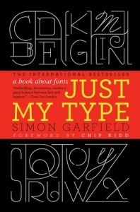
  • Weekend reading: Just My Type & my fascination with fonts

    Ignore the chick lit title — Just My Type is a wonderfully informative and gossipy exploration of fonts (thanks, Cesar). If you’re eager to learn why Garamond left an indelible mark on 16th century Paris, how Caslon cut the finest ampersand, or which master of the sans serif had a taste for ceaseless sexual experimentation, give it a go.

    I started my career in textbook publishing at Houghton Mifflin, a company which back in the late eighties had a management approach oddly similar to Dunder Mifflin today. What it did have in its favor was passionate editors, mostly highly educated women who cared not only about the pedagogical value of the content but also about the painstaking review of page proofs. The editors led endless page reviews to ensure the accuracy of the fonts, point sizes, and line leading — and the absence of widows and orphans. For better or worse, I had a knack for spotting a stray serif, and gained a love for fonts just before an embarrassment of them appeared on all our dropdown menus.

    Fast forward to Harvard in 2010, and to leading an effort to bring consistency to the University’s infamously decentralized visual identity. For the Harvard wordmark, the team settled on a modified version of Anziano Pro — striking a balance between Roman tradition and modern sensibility. It’s gratifying to see use of the wordmark spread as new digital properties are developed. Its success is partly driven by the desire for increased consistency, given the stark juxtapositions created by digital communications, and partly the recognition that fonts can reflect and amplify the nature of a message. It only takes one glimpse of Comic Sans on the side of an ambulance to understand the importance the right font.