
Tag: athletics
-

5 ways Google delivers winning World Cup results
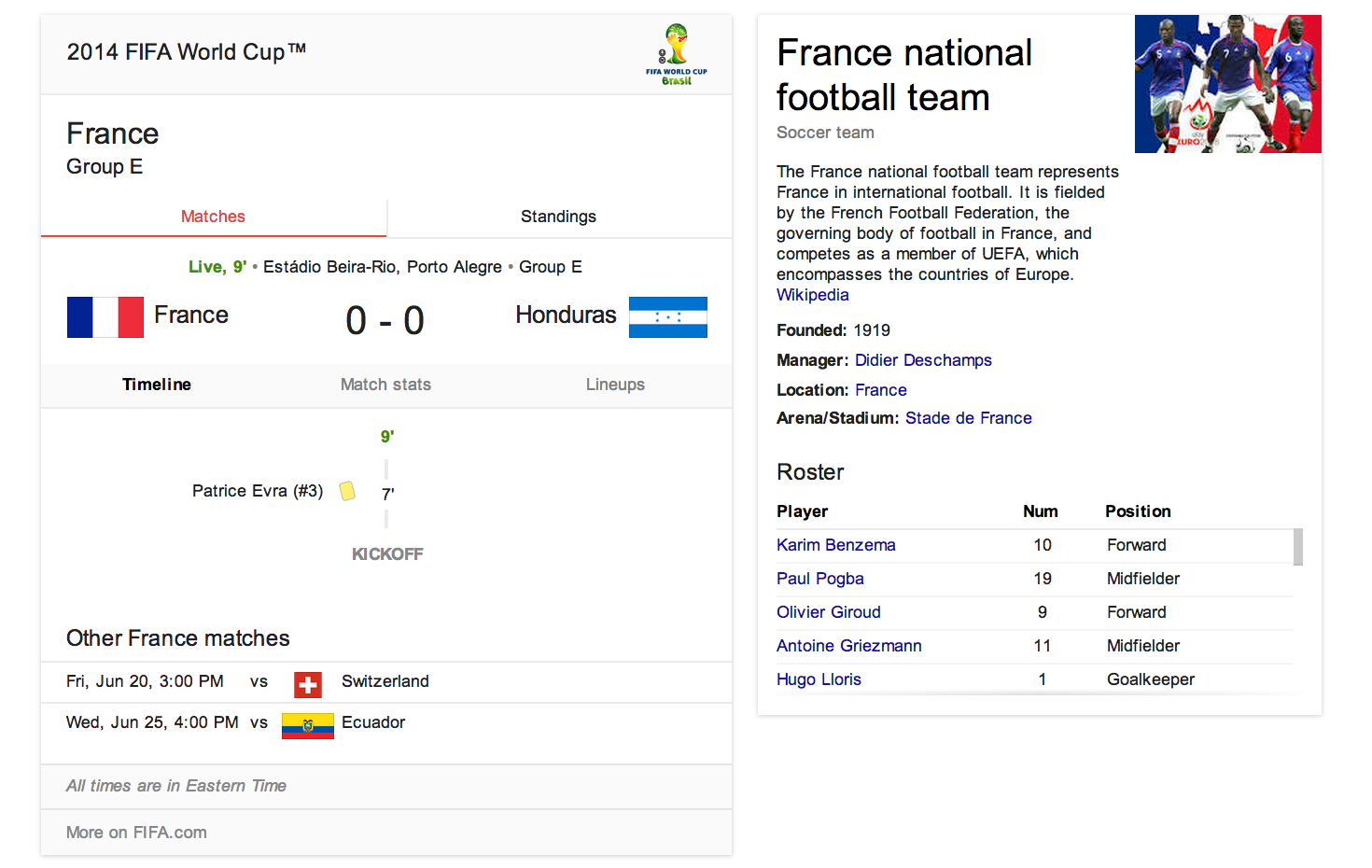
If you can’t watch every game live, you may be spending a lot of time surreptitiously tuning into the World Cup via search. Google serves up a clean, selective summary on the search results page above the organic news and web links. A search today for “France World Cup” yielded the interface below on desktop view:

- The desktop view directs the eye to a visual view of current game score, with flags as the focal point. The timeline defaults to “Matches” tab with “Standings” tab accessible.
- The interface offers relevant but limited additional information, like a reminder of the Group, and of other France matches.
- There is selective use of color (‘Live 9’ in green) so you can see the game’s progress at a glance.
- The sidebar brings in visual and text content from the Wikipedia entry, with general team information and roster.
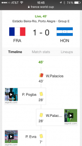
- The mobile view offers slightly different navigation. On mobile, the result omits the Wikipedia entry up top in favor of showing the roster via “Lineups”, and defaults to “Timeline” during the game. The scrollable interface highlights the great use of icons for elements like yellow cards, penalties, and own goals. As with the desktop view, playable video clips are prominent.
So many sports sites and television interfaces — for reasons that include both ad revenue needs and poor design choices — succumb to confusing, poorly differentiated visual clutter. Google’s clean interface does a solid job of serving up status and context at a glance for the World Cup obsessed.

-
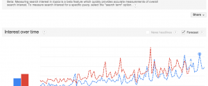
Search interest: Arsenal vs. Manchester Utd
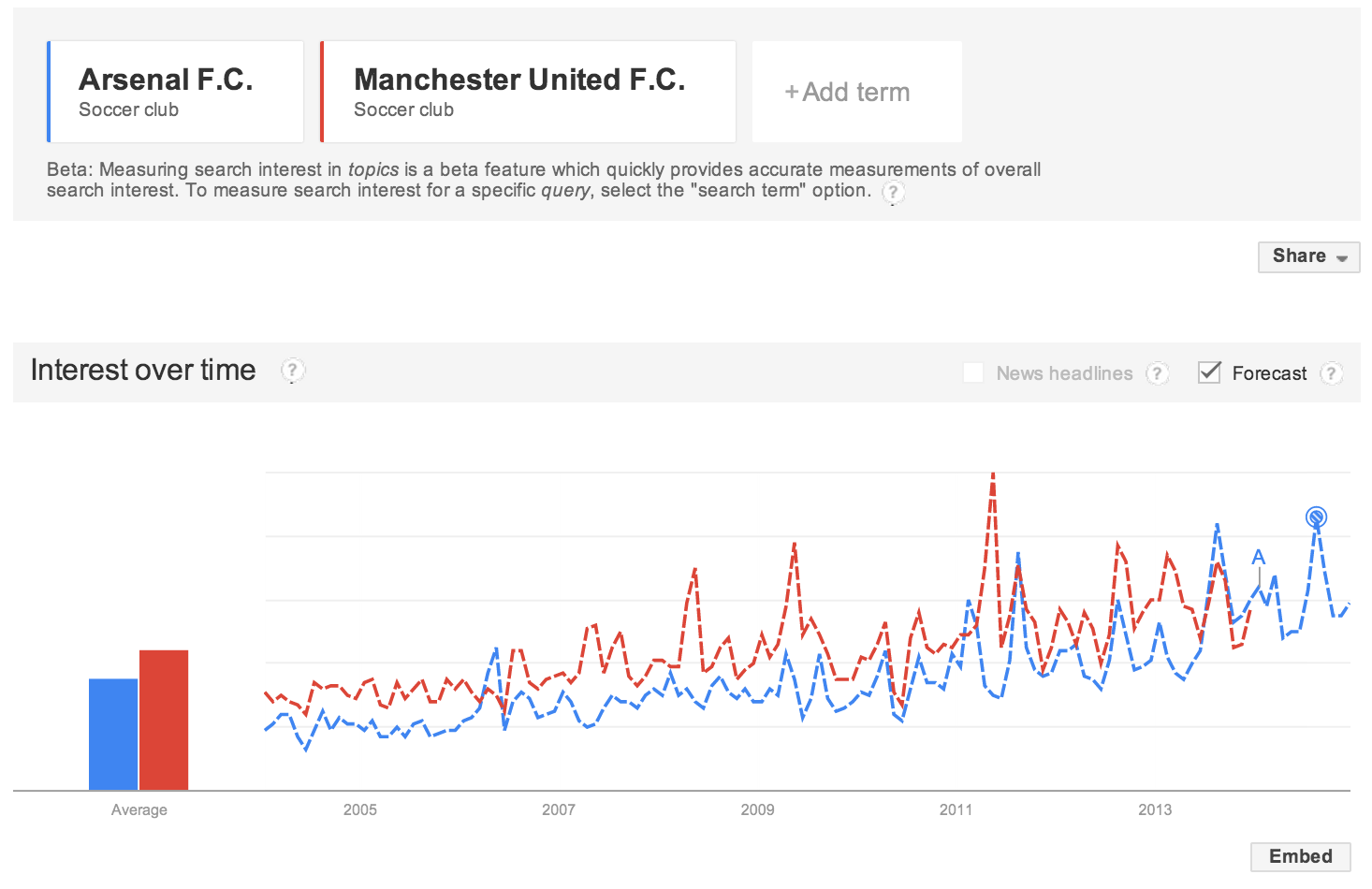
Highly unscientific, correlation is not causation, etc., but fun to see search interest in Arsenal FC rising and predicted to rise more as they finished 2013 at the top of the Premier League.
-

Effective data visualization, football edition
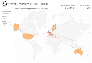
 As an Arsenal fan (the London team that’s currently first in the Premier League, a fact I try to work speciously into every conversation), I spend far more time than I should reading about soccer/football online. Like many sports, football is a goldmine of data from goals to assists to caps. In addition, football (unlike American football) is a game played globally, so there’s rich data about the rapid rise of player transfers internationally. And as the game became commercialized — it’s now the Barclays Premier League — the money moving around gets exponentially larger. All this data has been captured in a compelling and slightly addictive interactive visualization by Mac Bryla.
Back in 1965, when Bobby Moore was leading West Ham to FA Cup Victory, only one player transferred from England for a total of .02M €. By 1986, when Gary Lineker is playing for Everton, you can see how far the England players are traveling:
Fast forward to 1990 when David Beckham is at his peak, and you can see 115 English players fanning out across the globe, and the rise of money changing hands reaches 61.4M €.
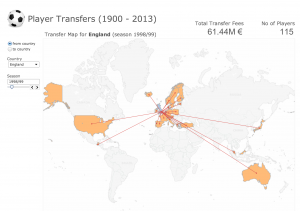
By 2012-13, it’s up to 221 players and 151.3M €. So if you scroll through the visualization you can see very little until the 1970s, and then tremendous growth in moves and dollars that could be compared in interesting ways to the rise of television, the World Cup winners, the popularity of soccer in the U.S., or even the growth of the internet.
What makes this data visualization work so well? First, while it’s not a breathtaking design, it’s clean and functional. The experience is also intuitive — the user can easily see the variables (explore by year; to and from country) that can be manipulated. Finally, the designer has done for us the most difficult job of all: winnowing out all the other facts (country of birth, team transfers, tenure abroad) that might be interesting data but would muddy this interface.
-
Lovely and functional football table
Most of the football visualizations I find seem to vanish after a few weeks or months, but I sure hope The Beautiful Table sticks.
Designed by Jon Ferry, this lovely and functional visualization shows you how your team (in my case, sadly, Arsenal in the Premier League) is faring. There are many small details that make this work, including use of club colors, smart mouseover behaviors withe match details, and data from both played and scheduled matches enhance the timeline.
Kudos for making something elegant that solves an actual problem: show me how my team is doing without making me look at a HTML table on a web page designed in 1997.
Found via infosthetics.
-
Shuffling deck chairs in European football

I follow Arsenal because I am a committed glutton for punishment. Agency Signal | Noise built this handy visualization to help you follow the rate and flow of players and money in European football. It’s helpful to see who’s accelerating the pace of cash out for talent — and vice versa.
-
Are effective school behaviors harming women in the workplace?
 Do Women Need to Realize that Work Isn’t School? Whitney Johnson and Tara Mohr point out in HBR that behaviors that enable young women to excel in school may serve them less well in the workplace. Johnson and Mohr argue, and I agree, that all employees and particularly women need to become more comfortable with behaviors like questioning authority, embracing improvisation, and engaging in self-promotion. (N.B. Approach the last of these far more carefully than your male peers.)
I’d add another important item to their list — learn how to disagree, and how to get over it. Engaging in conflict in the workplace and managing it toward resolution is part of the job, particularly in the fluid modern workplace where the need for constant adaptation can cause friction.
While school doesn’t always prepare us for that conflict, athletics may. Anecdotally, I’ve observed that many women who can tolerate workplace conflict well have participated in team sports. We know athletics correlate with career success; a 2002 study found that 82% of women in executive-level jobs had played organized sports in middle, high or post-secondary school. Discipline and focus are two obvious benefits, but I’d argue that team sports in particular offer participants experience in managing conflict and achieving resolution.
Image credit: U.S. National Archives: Department of Labor poster 1941-1945
-
The antithesis to 10,000 hours
 There’s a lot of reasonable thinking out there about how a skill is mastered, including the 10,000-hour rule popularized by Malcolm Gladwell.
I’m the first to advocate for the value of persistence — in marketing analytics, software development, and countless other disciplines there’s tremendous value in chasing every issue to its core and in finishing the job, even down to the tedious, final 10%.
Still, there are people whose skills — in strategy, writing, design, or coding –seem to transcend what’s possible for others. Leo Messi has likely put his 10,000 hours in, but I doubt there are many who could achieve what he has for the beautiful game.
According to the New York Times, former FC Barcelona Manager Pep Guardiolo said of Messi, “Don’t try to write about him. Don’t try to describe him. Watch him.” Here are 86 of his 88 goals in 2012 — but it’s really worth watching a full match if you can.